Wide-format graphic treatments are increasingly being worked into the architecture of interior spaces to enhance, divide or ‘theme’ a given area. This type of work can attract new and different clients who may not otherwise think of using a traditional sign shop’s services. Signmakers and customers alike stand to benefit by becoming more aware of the creative possibilities.
宽幅打印图形越来越多地被应用于内部空间,以某种特定的主题色彩来增强室内的空间营造力、划分区域、提升整体的文化氛围。将宽幅打印图形作为内饰的这种工作吸引着不同类型的客户,同时也标志着标识制造商和消费者都能从中获益。
Printed graphics and architectural-finish films have become particularly fashionable in open-concept corporate offices, where there may be no other physical definition of the distinction, for example, between an individual’s workspace and a meeting room. In such instances, a simple change of colour or style through window graphics can be used to signify the separation of different areas. A work zone, for instance, might use more neutrally coloured corporate graphics than a more social zone.
尤其是在人文文化比较强的企业里,宽幅打印图形已经变得特别流行,工作区域和会议室本身可能没有特殊的物理定义,在这种情况下,通过宽幅打印图形应用在墙壁或者窗户上,简单地改变颜色或整体风格,可以划定不同区域,为每个区域附加文化色彩。但是,不同区域所进行得细节处理却大不一样,例如,在办工区域使用的宽幅打印图形,会比其他区域使用的宽幅打印图形的风格更为中性。
People feel better when they are in an esthetically pleasing setting, rather than surrounded by flat, featureless backgrounds. This is one reason for creating the right esthetics for a corporate space; another is branding, by theming a space to make it uniquely identifiable.
这样做的目的是,为了让人们在美观的环境中得到舒适感,从而舒心地工作,而不是在一种严肃、生硬、没有任何特色的环境中投入工作。因此,为企业创造正确的美学价值,通过品牌文化来增强空间营造力是非常重要的。
Indeed, the primary appeal of wide-format graphics for corporate clients is the opportunity to completely customize their environment. They can extend their commercial branding to all areas, from corporate interior offices to spaces where their products are showcased.
事实上,宽幅打印图形对于企业客户的主要吸引力完全是由所处的环境所决定,他们可以将商业品牌扩展到所有领域,从企业内部办公室延伸到产品展示的全部空间。接下来,文章通过具体案例来分析如何从颜色的处理,来增强内饰宽幅图形的空间营造力。
Common colours
颜色的处理
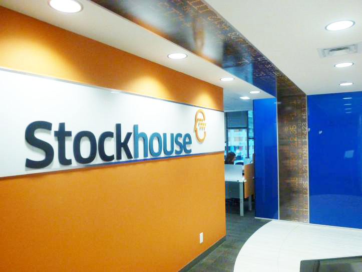
Vancouver-based Stockhouse Publishing, which offers web-based investment management tools and related news, advice and market insight, is one of the companies to catch on to this trend. In 2012, a series of new wall and window treatments were integrated into the company’s offices, tied together with a common colour scheme.
在温哥华,所有企业所迎合一大趋势是——对公司的管理要进行规模性投资,这其中包括对公司形象的整合。Stockhouse Publishing是迎合这一趋势的公司之一,他们的办公室重新整合了一系列新型的墙壁和窗户图形,并以一种通用的配色方案将所有图形捆绑在一起,为办公区域打造了整体的色彩效果。
The graphics were designed by Vancouver-based Fusion Projects, which specializes in construction and project management, and then printed and installed by Ampco Grafix, a wide-format graphics provider in nearby Coquitlam, B.C.
他们应用的新型宽幅打印图形是由总部位于温哥华的Fusion Projects公司所设计,该公司专门从事企业项目管理的工作,同时配合Ampco Grafix公司附近的Coquitlam公司进行安装的工作。
The project used dimensional lettering to clearly distinguish the entrance area. This added a level of style and sophistication to the space, with the letters applied to a background of Stockhouse’s Pantone branding colours.
该项目采用了艺术字体来清晰地解构企业入口的区域,并在字母设计上增加了一定的风格和复杂程度,来呈现Stockhouse Pantone品牌的色彩与形象。
Ampco Grafix produced the lettering with 12.7-mm (0.5-in.) thick Komacel rigid polyvinyl chloride (PVC), using a Vutek Ultra Vu II 150sc grand-format solvent-based inkjet printer. It was complemented by a reception wall and TV wall panel produced using white polymethyl methacrylate (PMMA), with the material continuing throughout the open office area to define it physically and to ensure a consistent brand identity.
Ampco Grafix使用了Vutek Ultra Vu II 150sc大幅面溶剂型喷墨打印机,以及材料为厚度12.7毫米(0.5英寸)的Komacel硬质聚氯乙烯,然后由一个白色聚甲基丙烯酸甲酯的生产墙和电视墙作为支撑,应用在整个开放式办公区域,呈现一致的品牌化标识。
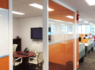
Next, 3M Canada’s Clear View, a highly transparent window film, was treated with Stockhouse’s Pantone orange brand colour—using a Vutek UltraVu 3360 super-wide-format digital printer—and applied to the meeting room window. This helped provide privacy for groups using the space, while also ensuring a consistent theme throughout the offices. Although the film is hard-wearing, one key benefit of installing it is it can be easily removed later if it is no longer required or if the company decides to change its colour scheme.
此外,他们还使用了一款Vutek UltraVu 3360超宽幅数字打印机,将图案打印在3M公司生产的Clear View高透明窗膜上,并与Stockhouse的Pantone橙色品牌颜色相吻合,应用在会议室的窗户上,不仅保护了该空间的隐私,同时确保了办公室的整体风格。这种窗膜不仅具有耐磨性,安装它的另一关键好处在于,一旦不再需要,或者公司决定改变配色方案,它可以很容易地被移除。
The colour scheme adopted for the entrance differed from that in the office area, where a 508-mm (20-in.) wide ‘ticker tape’ graphic was applied across the ceiling and onto a far window’s glass panel. It too was printed using the UltraVU 3360, but onto 3M’s ControlTac 0.05-mm (2-mil) thick cast vinyl with Comply adhesive, then treated with a gloss laminate. The graphic’s letters were produced separately with Duratext vinyl, as were silver stripes for either side of the graphic.
公司入口采用的配色方案与办公区域采用的是不同的,在办公区域内,天花板上和远窗玻璃面板上应用了宽度为508毫米(20英寸)的彩色图形,同时配备了由3M公司生产,厚度为 0.05毫米(2密耳)的铸塑乙烯树脂和粘合剂,这些都是用光泽层压板处理过,而字母图形是用Duratext乙烯基单独制作而成,图形两边有银色条纹。
By using this combination of wall and window treatments, Stockhouse’s new interior design scheme can better communicate the company’s brand in an open and warm way, enhancing a space that was previously unremarkable. The rooms even feel larger now that they are visually connected, with common colours tying them together.
通过对墙壁和窗户进行处理,Stockhouse公司在视觉上呈现了统一的色彩基调,新的室内设计方案更好地传达了公司的品牌和理念,同时特强化了整体的空间营造力,让员工感觉办公空间更大更立体化了。

Wall murals
墙体图形的设计
Ampco Grafix recently themed its own lunchroom with a wall treatment, but in a very different way. The large-scale graphic depicts a scenic waterfall as a background image and showcases inspirational testimonials from the company’s customers in the foreground, using vinyl lettering. This personal touch makes lunch more enjoyable for staff than staring at a blank wall would be.Ampco Grafix
另一个要细说的案例是关于一家主题餐厅,他们针对墙面上宽幅打印图形进行了细节化处理,但方式与上述的案例完全不同。一个风景优美的瀑布图形打印在乙烯基材料上,被安装在了餐厅的墙上,为了给在这里使用午餐的人提供一种轻松的氛围。
Indeed, an interior space—large or small—can be visually enhanced with wall murals to add interest, colour and even a greater sense of height and depth through optical illusions. By injecting personality into a tired, uninspiring space, a mural is an instant eye-catcher that can take a room from bland to spectacular.
事实上,室内空间的大小可以通过宽幅打印图形的设计来改变,也可以通过光学原理和色彩来调整高度和深度感,将一个平乏无趣的空间,打造成一个有食欲有氛围的空间。
Printed onto wall-graphic substrates and complemented by architectural finishes, wall murals can feature intricate and dramatic design schemes. Ampco Grafix recently transformed the entrance to a ColyVan Pacific apartment complex in North Vancouver using mural graphics and Di-Noc architectural-finish vinyl films with Comply adhesive for a wood effect.
打印在墙上的图形,辅以装饰,可以采用复杂而富有戏剧性的设计方案。Ampco Grafix公司最近改造了位于温哥华,一栋ColyVan Pacific公寓大楼的入口,他们采用了Di-Noc乙烯基薄膜,以及Comply粘合剂,制成了一种木质式样。
These types of films can help renew a building without costly renovations. They are popular in the construction and interior design communities because they closely approximate the appearance of metallic or natural materials, like wood and stone, but at a lower cost. They are also perceived as a ‘green’ alternative to using natural resources.
使用的这些薄膜可以更新建筑物的外观,而不需要进行昂贵的翻修过程,因此,它们在建筑的室内设计领域非常流行,除了它们的外观非常接近木材和石材等金属或天然材料以外,成本也比较低,被认为是使用自然资源的绿色替代品。

The apartment complex’s scenic wall mural, meanwhile, helped make a dull and uninspiring space warm, open and inviting. It also gave a narrow corridor a greater sense of depth.
与此同时,公寓大楼的墙体图形使整个入口空间变得温暖,使人们经过这条狭窄的走廊时,能体验到一种温馨的感觉。
Window options
窗膜的应用
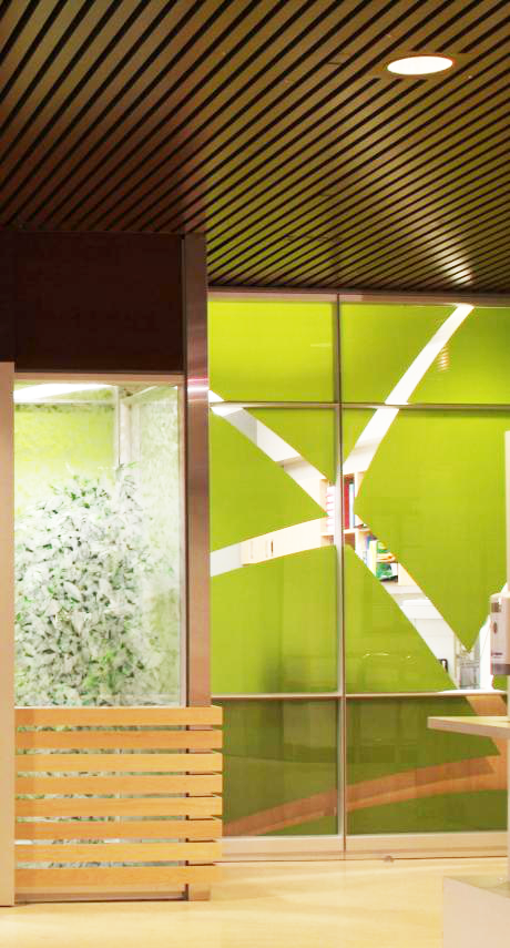
In some buildings, companies use windows as a canvas because they want to mask unsightly and/or distracting views. A long wall with several windows can even be covered entirely with a single treatment, rather than wrapping each window individually. The effect could make the wall appear larger.
一些公司应用窗膜,将多个窗户完全用一个宽幅打印图形来覆盖,与墙面混为一体,在视觉上增强空间感。
Such was the case for a Vancouver-based call centre, which used graphics to enhance a space and provide an added sense of depth. The project also masked a partition wall.
位于温哥华的一个呼叫中心就是这样做的,使用宽幅打印图形掩盖隔墙,来增强空间的深度感。
Other reasons to apply graphic panels to windows include controlling how much light enters throughout the work day and preventing outsiders looking in with a partial or complete ‘privacy screen.’ With gradation effects, it is even possible to tailor the amount of transparency along different parts of a window’s surface, which can help naturally light a room without letting direct glare affect staff.
应用窗膜的好处包括:第一,能控制白天内光线的射入,并防止外部人员窥视内部的隐私;第二,通过图形的渐变效果,可以根据窗户表面的不同部分来调整透明度,使光线自然地照亮房间,从而不会影响到员工的工作。
Of course, window treatments are also an easy way to add a splash of colour to a room. They are easily changed out to serve as seasonal décor or simply to change the ‘mood’ of the room.
当然,对窗户的处理需要根据季节,来适当地进行调整和装饰,为室内空间增添不一样的氛围。
There are a wide variety of window films available today to achieve different effects. Some are optimized for printing graphic elements. Others are designed specifically to block ultraviolet (UV) rays or ensure privacy. Still others are decorative film finishes, with patterns that capture the look of etched, cut, frosted, sandblasted or textured glass to a realistic degree, but at a fraction of the price. 3M’s Fasara products are examples of this type of film.
目前,市场上有各种各样的窗膜,它们可以达到不同的效果,有些还针对图形的元素进行了特别的优化,来阻止紫外线或保护隐私。还有一些装饰性薄膜,其图案能够将蚀刻、切割、磨砂、喷砂或纹理的外观逼真地呈现出来,达到精致的艺术效果。
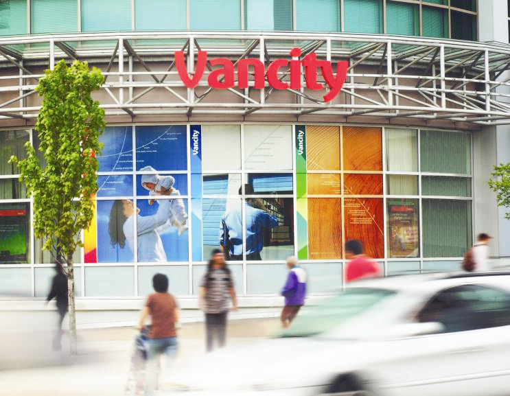
In some cases, full-colour graphics are printed onto a transparent film, so as to divide spaces with images while still letting people see out. This is one of the best ways to make a confined space feel open and larger than it actually is.
在某些情况下,全彩的宽幅图形打印在透明薄膜上,可以让人们用图像来划分空间,在视觉感官上,产生比实际空间更大的视觉体验。
There are even methods for printing graphics directly onto smooth glass before windows are installed. These tend to be for more permanent architectural purposes.
对于窗膜的安装,还有一种直接将图形打印到玻璃上的方法,这种方法能使图形持久的附在建筑物的表面。
The process and material of choice will depend on the client’s needs. The possibilities are nearly endless today for enhancing, dividing or unifying spaces with graphics, but what specifically can be printed and installed will correspond to what the customer is looking for.
当然,选择的设计和材料将取决于客户的需求,用图形来增强或划分空间只是需求的一部分,具体产生的作用和效果是需要与客户正在寻找的东西相对应的。

In any case, it is a good idea to consider window coverings as early as possible in the initial planning stages for any interior design project, particularly in open-concept spaces. The average building has more than 20 windows, all of which are potentially a canvas for graphics!
无论如何,在任何室内设计的初始规划阶段,特别是对于一个开放式空间,考虑应用宽幅打印图形来作为内饰是一个非常好的选择。平均每个建筑有20多个窗户,所有这些都可能成为一道亮丽的风景。


