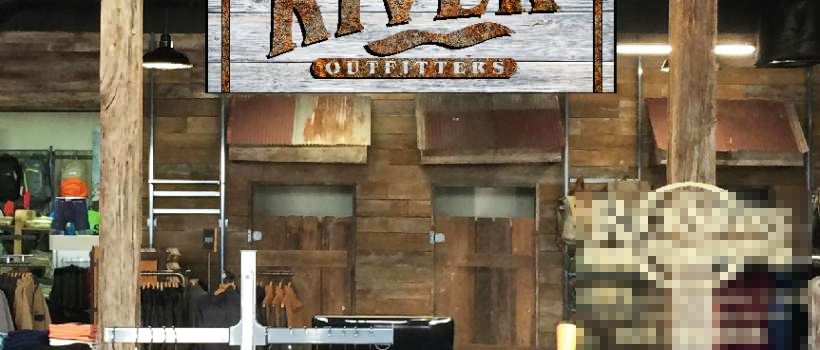
Recently we had a client who owned a specialty clothing store over in Vicksburg, Mississippi, contact us while we were putting the final touches on a similar store just across town here in Longview, Texas. The interior theme was all things rustic and casual, and the sign he had in mind to be placed over the customer counter had to fit that environment and be an accent piece right where everyone would see it.
最近,我们在密西西比州维克斯堡为一家专营服装店的客户服务,这个客户是我们当时在德克萨斯州朗维尤镇对面的一家商店,之前有过接触,之后联系到我们。这个服装店内部一切朴素随意,他们想要让我们为他们定制一些适合这个环境的标识,吸引更多人的关注。
His logo was quite simple, but gave us something to work with, and after a look inside I thought I knew about what he was after. Back at the shop, I drew up a sign and created a simulated graphic that I inserted into a photo of his customer counter area. This I sent by email, and soon received his response which was basically, “I like it. Get to work”.
他们想要的标识非常简单,我看了一下他的思路后,回到商店,画了一个标牌,并创建了一个模拟图形,插入到他客户柜台的照片中。我通过电子邮件发送过去,很快就收到了他的回应,回复的内容是他很喜欢我的设计。在得到了他的肯定之后,我便开始标识的制作工作。
Well, I have to admit I had several projects in front of that one, so doing the job in a real hurry was not in the cards, but he was willing to wait a little while, and on a quiet Saturday morning I came down to the shop intent on getting this job on the road to completion.
我不得不承认,在这个项目前,我同时接了几个项目,所以加上这个工作,真的很匆忙,所以很快地出成品是不可能的,但是这个服装店的老板愿意给我时间。
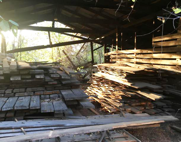
After looking over my specs again, I headed back to the house to get some materials to work with. The background would be old, weathered and sun-grayed wood, and on the back of our property I have a dilapidated old barn I inherited when we bought the land. So far I have done little with it but stack a pile of rough cut lumber there for when I will get around to completely rebuilding this East Texas relic.
当我确定好一些标识的大小与规格,我回到仓库开始收集材料。由于之前我接到过很多不同种类的项目,制作的标识的材料都不相同,对于这次这个项目,仓库里正好有一些古老、风化和变灰的木头,能为这次标识的制作提供原材料。
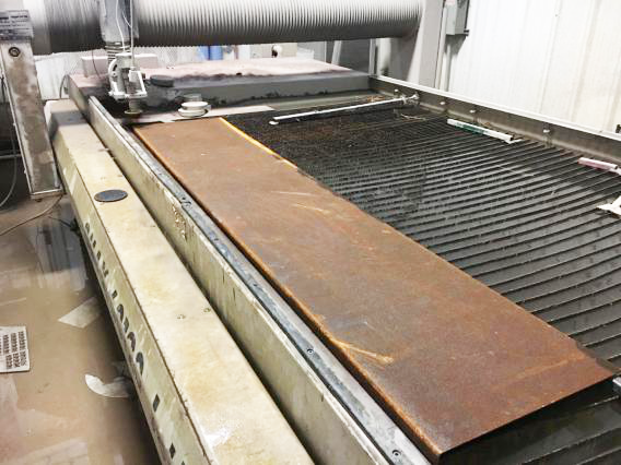
A little bit of effort turned up a few boards that looked compatible with each other, and had the look we wanted, and then I headed back to the shop. I ventured across the highway to our other facility, where we do a lot of metal cutting, some digging around behind that shop turned up a wide piece of 1/8” thick steel that had a formed edge on one long side, and looked to have been forgotten about.
从中,我选择了几块看起来能够相互兼容的木板,然后回到商店,穿过高速公路到达另一个设施,在那里,我们进行了大量的金属切割,那是一些1/8“厚的钢,在一边长的边缘处进细节处理。
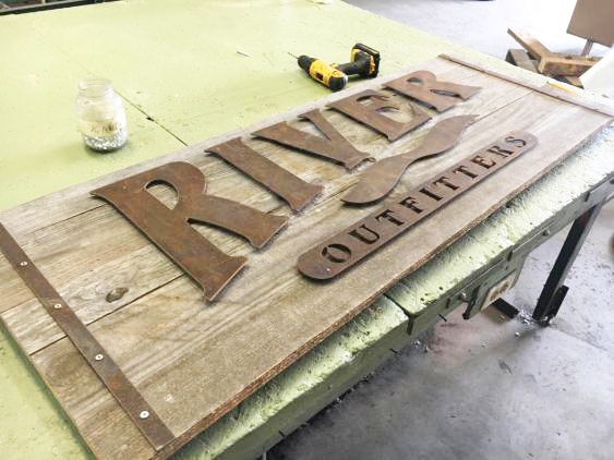
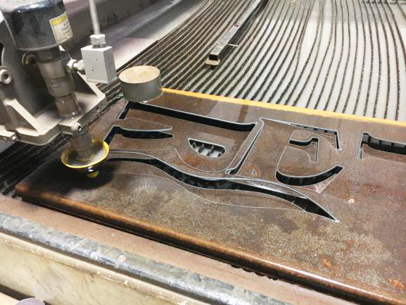
Getting a green light, the next stop was our original Omax waterjet, where I set up the cutting job for making the letters and other elements of this logo. In about an hour I had cut everything we needed for this small job out of just part of the scrap of metal I’d found.
然后我们使用可一种Omax水刀,对制作这个标识的字母和其他元素进行裁剪的工作。将金属碎片的一部分中全部剪掉,我们大约只花费了一小时的时间。
The rust, if this can be said, was perfect. It formed a nice texture and an even earth-tone color to the parts I made, exactly the coloring I needed against the gray tone of aged and faded wood that would comprise the background of the sign.
从另一种角度来说,生锈是一种特殊的审美效果,它为我制作的部件形成了一个很好的纹理和均匀的土色调,这正是我所需要老化和褪色灰色的色彩效果,我将它作为标识的背景。
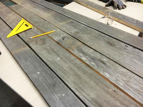
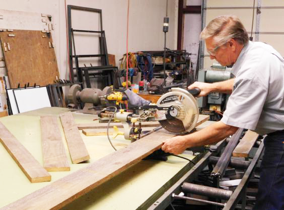
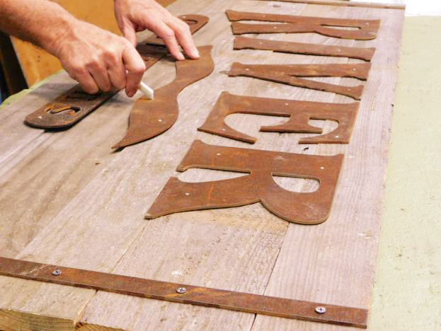
Then, with old wood planks and rusty waterjet cut parts, I went back to the sign shop and started assembling my client’s custom sign. I arranged the boards until I liked what I saw, and marked exactly which part of each board I would be using. I almost could have made another sign of the same size with the drops I had left over, but I was determined to use the most ideal part of each plank I had chosen out at the barn.
接下来,我用旧木板和生锈的水刀切割零件,开始组装客户的定制标牌。我开始选用木材,并且用记号标记了我将使用木材的哪一部分,选出的每块木板上最理想的部分才可以做出客户想要的效果。
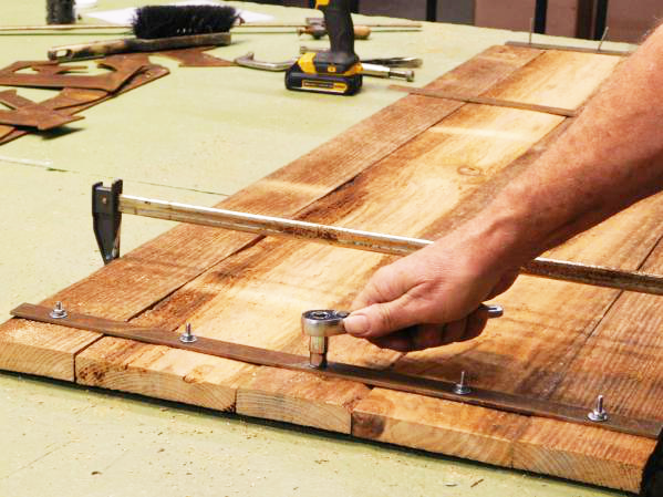
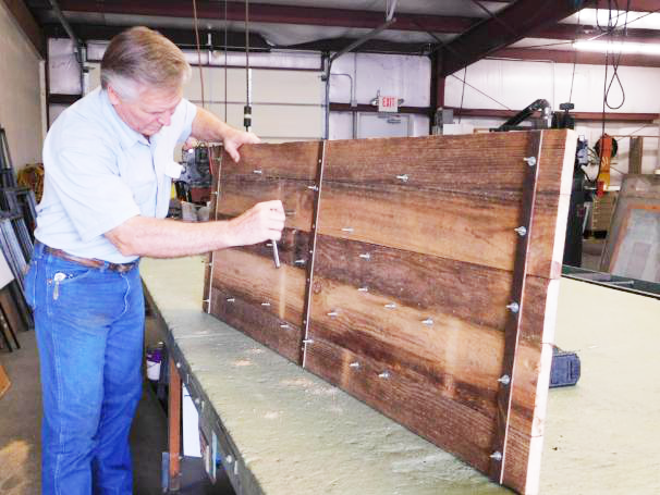
When I had cut the letters and logo parts, I also cut two pairs of steel strapping of the same rusty steel that the letters were made from, and used them to sandwich the planks together and make the sign itself. Later I would determine that the span between the steel straps was too long and the boards could warp in opposite directions in an unpleasant way, so I made another strap and would screw it to the back side of the sign right in the middle, with screws short enough they would not protrude to the front of the sign.
当我把字母和标识其他部分切开时,我也剪了两对同样生锈的钢制钢带,这些钢带是由这些钢丝制成,并用它们将木板夹在一起,做成标牌本身。我首先会确定好钢带之间的跨度长度,如果太长,木板可能会向相反的方向弯曲,所以,我制作了另一条带子,用螺丝将它拧到标识的背面,只有足够短,他们才不会突出来。
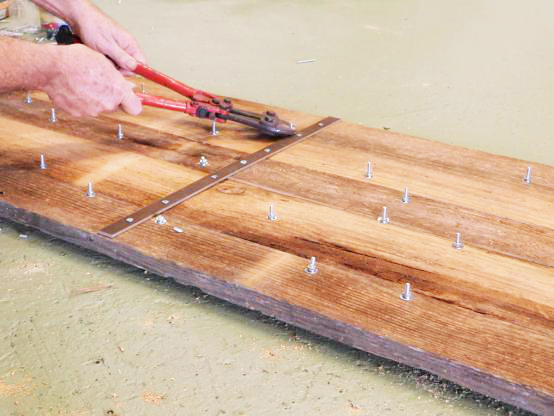
Small stainless steel 3/16” bolts or machine screws were used to pull the straps together and secure the boards. These were tightened down with a ratchet, and then the excess of each bolt was cut off with a pair of bolt cutters and ground smooth with the securing nut.
我使用了小型不锈钢3/16”螺栓或机器螺钉将带子拉在一起并固定板子,用棘轮拧紧这些螺栓,然后用一对螺栓刀将多余的螺栓切断,并用紧固螺母磨平。
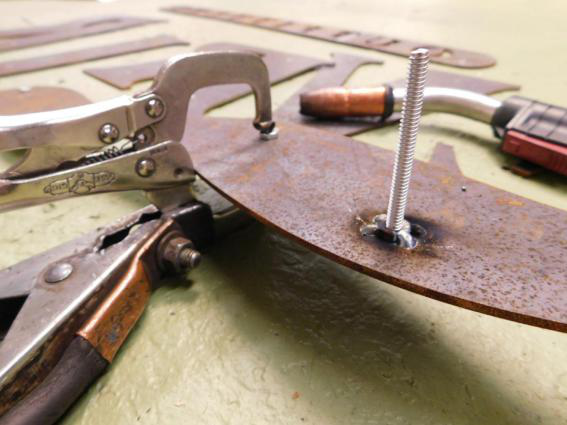
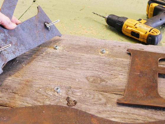
I did not want any screw heads in the rusty steel lettering itself, so small 3/16” nuts were welded to the backs of the letters and logo parts, into which threaded studs would be screwed in place instead of bolts, thus no bolt heads would show from the front of the sign.
因为我不想在生锈的钢铁刻字中留下任何螺丝头,所以小的3/16“螺母焊接在字母和部件的背面,螺纹螺钉将用螺栓代替,螺栓头不会从标识的前面凸显出来。
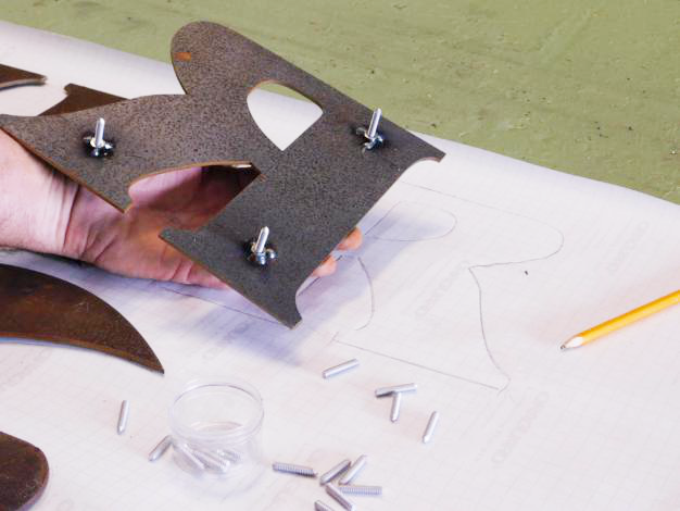
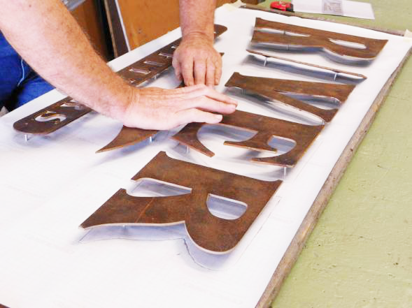
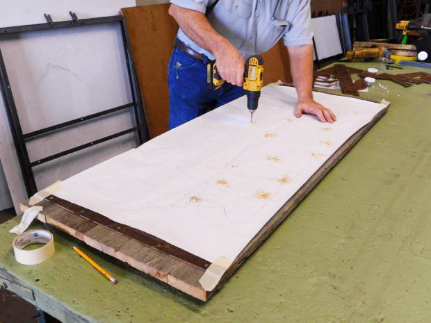
A piece of white butcher paper was cut to fit the sign, and taped in place and the metal parts were arranged correctly and then traced around to make a pattern. The metal parts were removed and short threaded studs with ground points were threaded in place where the studs would later go, and the letter or logo part was placed carefully back into its traced position on the pattern. Firm pressure was applied by hand to make clear puncture marks.
将一块白色的屠夫纸切成符合标识的大小,在一处地方放置,金属部分正确排列,然后在四周绘制图案。接下来将金属部件移除,并将具有接地点的短螺纹螺柱拧入螺柱将要移动的位置,再将字母部分小心地放回到图案上的追踪位置。
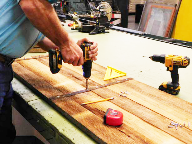
Following these marks in the pattern, all the holes to secure the metal parts were drilled precisely in the right places. After that, the final studs were threaded onto the backs of the parts and each part was secured permanently in place, using some 3/8” nuts behind each one as spacers. No primer, no paint, no clear coat, no finish work of any kind was done since the weathered and rusty look was what we were after.
在图案中进行标记之后,所有用于固定金属部件都能精确地在位置上钻孔。最后,螺栓被拧到零件的背面,每个零件都被固定在一个固定的位置上,零件后面用3/8“的螺母作为垫片。所有的过程没有底漆、没有油漆、没有清漆,因为做出风化和生锈的原生态外观是我们所追求的效果。
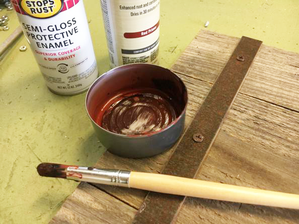
One final touch was taken, however, to disguise the bright stainless steel head of the bolts on the strapping, and even the nuts and washers on the back of the sign where the studs were secured. In order to keep this bright shiny metal from being a visual distraction, I took some flat back and flat rust red primer, in spray cans, and sprayed some of each color in tuna fish cans, then mixed the two colors a bit with a paint brush. Then all the new and shiny screw heads, bolts and washers, were “aged” right quick and became visually insignificant on the final product.
最后一个处理是把捆扎螺栓上的不锈钢头,甚至是标识背面固定螺栓的螺母和垫圈隐藏起来。为了保持明亮的金属不受视觉干扰,我在喷雾罐中取了一些平锈的红色底漆,在罐头上喷涂了一些颜色,然后用涂料将两种颜色混合,所有新的和有光泽的螺丝头、螺栓、垫圈被迅速“老化”,在成品上产生一种复古的视觉感。
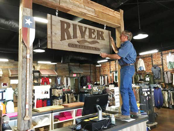
I did not alter the mounting eye screws and “S-hooks” used to hang the sign, and the installation was extremely simple. I stood on the customer counter, and pilot drilled a couple of appropriately spaced holes, treaded in two eye screws and hung the sign. Nothing to it.
安装非常简单,我没有换掉安装吊环螺丝,以及用于吊挂标识的S型吊钩,我站在客户柜台上,钻了几个适当间隔的孔,用两个吊环螺丝钉住,并挂上标牌。
The “River Outfitters” sign was a fun and simple job, but one that gave a client exactly what he was after and left another one of our calling cards in this town where we have left so many. It will be interesting to see how long until someone asks if we can do a similar sign for their rustically decorated business. My guess is, it won’t be long.
River Outfitters这个招牌是一件有趣而简单的工作,给了客户完全想要的东西,越来越多的人问我们,是否可以为他们的装饰性业务做一个类似的标识,这非常有趣。
