Flix Brewhouse is America’s only first-run movie theatre to incorporate a fully functioning microbrewery. This brilliant new concept, like many great ideas, originated in Austin, TX. Cima was introduced to the Flix team in 2013 by JKR Partners, a Philadelphia-based, architecture and environmental-design firm that understood Flix was a growing concept that demanded unique, iconic signage to boost its brand. Over the next year, Cima worked with Flix’s management team to develop exterior and interior signage standards that would maximize the impact of its logo and elevate its customers’ experience with the brand.
弗里斯是美国唯一一家头轮电影院,内部包含一个配置齐全的微型酿酒厂,并以此为人所知。它这种新颖又独特的营运理念,最初在德克萨斯州的奥斯汀市出现,近年来,取得了长足发展。在2013年,西玛公司通过费城一家建筑环境设计公司JKR与弗里斯取得联系,JKR非常了解弗里斯的发展模式,它认为,弗里斯需要一个极具特点、个性化的标识牌,这样,有助于增强其品牌影响力。在此基础上,西玛公司又充分了解弗里斯团队的具体要求,为制作出满足要求的户内外标牌做了充足的准备,从而使logo充分发挥其影响力,同时,还通过品牌宣传效果提升客户体验。

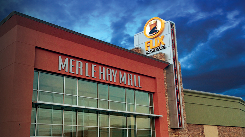
For its second location, Flix selected the Merle Hay Mall in Des Moines, IA, which opened in 1959 and, according to its website, houses more than 90 stores and restaurants, and remains a key shopping destination for its region. Becoming an anchor tenant at this site presented numerous branding obstacles – its entry point, on the mall’s south side, has no frontage that faces the primary entrance road on its east side.
其次确定安装位置。弗里斯决定将其安装在其旗下位于爱荷华州得梅因市的梅勒购物商场大楼上,从其官网了解到:该商场于1959年开始营业,由90多家商铺和餐厅组成。截至目前,仍然是该地区最重要的购物场所。但对于大多数的品牌商来说,成为该商场的租户有很多的障碍,最主要的原因就在于其出入口的设置不太合理。
From the outset, the stakeholders’ principal goal focused on creating an inviting and impactful entry with visibility from multiple sides. The main entry includes large, glass windows and unobstructed views of Flix’s brewing tanks. Therefore, our goal was to design signage elements that would accent the entry and complement the impressive tanks.
从一开始,双方的目标都在于打造出一种邀请顾客前来的氛围,并利用各种设计元素增强呈现的效果。该标识牌的设计灵感就来源于此,其主体部分采用大型的玻璃窗造型,以便将罐装的弗里斯啤酒形象一览无余的呈现。同时,设计时增加独特元素,使罐装啤酒的图案形象更加立体,让人印象深刻。
Idea fermentation 前期准备及设计
Keith Denny, Cima’s design VP, worked with Flix and the mall’s architect, DLR Group, to develop a branded, 55-ft.-tall, tower feature that would extend high enough for patrons on the mall’s opposite side to locate Flix’s entry.
西玛公司设计副总裁凯斯·丹尼与弗里斯以及该商场的设计公司DLR集团三方协商,最终确定,该标识牌高55英尺,以塔式的造型呈现,安装的位置刚好面对商场的入口,为顾客确定方位提供方便。

After several design revisions, Denny’s concept included breaking the plane of the roof’s top tower with a logo sign and a background cladding structure built with Mitsubishi Plastics Alpolic MNC Mica skin. From our fabrication partner’s previous success with this material, we were confident it would perform well. Building the tower allowed the mug logo to extend above all other structures and become a recognizable beacon at all entry points of the 1,000,000-plus-sq.-ft. property.
经过多次的设计修改后,丹尼的设计中包括将logo标识安装在商场的最顶端,背景板结构使用Mitsubishi Plastics Alpolic MNC Mica制作,并在其表面涂层包裹处理,该材料由合作伙伴强力推荐,因此,对它的性能非常有信心。制作塔式的标识牌,有助于突出啤酒杯logo使其即使在100多万平方英尺的区域内,也能一眼看出。
The Flix logo’s design presented its own challenges; creating a version that yields consistent lighting and is easily interpreted at 50 ft. above grade. After having sampled several logo versions, Cima developed one with a subtle white outline around the shape that clearly defines the mug and filmstrip details.
弗里斯logo在设计过程中,需面临很多挑战。在标识牌的制作过程中,要求照明亮度保持一致,使其在距离地面50英尺高的位置,也能清晰可见。通过研究各种收集的logo风格后,西玛公司确定了该标识牌logo的大致轮廓:周围边缘处为白色,并明确了啤酒杯和背景板的详细细节。
Once the client accepted the final design, we handed it off to Cima’s technical designers, Tom Kay and Will Wray, to outline fabrication and installation details. Collectively, the Cima team detailed the 8-ft.-tall, illuminated mug logos, with surrounding rings and custom decorative caps, to sit atop the tower feature. Translucent-plastic inserts, which illuminate the tower’s edge, became the final touches in creating an entry statement that elevates the customer experience.
该设计如果得到客户的满意,就将初步的设计图纸转交给西玛公司的专业设计人员汤姆·凯伊和威尔·雷伊,并简述制作和安装的详细信息,以方便制作。整体而言,西玛团队将logo设置为8英尺高,啤酒杯的部分可以照亮,其周围为环状,帽状的定制装饰固定在塔式造型的顶端。使用半透明的塑料板材,可以将塔的边缘照亮,提升客户体验。
The brewery 标识牌制作
Mark Wells, one of our lead fabricators of custom signage and architectural elements, directed the production of the custom ring and mug logo. Wells has more than 20 years of experience manufacturing casino, stadium and entertainment-venue signage. Keith and Will discussed the project’s design intent with Mark.
马克•威尔斯作为定制标识牌领域的著名制作商之一,他主要负责该项目定制环以及啤酒杯logo的制作。因为马克有20多年制作娱乐场所、体育场等地标识牌的丰富经验,因此,丹尼和威尔还针对该项目的具体设计方案与马克进行了讨论,从而确定最佳方案。
The timeframe was tight, and Des Moines’ city government required a variance to approve the components, which reduced Cima’s lead time. To meet the condensed timeframe, we assigned two additional fabricators, Larry Cellucci and Chris Paszynin, to tackle accompanying channel letters. The white background behind the mug logo took shape; a 0.125-in.-thick, aluminum face covered a 6-in.-deep, aluminum-angle frame. A vertical seam filled and finished for a flawless appearance.
时间已经很紧迫,得梅因市政府还要求该项目中使用的组件必须一一得到批复,这极大地缩短了西玛公司制作项目的时间。为了解决由于压缩时间造成的各种状况,我们另外聘请了两位制作人员,分别是拉里·赛乐凯和克里斯•帕斯尼,主要负责发光标识字的制作。啤酒杯logo后面的白色背景板制作成型后,将0.125英寸厚铝质面板覆盖在6英寸深的角铝框架上。接着,再将垂直缝处进行填充,其外形就完美呈现出来。
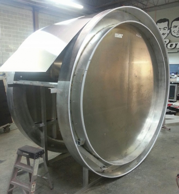
Cima fabricated the outer ring with 0.080-in.-thick returns and polycarbonate faces decorated with Avery Dennison Graphics Solutions MPI 2025 sunflower-yellow, translucent vinyl, illuminated with MaxBrite warm-white LEDs. Looking ahead toward installation, Wells’ team fabricated the ring logo in three sections with ship-lap seams and a removable bottom section that easily accommodates mounting hardware.
西玛公司在制作外圈时,返回深度设置为0.080英寸厚,聚碳酸酯型面板采用艾利丹尼森图形解决方案推出的MPI 2025向日葵黄色、半透明的乙烯材料制作,并使用MaxBrite暖白色的LED进行照明。为了方便安装,威尔团队将环圈logo分三个部分制作,底部可移动,这样,可调整位置,使需安装的相关硬件更加容易。
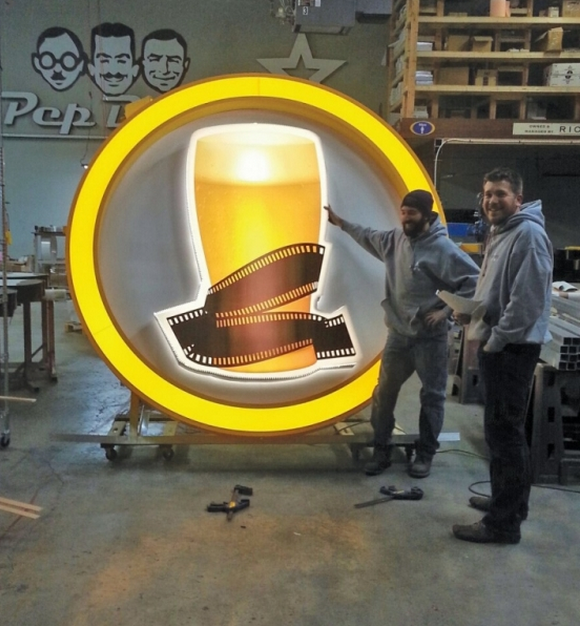
The project’s design intent presents the mug logo as the featured element; it sits proudly within the surrounding ring. This mug logo presented various challenges. First, we played with the printed mug image and experimented with several color options before we struck the right balance of the logo’s warm colors and accentuation of the glass’ condensation beads.
该项目的设计意图是,将啤酒杯logo作为该标识牌的特色凸显出来,其以独霸之姿位于环圈的中心,以绝对的方式呈现。啤酒杯logo在制作过程中遇到了很多挑战,首先,这个啤酒杯的图形是采用打印的方式完成的,尝试了几种颜色,最后决定选用暖色系,使起到平衡的效果,同时突出玻璃背板上的珠子造型。
While printing this image, we noticed the mug blended with the surrounding filmstrip, and could create difficulty for new customers trying to understand the logo. Denny devised a sign variation – a slight, white outline around the entire image that better defines the separate elements. We printed the final logos with Avery Dennison’s MPI 2025 translucent film on our Roland SolJet Pro III XJ-640 printer with eco-solvent inks. Then, we applied the prints to a white, polycarbonate background. The mug logos feature frosted-acrylic back panels spaced 2 in. above the white background, which allows a warm halo effect and adds brilliance to the logo.
在打印这个logo图形时,注意到啤酒杯混合有周围的背景板,对于新顾客来说,对理解这个logo有一定的难度。丹尼有一个标识的设计创意,在整个图形周围围一圈颜色很淡的白色轮廓,使每个单独的元素能更好的呈现。最后的logo图像的打印采用艾利丹尼森MPI2025半透明膜,并使用应用弱溶剂型墨水的罗兰SolJet Pro III XJ- 640型号打印设备进行打印。接着,采用白色的聚碳酸酯制作背景板。啤酒杯logo的特色是,在白色背景板的上方,磨砂亚克力背板间空出2英寸,这样,呈现出光晕的效果,使logo的形象更加突出。
The large logos’ final challenge involved creating an adjustable frame that allows them to flexibly straddle the top of the tower; building measurements couldn’t be verified prior to fabrication. We joined the two logos together with a 4 x 4-in., aluminum-angle spread frame with mounting that’s adjustable in ½-in. increments, which allows a snug fit over the Alpolic tower cap. A rolled, 0.080-in., painted-aluminum cap seamlessly joins the two logos.
标牌的整体logo面临的问题主要在于,要将框架制作成具有可调节的特性,因为安装在建筑物的位置比较特殊,很难准确地测量出具体的数据,而增加其灵活性,这样在建筑物塔形结构的顶端安装时更加方便。接着,使用4×4英寸角铝框架将两个logo组装在一起,并且中间保持½英寸的变量,便于后期的调整,除此之外,还要应用0.080英寸铝质喷涂帽,以无缝连接的方式将其固定处理。
Fill ’er up 项目安装
For installation, Cima engaged our Des Moines-based, preferred local installer, Signs-N-More, to work alongside Jim Rose, our director of field services. Gary Mills helped coordinate installation, and Doug Lee, Signs-N-More’s lead installation technician, also played a huge part in a successful job.
制作完成,接下来就是标识牌的安装。西玛公司与得梅因当地一家著名的安装公司Signs-N-More合作,公司的吉姆·罗斯主任负责现场的调配工作,加里·米尔斯与道格·李负责安装方面的协调,而Signs-N-More则主要配合安装技术人员的工作。三方合作,顺利完成该项目标识牌的安装。
The tower and signs’ installation were slated for completion in five or six working days. As expected, Des Moines December weather didn’t cooperate. A few weather delays crunched our installation timeframe to three days for completion. Rose and Lee’s team attacked this project full throttle, working into the weekend to get all of the elements installed within the committed timeframe. The mug logo’s construction enabled the final cap’s dimension to be measured onsite; installers adjusted the aluminum spreader frame and installed the logo.
该项目中,计划在5-6个工作日内完成安装。正如所预期的那样,得梅因恶劣的天气状况对安装工作的展开造成了很大影响,时间上的延迟不可避免。为此,罗斯和道格团队加速工作进程,到周末完成了所有相关配套设施的安装工作。制作的啤酒杯logo在安装前要在现场测量其尺寸,安装人员根据具体的大小调整铝质框架,以方便安装。
Like an orchestra, our team began the installation just a few hours after the Alpolic cladding was completed. Using its Elliott G85R Hi-Reach, the Signs-N-More team started placing signs on the tower’s south end. Working on a JLG 600s boom lift, Rose assisted with securing the logos. Once they’d placed the first logo, the team moved to the tower’s north side and mounted the second.
通过协同合作,团队工作人员先将Alpolic进行覆层处理,之后的安装则只需几个小时就可完成。借助于Elliott G85R,Signs-N-More团队着手在南侧进行标识牌的固定安装,利用高空作业平台,可有效辅助罗斯固定logo的位置。完成后,工作人员转换到北侧进行另一部分logo的安装。
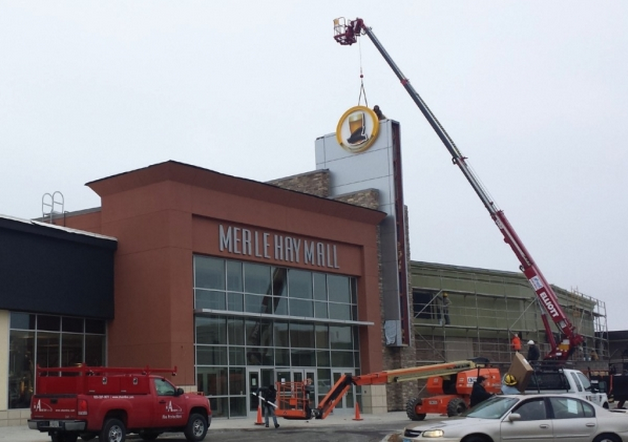
They secured the angle frame to create one large logo structure that straddles the top of the tower. Once they’d placed and wired the logos, the team installed the sets of face-lit, LED-illuminated Flix Brewhouse channel letters on each side of the tower. Next, our team exited the Des Moines cold and finished wiring the elements inside the tower.
固定角框,从而确定整个logo框架,以便于在建筑物塔形结构顶端的安装。接着,负责安装照明光源以及发光标识字的工作人员也开始工作,同时,进行布线处理。此外,考虑到当地寒冷的天气原因,决定将连接线安排在建筑物的内部,以降低由于天气造成的各种影响。
The client was extremely pleased with the result. As movie-theater owners and operators face increasingly stiff competition for the public’s entertainment dollar, innovative concepts are required to make moviegoing a more attractive proposition. Flix Brewhouse provides an enticing atmosphere for next-generation movie buffs to enjoy films in a lively, comfortable atmosphere. And, as always, compelling signage helps get them there.
经过团队工作人员的努力,顺利完成了该项目的设计、制作以及安装工作,并最终取得了客户的满意。面对当前竞争激励的现状,影院老板和相关运营商如何推陈出新,以全新的面貌服务受众,成为突破发展瓶颈的难题。针对这种情况,弗里斯提出的极具创意的想法所制作的标识牌,不仅为电影爱好者提供享受、舒适的气氛,同时吸引了新的受众,取得共赢的效果。

