From an environmental graphic design (EGD) perspective, a signage system can be considered the combination of three distinct but interrelated subsystems: information, graphics and hardware. The information system dictates where signs will be installed, what they will say and how that content will flow from one sign to another in a cohesive stream. The graphics system, on the other hand, puts forth how that information will be displayed on the signs in terms of typography, colours, layout, arrows, symbols, etc. And the hardware system, of course, comprises all of the physical structures that will hold the graphics.
从环境图文设计 (EGD)角度来看,一个标识系统可以看成由三个既有区别又相互联系的子系统组成:信息、图文和硬件。信息系统——决定标识安装的位置、标识显示的信息、信息内容如何连续不断地显示。图文系统——决定信息通过何种方式展现出来,包括排版、颜色、布局、箭头指向、标志等等。硬件系统——支撑所有图文的实体结构。

From design to fabrication
从设计到制作
Designing a comprehensive sign system is a problem-solving process, whereby the designer serves as the intermediary between a problem—as posed by the client or the environment in question—and its solution. There is also a partnership with the fabricator, who plays a key advisory role in the design process.
设计综合性标识的过程其实就是解决问题的过程,其中,在客户提出的设计要求和最终解决方案这两者之间,设计者就充当了媒介物。在设计标识过程中,标识制作商也扮演了一个重要的顾问型角色。
Everyone brings value to the table. Designers provide the problem-solving approach, creativity, esthetic sensibility and vision. Fabricators, on the other hand, bring a skilled craft, engineering, equipment and logistics to each project.
在标识制作过程中,每个人都会为该项目创造价值。设计者提供解决方案、创造力、审美识别力和想象力。同时,制作商提供娴熟的技艺、工程学知识、设备以及每个项目的后勤服务。
Sign fabricators do not always need to work with EGD professionals, as some projects are relatively straightforward from start to finish; but EGD firms always rely on sign fabricators to turn their concepts into reality. To that end, designers generally follow an architectural model in their work methodology and recommend fabricators for certain projects based on their specific strengths. Some shops are better at manufacturing outdoor signs, for example, than indoor signs.
标识制作商没有必要总是与EDG专业人士合作,因为一些标识项目从开始到完成的过程都是相当明确的;但是EDG公司却总是要依靠标识制作商来将其想法概念变为现实。为了实现这个目标,设计者在他们的工作方法论中,通常都会有一个体系结构模型,并且还会推荐具备特定优势的制作商参与其中。

A project's process
一个项目的制作过程
In EGD, the process for a project actually starts with pre-design data collection and analysis. Only then can they create schematic designs and then further develop and document them. Post-design processes include fabrication, installation and evaluation.
对EDG而言,一个标识项目实际上是从前期设计的数据收集和分析开始的。只有经过该过程他们才能创作设计原理图,然后进一步修改完善。后期设计过程则包括制作、安装和评估。
Pre-design
前期设计
By way of example, One Raffles Quay (ORQ) is a financial services and banking complex in Singapore that links two office towers—one 50 storeys, the other 29 storeys—with each other and, through a retail concourse, a Mass Rapid Transit (MRT) station below. Purpose-built in 2006, it required clear signage to direct a variety of tenants and visitors through parking lots and walkway connections, so the pre-design phase involved careful examination of a site plan to plot out sign locations, including analysis of entrances and floor layouts. The idea was to gather information before gathering inspiration.
举例来说,新加坡莱佛士码头一号是融合金融服务和银行业的综合性大厦,它连接着两幢办公大楼——其中一座50层,另一座29层,穿过广场就是大众捷运车站。2006年建造了该特色建筑,需要清晰的标识来为租户、停车场与行人通道相接位置的参观者指明方向,因此前期设计过程需要经过细致测试的场地规划,从而绘制出标识的准确位置,包括入口和楼面布局分析。要想有设计灵感就要先收集具体相关信息。
The pre-design process also involved developing identity strategies. Early on, there was the potential for the complex to be named after Singapore's Marina Bay, such that its office towers would be branded ‘One Marina Bay’ and ‘Two Marina Bay.’ This strategy would have emphasized the destination, rather than the street address, and created a sense of place based on geography. In the end, however, the ORQ brand was implemented and the two office buildings were named the North and South Towers.
前期设计过程也包括身份命名策略。早期时,这座建筑以新加坡滨海湾命名,两幢办公楼名字分别“滨海湾1号”和“滨海湾2号”。该命名重点在于目的地,而不是街道地址。最终,ORQ商标被做成,两幢办公楼被命名为南北塔。
Design
设计过程
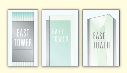
Inspired by architecture firm Kohn Pedersen Fox's (KPF's) design of the complex, several signage schemes were put forward to the client, each involving a different approach to letter illumination.
我们从科恩佩德森福克斯建筑师事务所(KPF)复合建筑的设计中获得灵感,给客户提供了几种标识设计方案,每种方案都采用不同的发光字照明形式。
The first was inspired by how the building's components were offset slightly from each other. Translucent glass would similarly be offset from a metal lightbox base, creating a light and airy esthetic reflecting the building's own details and materials.
从KPF复合建筑中借鉴到,如何在办公楼外观上做出吸引人的设计。因此第一种方案是将半透明玻璃与金属灯箱衔接,能够展现出明亮的空中美感,反射出办公楼自身的细节和材质。
The second was based specifically on crystalline skylights the architects planned to place over the main plaza. Faceted, bevelled or layered glass would connect with a metal lightbox in a more angular, asymmetrical and dimensional manner.
第二个灵感来自于水晶天窗,建筑师打算将其安置在主广场上。用金属灯箱将平面的、斜切的或分层的玻璃以更加有棱角的、非对称的、立体的方式连接起来。
Finally, the third scheme was informed by the top of each office tower, which featured an illuminated ‘crown.’ Sitting on a stone base, each sign would feature fluted, patterned glass supporting a metal lightbox and, on top, a ‘lantern’ nicknamed the crew cut. This sleek, clean and elegant design would more literally represent the buildings’ form.
最后,第三种方案灵感来自于办公楼的顶部设计,它以‘王冠’外形照明为主要特色。它的底座是石头,每个标识都是用有凹槽、图案的玻璃支撑着金属灯箱,顶部是平头式灯笼天窗。这个光滑、干净、优雅的设计可以毫不夸张地展现出该建筑的外形。
In the end, the client went with the third option. It was perhaps the most conservative of the three, but it was also highly referential to the building and could be more easily adapted than the others to a number of formats, from free-standing totems to ceiling-suspended signs to wall plaques to projecting signs—as well as different sizes, which at that point were not yet known, as the content had yet to be determined.
客户最终选择了第三种方案,它可能是三种方案中最保守的,但是也是最能代表该建筑的方案。相比于其他方案,它更适合多种形式的标识,包括独立式图腾、天花板悬挂式标识、壁挂墙饰、凸出标识等各种尺寸的标识。
After constructing scale models, some of which lighted up, the designers proposed for the crew cut signs to be made of laminated glass and internally illuminated. This raised the question of whether the glass would be self-supporting or would require an internal frame. Glass suppliers and engineers determined the glass-body totem signs, some of which were 3 m (10 ft) tall, could indeed be self-supporting.
在看过其中一些比例模型照明效果之后,设计者打算将平头标识做成照明玻璃和内部照明的形式。但需要注意的是,玻璃是自立式还是需要内部框架支撑的。玻璃供应商和工程师决定做成玻璃身图腾标识,高3米(10英尺)的自立式标识。
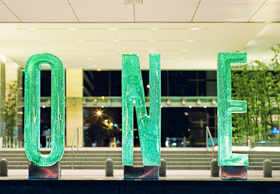
The complex's primary identification signage had to be adapted for two entrances, including the main one on Raffles Quay and another designed to accommodate vehicular passenger drop-offs and pickups. The concept for the drop-off entrance was a waterside series of free-standing glass letterforms with metal surrounds, pedestal supports and external illumination.
该建筑主要标识要匹配两个入口,包括莱佛士码头的一个入口和车站上下客区的入口。下客区入口标识是一系列临近水边独立的玻璃字体,底座是金属材质,且是外部照明的。

For the underground parking lot, meanwhile, different colours were chosen for each level, along with tall, thin graphics that would relate visually to the rest of the overall sign system.
同时,对地下停车场来说,每一层的标识都是不同颜色的,且又高又细的图文和整体标识系统在视觉上很相衬。
Further design development involved scheduling the signs’ messages, along with site-plan sketches indicating viewing distances from where each sign would be installed and its foundation requirements (e.g. electrical power connections). A wide variety of colour and material samples were tested for their appropriateness, weight, grain and finish, while graphics were planned in terms of type style, size and letter spacing.
进一步的设计内容是制定标识制作的时间表,还有指示标识安装距离和要求(例如电源连接)的总体平面设计图。各种颜色和材质样品用于测试是否匹配标识的适宜性、重量、纹理以及表面处理,而图文则根据标识类型风格、尺寸和字符间距来绘制。
During this process, the designers sought input and advice from multiple fabricators and engineers, which provide invaluable to the team in ensuring the project’s success. Finally, documentation was completed with the creation of detailed drawings for fabrication.
在这个过程中,设计者要从多个制作商和工程师那里寻求资源和建议,他们提供的信息对于整个项目的成功是无价的。最后的设计文档包含详细的制作图纸。
Post-design
后期设计
One of the big questions at this point was whether or not the drop-off entrance's 1-m (3.3-ft) tall waterside letters could be cast in glass for a hand-crafted, artistic esthetic as a counterpoint to the rigid structure of the building. In Singapore's hot climate, especially, the glass would provide the softer, cooling image of a green oasis. The designers found a vendor and co-ordinated efforts with architects and engineers to develop a series of prototypes.
后期设计中一个大问题是下客区入口处1米(3.3英尺)高的临水字符是否能被浇铸在玻璃中,最后以手工制作、独具艺术美感的外观安装在坚硬的建筑结构上。在新加坡炎热的气候下,玻璃尤其能够展现一种温和的、凉爽的绿洲氛围。设计者发现供应商和建筑师、工程师共同合作能够制定一系列标识制作标准。
The glass was cast in 15-mm (0.6-in.) thick steel moulds, which had to be custom-welded for each letter. It proved difficult to cool glass of that thickness—multiple letters cracked during the annealing process before a complete set with consistent colouring and distribution of bubbles within the glass was produced. Extra letters were also stored as replacements in the event of breakage.
每个玻璃字符要被浇铸在特定的15毫米(0.6英寸)厚的钢模具中。结果表明,冷却此厚度玻璃是有难度的,在玻璃内部完成连续着色和气泡分布步骤之前,许多字符在低温退火过程中就破裂了。在玻璃破损的情况下,储存额外的字符来代替这些破裂的玻璃是很重要的。
The final, successful letters were cemented into place within a stainless steel ‘boot’, which was then levelled and overclad in stone. It was very important to keep the letters protected during installation at what was still an active construction site.
最后,将字符固定在不锈钢底座上,然后再用垫圈将其填平覆盖。在没有固定好的结构上安装字符时,保证字符的完整性是很重要的。
At the other entrance, the letters were built into the face of a fountain instead. From a localized engineering standpoint, it was essential to ensure the fountain would not leak and short out the letters' lighting system. The lighting was also tested at night to ensure it provided the desired appearance.
在另一个入口,字符被安装在喷泉的对面。从局部工程学观点来看,确保喷泉不会喷出且低于字符照明系统是很重要的。夜间也要对照明进行测试以确保它达到了我们想要的效果。

ORQ-signage--15-Ultra-High-Res
ORQ标识--15超高物体
The green glass letters became iconic of the facility and appeared on the complex's developer's annual report.
该绿色玻璃字符变成了标志性的设施,出现在了该办公楼开发者的年度报告中。
In the parking lot, the colourful graphics were sprayed on-site, rather than digitally printed as decals and then applied to the walls. The results looked just like the original designs.
在停车场里,进行现场喷涂彩色图文,而不是数码喷印贴花纸再贴到墙上。最终效果看起来和最初设计图文是一样的。
Imposing a brand
充分利用商标
After the installation, the green glass letters identifying ORQ became particularly iconic for photo opportunities, including one for the cover of the complex's developer's annual report. They were a strong example of how signage can impose a singular brand and personality across a large-scale facility.
安装完之后,代表ORQ的绿色玻璃字符标识成了媒体报道的标志性建筑,包括该复合办公楼开发者的年度报告。这是一个很好的例证,证明标识如何通过大规模的设施来影响单一品牌个性的。
Indeed, clients come to appreciate how a space can be transformed with signs and graphics much more easily and affordably than with architectural treatments. The key to success is the relationship between signage and branding; it all needs to work together.
的确,与建筑艺术处理相比,客户更加青睐于方便可负担得起的标识图文设计。成功的关键就是标识商铺和品牌商家之间要不断地进行合作。


