ADA signs are designed, specified, and fabricated everyday. Some are done the right way and well, others are not. The truth is that the guidelines for ADA signs are not complicated. There are a few key aspects that all ADA signs must comply with and a few simple rules that must be followed.
每天都会有ADA标识被设计,细化,加工制作。有些是做的比较正确的,有些却不是。事实是ADA标识方面的条例一点也不复杂。有几个比较重要的方面是所有的ADA标识必须要遵守的。
The problem with non-compliant signs can be boiled down to two issues.
标识制作方面的问题可以总结为两点。
The first issue is a lack of knowledge and the second issue comes from ignoring the ADA guidelines to meet a specific design ascetic.
第一点是缺乏专业知识,第二点是为了满足特定的设计理念而忽视了ADA标识中的条例。
On March 28, 2014, the Department of Justice (DOJ) increased the penalties associated with ADA Violations. The penalty for the first violation is $75,000 with each additional offense being $150,000—real money for sure. As a sign fabricator, architect or designer, you have the obligation to make sure the work you're producing meets the ADA guidelines.
2014年3月28日,司法部加大了ADA违规的惩罚力度。第一次违反的处罚是75000美元,每一次额外的违规是150000美元——确定是现金。作为一个标识制作者,建筑者,或者设计师,你都有义务确保自己正在进行的工作是符合ADA条例的。
Here are five common things wrong with ADA signs. There are others, but these five highlight the main areas.
这有5个在ADA标识上常见的错误。还有一些其他的,但是这5个是比较突出明显的。
Font: A Nasty Four-letter Word
Font:令人不愉快的四字单词
The word “font” can be one of the nastiest four letter words when it comes to design.I'm not sure why so many people ignore the fact that the tactile on ADA signs should be San Serif or the fact that the character size is regulated. The language in the 2010 Standard for Accessible Design (SAD) is straightforward.
703.2.2 Case. Characters shall be uppercase.
703.2.3 Style. Characters shall be sans serif. Characters shall not be italic, oblique, script, highly decorative, or of other unusual forms.
703.2.4 Character Proportions. Characters shall be selected from fonts where the width of the uppercase letter “O” is 55 percent minimum and 110 percent maximum of the height of the uppercase letter “I.”
703.2.5 Character Height. Character height measured vertically from the baseline of the character shall be 5/8-inch (16 mm) minimum and 2 inches (51 mm) maximum based on the height of the uppercase letter “I.”
当谈及到设计的时候,“font”这个单词可能是最让人不愉快的四字单词之一了。我不确定为什么这么多人会忽视这个事实,ADA标识的触感应该是无衬线字体,或者会忽视字符的大小,应该按规定来。2010年无障碍设计的规范里标注的很明确。
703.2.2 案例 字符应该是大写字母。
703.2.3 样式 字符应该是无衬线字体。字符不能是斜体,倾斜的,手写的,过度装饰的,或者其他不同寻常的形式的。
703.2.4 字符比例 字符是从所有英文字母里挑选出来的,比如大写字母“O”的宽度,最窄的部分是大写字母“I”高度的55%,最宽的部分是它高度的110%。
703.2.5 字符高度 以大写字母“I”为例,从字符底部基线垂直测量的高度为,最小为5/8英寸(16mm),最大为2英寸(51mm).
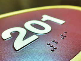

Not everyone wants to use Helvetica for everything. I get it, although I personally like Helvetica. There are so many other ways to make your signs decorative with the use of color, shape, materials, etc.
不是每一个人做每件事都用Helvetica字体。我就是这样,虽然我个人比较喜欢Helvetica字体。也有一些别的方法可以让标识通过颜色使用,形状,材料等方面做一些装饰。
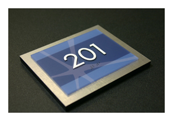
There's also the option to create Dual Message signs where you can have the tactile blend in with the background as long as the same message is above contrasting with the background. This scenario allows you to use Serif fonts for the visual message.
还可以选择创造双重信息标识,这样就可以把触觉融入到背景里面,只要同一种信息可以和背景形成对比。这种情况下,就可以用无衬线字体做视觉信息部分。
703.1 General. Signs shall comply with 703. Where both visual and tactile characters are required, either one sign with both visual and tactile characters, or two separate signs, one with visual, and one with tactile characters, shall be provided.
703.1 总结 标识应该遵守703条例 有视觉和触觉的特点都需要具备的,要么是一个标志同时具备视觉和触觉两个特点,或者两个独立的标识,一个是视觉上的,一个是触觉上的,这些都是可以的。
There are several Exemptions in the code that refer to the requirement for Dual Message Signs. To read more, refer to the 2010 Standard.
还有一些涉及到双重信息标识豁免条例。更多具体信息,请参考2010准则。
2.Kerning: Do Those Letters Look Funny?
字距调整:那些字母看起来会很滑稽?
Kerning may possibly be the most hated part of the ADA. The new 2010 Standard says there needs to be a minimum of 1/8-inch between the two closets points of any tactile characters.
字距调整可能是ADA 标识中最烦人的部分了。新版2010准则有注明:任何一个触觉标识中的两个字符之间最少要间隔1/8英寸。
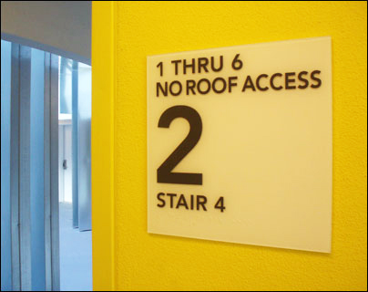
703.2.7 Character Spacing. Character spacing shall be measured between the two closest points of adjacent raised characters within a message, excluding word spaces. Where characters have rectangular cross sections, spacing between individual raised characters shall be 1/8-inch (3.2 mm) minimum and 4 times the raised character stroke width maximum. Where characters have other cross sections, spacing between individual raised characters shall be 1/16-inch (1.6 mm) minimum and 4 times the raised character stroke width maximum at the base of the cross sections, and 1/8-inch (3.2 mm) minimum and 4 times the raised character stroke width maximum at the top of the cross sections. Characters shall be separated from raised borders and decorative elements 3/8-inch (9.5 mm) minimum.
703.2.7 字符间隔 字符间隔应该是从一个标识里面,两个突出来的相邻的点之间开始测量,不包括字间距。字符上有矩形横截面的地方,个别凸出来的字符之间的间距最小是1/8英寸(3.2mm),宽度最大的有可能是它的4倍,字符有其它横截面的话,个别凸出来的字符间的间距最小是1/16英寸(1.6mm),横截面的底部最大宽度为它的4倍,横截面顶部的凸出字符间距最小为1/8英寸(3.2mm),最大为它的4倍。字符凸出的边缘和装饰处应该至少间距3/8英寸(9.5mm)。
When you think about it, this is pretty simple. The tricky thing is that some character pairs are naturally closer together meaning that in order to be ADA compliant, the character sets need to be spaced further apart than normal, making the character spacing appear wrong at times.
当你考虑到这些时,那就非常简单了。比较棘手的就是有些成双成对的字符本来就会靠的比较近,这就意味着要做合规的ADA标识,字符间的间距就要调整的比一般的宽一点,这样有时字符间距就会看起来不太协调。
The 1/8-inch kerning minimum also makes words longer and causes issues with the size of the sign as you cannot compress the word or reduce the size of the character below 5/8-inch.
最小值1/8英寸的字符间距也会让整个单词看起来会很长,这样就会产生一些尺寸大小的问题,因为既不能压缩单词,又不能把字符的大小缩小到5/8英寸以下。
If you think about it, tactile is required 。so people with visual disabilities can trace their fingers along the tactile to read the information on the sign. The number of people that can actually read Grade II Braille is low thus the requirement for tactile.
如果能够考虑到这些,触觉也是必要的。这样视觉有障碍的人也能通过他们的手指触摸,阅读了解到标识所表达的信息。事实上能读懂二级盲文的人是很少的,因此触觉标识就很有必要。

3.Character Size: Too Big or Too Small
字符规格:太大或太小
The size of tactile is simple with little room for interpretation. The minimum height is 5/8-inch and the maximum is 2-inch. We often see this rule broke when the design doesn't allow enough room for compliant Braille and tactile. This also happens a lot with certain frame systems.
触觉标识的大小很简单,没什么特别说明的地方。最低高度是5/8英寸,最高高度为2英寸。设计时,没有足够的空间做盲文和触觉点的时候,这种规则通常会被打破。在一些建构系统中,这种情况偶尔也会发生。
703.2.5 Character Height. Character height measured vertically from the baseline of the character shall be 5/8-inch (16 mm) minimum and 2 inches (51 mm) maximum based on the height of the uppercase letter “I.”
703.2.5 字符高度 以大写字母“I”为例,从字符底部基线垂直测量的高度为,最小为5/8英寸(16mm),最大为2英寸(51mm).
The exception to this rule is with the Dual Message Sign. In this case, the tactile is allowed to be as small as 1/2-inch.
这款条例对Dual Message Sign有例外。在这种情况下,触觉标识可以为1/2英寸大小。
Exception: Where separate raised and visual characters with the same information are provided, raised character height shall be permitted to be 1/2-inch (13 mm) minimum.
例外:同一标识里有单独凸出的和视觉上的字符时,凸出的字符高度可以允许最少1/2英寸(13mm)。
4.Braille: Is That Compliant?
盲文:符合标准吗?
There are many different ways to manufacture Braille signs, and yes, you can make compliant Braille with all the fabrication methods. The 2010 Standard has a few specific codes relating to Braille that include the structure of the dot, the cell spacing, and placement.
有很多不同的制作盲文标识的方式,同时,还可以结合所有制作盲文的方法。2010准则里有一些特定的关于盲文的规范,包括字符点的结构,字符间距和布局。
The verbiage regarding the shape of the Braille is very specific. The language is not written to include or exclude any materials. The language is a guideline for the shape and size of each Braille dot and cell.
关于盲文呈现形式的措辞是非常具体的。这篇准则没有涉及到任何材料的运用。它主要是关于每个盲文的点和字符的大小和呈现形式的一篇准则。
703.3.1 Dimensions and Capitalization. Braille dots shall have a domed or rounded shape and shall comply with Table 703.3.1.
703.3.1 尺寸和大写。盲文每个点都应该是有个拱起来的点或者是圆形的,一切要遵守703.3.1条例。

In the U.S., signs are required to have Grade II Braille, which incorporates 189 contractions and short form words. The condensed size of the Braille is ideal for the limited space available on most signs.
在美国,标识要求必须有二级盲文,其中包含了189个缩略词和简短词。压缩尺寸版的盲文对于大部分标识中空间有限这个问题,是比较理想的解决方案。
Title 24 in California uses different spacing for Braille. California Braille, as it's commonly called, still uses Grade II Braille but the spacing between the Braille cells is farther apart.
加利福尼亚州的Title 24在盲文中使用的间隔不相同。就如一般的一样,加利福尼亚盲文仍然用的是二级盲文,但是盲文之间的间距还更加宽一点。
The other main difference with Title 24 is the placement of the Braille. Both the 2010 Standard and Title 24 require the Braille to be a minimum of 3/8-inch directly below the corresponding text. Title 24 however sets a maximum distance of 1/2-inch. Both require the Braille to be directly below the raised text so no, you cannot put the Braille on the right side of the text.
Title 24中另外一个主要的不同就是盲文字的布局。在2010准则和Title 24中,盲文字最少要在相应的文档的正下方3/8英寸处。然而Title 24还设置了最大值1/2英寸。两个都要求盲文字要在突出字文章的正下方,所以绝对不能只是把盲文字放在文档的右边。
The uppercase indicator before Braille is not often required, but since many people are not sure, we see it used frequently. The codes state that:“The indication of an uppercase letter or letters shall only be used before the first word of sentences, proper nouns and names, individual letters of the alphabet, initials, and acronyms.”
在盲文之前字母是不要求大写的,但是因为很多人不确定,而我们又看到他们用的挺多的。条例里面有规定:“大写字母的指示通常是用在每句话的首字母,专有名词和人名,单个字母,缩写和首字母缩略词。”
5.Mounting: Is That Sign Too Low?
安装:标识太低?
The 2010 Standard changed the mounting requirements for ADA signs. There is now a variance of forty-eight to sixty inches. The mounting height of the sign is base on the height of the tactile characters above the finished floor. This means that the flooring needs to be factored in when determining the placement of the signs.
2010准则里有对ADA标识的安装要求做一些改变。现在的变化范围有从48-60英寸。标识的安装高度是以已经竣工的地板上方的触觉性的字符的最高点为准。这就意味着,地板也是决定标识安装的决定因素之一。

The code spells out most of the mounting scenarios in details. If you ever have a situation where you're uncertain the correct location to mount an ADA sign, you should ask the local building inspector. Unfortunately as many of you know, different people have different interpretations of the codes, especially when it comes to mounting location.
条例里面对大多数的安装情况都做了具体细节上的说明。如果你遇到安装ADA标识的正确位置不确定的情况,可以询问当地的建筑检查员。不幸的是,正如大多数你了解的那样,不同的人对于条例都会有不同的见解,特别是涉及到安装位置的时候。
703.4.1 Height Above Finish Floor or Ground. Tactile characters on signs shall be located 48 inches (1220 mm) minimum above the finish floor or ground surface, measured from the baseline of the lowest tactile character and 60 inches (1525 mm) maximum above the finish floor or ground surface, measured from the baseline of the highest tactile character.
703.4.1 地板或者地面上方的高度 标识上的触觉字符应该安装在距离地面或地板最小距离为48英寸处(1220mm),从可触摸字符的最低底线处开始测量,最大距离地面为60英寸(1525mm),从可触摸字符的最高点起算。
Exception: Tactile characters for elevator car controls shall not be required to comply with 703.4.1.
例外:升降电梯上的可触摸控制健不用遵守703.4.1条例。

703.4.2 Location. Where a tactile sign is provided at a door, the sign shall be located alongside the door at the latch side. Where a tactile sign is provided at double doors with one active leaf, the sign shall be located on the inactive leaf. Where a tactile sign is provided at double doors with two active leafs, the sign shall be located to the right of the right hand door. Where there is no wall space at the latch side of a single door or at the right side of double doors, signs shall be located on the nearest adjacent wall. Signs containing tactile characters shall be located so that a clear floor space of 18 inches (455 mm) minimum by 18 inches (455 mm) minimum, centered on the tactile characters, is provided beyond the arc of any door swing between the closed position and 45-degree open position.
703.4.2 位置 单扇门上安装可触式标识的时候,标识应该安装在门闩旁边的一侧。安装在两扇门中有一扇是活动门的,可触摸标识就需要安装在固定的门上。如果是安装在两扇门都是活动门的,那么可触摸标识应该安装在右手边门的右侧。如果在单扇门上的门闩处或者双扇门的右边墙壁没有空余的位置,那可触摸标识应该安装在最邻近门的墙壁上。标识应该安装可触摸式的,这样整个围绕可触摸标识的最小尺寸的18英寸(455mm)的距离地面高度就很明显了,这是基于每扇门开关之间的角度都是45度设立的。

Exception: Signs with tactile characters shall be permitted on the push side of doors with closers and without hold-open devices.
例外:可触摸式字符标识在可推式的门和没有自动闭门器设备的门上,也是可以安装的。

Conclusion
总结
By following these five rules and applying a bit of commons, you'll create complaint ADA signs that will help all people navigate the built environment with confidence and ease.
通过上述这5条规则,和日常中常见的应用,你就能很自信也很轻松的创造出合格的ADA 标识,能够帮助人们在建筑楼里指路导航。


