Just before the Thanksgiving holiday, Kevin, our contact person for one of our very best clients, Exco Operating, gave us an almost impossible assignment of doing a total makeover of their large dimensional sign, and he needed it to be completed by the Tuesday after the holiday.
就在感恩节的前几天,与我们合作关系最好的客户之一凯文,交给了我们一个几乎不可能完成的任务。他要我们把Exco Operating的立牌标识完全翻新,并且要在感恩节后的周二之前做好新标识。
Though I had known they wanted this done because of a buy-out and name change the company was going through, an unexpected visit from some VIPs from corporate headquarters had just moved the deadline well forward, painfully forward, since we had not even started drawing up a plan, nor had they given us new art or even a company color scheme.
尽管我已了解到,他们现在公司正处于收购和更名的过渡时期,公司总部主要负责人需要亲自验收成果,并将验收日期提前,所以才要在如此短的时间内完成这项工作。但是我们根本来不及制定方案,他们也没有提供给我们对新标识的想法或配色方案。
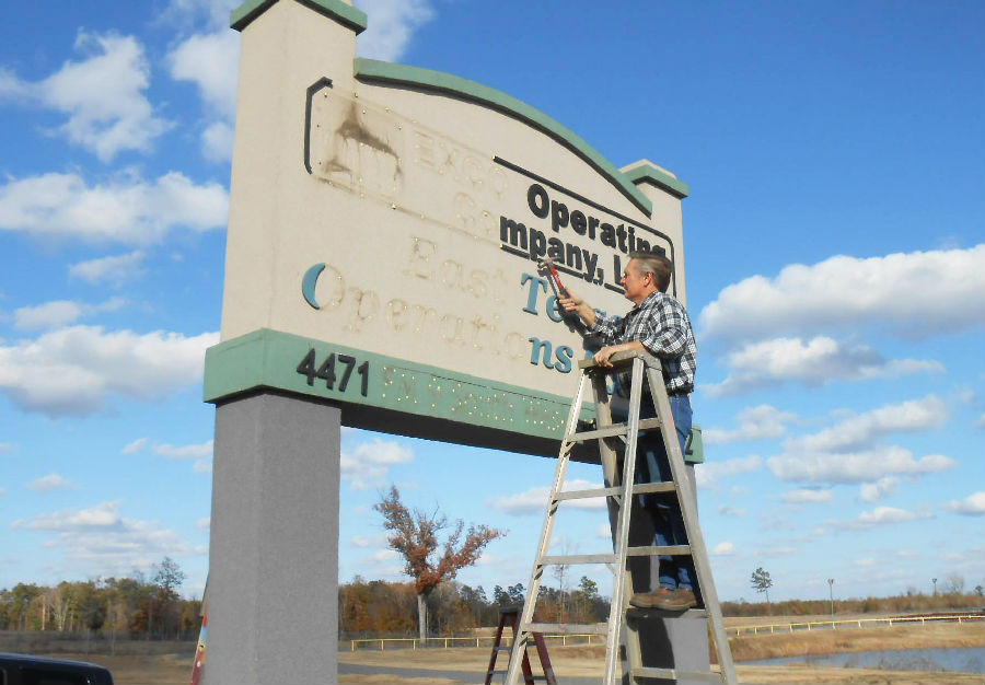
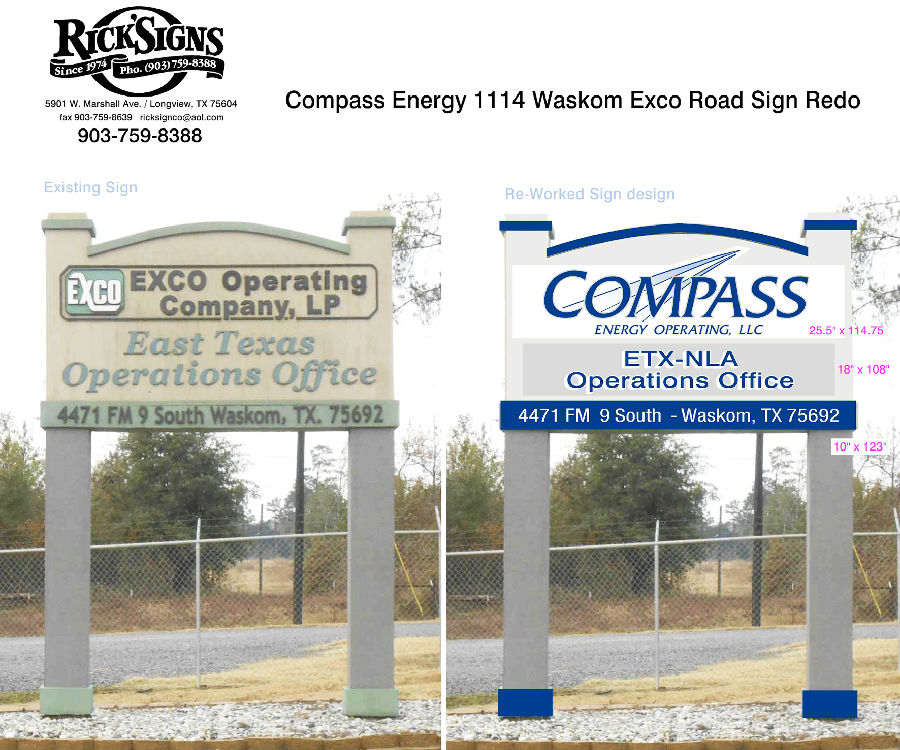
Exco, now Compass Energy, is an oil and gas production company with a local main facility in a very rural setting a few miles south of Waskom, Texas. Their present sign was a large textured foam covered structure, with all raised router-cut lettering, dimensional logo and so forth. It was double-sided and on columns approximately 18”square and 8' tall to the bottom of the sign itself. Nothing of the old logo or letters would be saved, and according to the rough digital copy of their new logo, the only one provided to me, all the colors would change as well.
Exco现在更名为Compass Energy,是一家汽油生产公司,坐落于德克萨斯州瓦斯科姆以南几英里的小乡村。他们现有的标识是用粗糙的泡沫覆盖的结构,上面是凸起的围字切割刻字和立体商标。此标识是双面型的,并安置在面积大约为18平方英寸、8英尺高的柱子上面。按照他们提供给我的粗略数码图像(这是唯一关于新标识制作的想法),我发现旧标识上的商标和刻字都没有被保留下来,基本色调也都改变了。
Getting all the old lettering and logos off would leave a sign surface that would be somewhat damaged under the best of circumstances, so most of the old sign's surface would have to be covered. And, they wanted at least the main lettering in the logo to be raised. At best we would have a few days to get this completed, along with other sign work already in the progress at that moment, so this would be a race to the finish to say the least.
在把所有的旧刻字和商标全部去除的过程中,即使在最好的情况下,也会对标识表面造成一定破坏,因此要把旧标识表面的绝大部分都重新粉刷覆盖。同时,他们要求商标上的主要刻字要凸出来。在此期间,我已经有其他正在进行的标识制作项目,所以要想按时完成这项工作,对我们来说确实不是一件容易的事。
Having no time to waste, I put together a proposal of what the revised sign should look like, and how things would be covered and trimmed, part of this to mask some deterioration beginning to show in the sign itself, and I chose the background and trim colors I thought would go with their logo myself. By the next morning this concept was accepted unchanged and a price agreed upon. Now it was off to the races.
该项目刻不容缓,我制定了一套方案,包括新标识的外观展示、如何覆盖裁剪面板、字母等,至于标识本身可能由于变质褪色的问题,我会选择能够和他们的商标颜色更匹配的背景色来解决。次日上午,我的方案得到了大家的一致认同,并且在价格上也达成了共识。这个项目就这样开始了。
But, it was a complicated race, partly because this wasn't the only thing I had to work on right then, and needless to say my time off for Thanksgiving was not much more than an enjoyable dinnertime. It seemed almost too much work to do for this old sign maker since my employees were scattered far and wide.
然而,这真的不是一项简单的任务,因为我要做的项目不止这一个,更不用说我牺牲了感恩节休息日来做这个项目。由于我的员工们都住得比较远也比较分散,所以几乎所有的工作都要由我来做了。
Because of the holiday, I would be doing a lot of this work myself, and I did not want the cost of bringing our manlift out to that distant location when it was time to do the install, so the intention was to keep everything as light and sectional as possible. No materials heavier than .040 aluminum and thin aluminum laminate sheet were used.
因为是假期期间,所以我自己完成了大量的工作,而且我不想在安装的时候,还要花费人力物力把升降机运到那么远的地方,这样做是要保证所有的零件都要尽可能的轻便且可组合在一起。我做的没有比0.040铝更重的零件,并且薄的铝层板也为我所用。
We wanted fast drying and non-glossy paint, and chose to go with Sherwin Williams A-100 satin finish latex paints for the sign structure, the trim colors, and the background we would be painting on our panels, though the main logo panel would be the factory white itself.
我们想要那种快干无光的油漆,所以选择舍温·威廉姆斯A-100系列的光滑乳胶油漆来喷刷标识架构并调整配色。
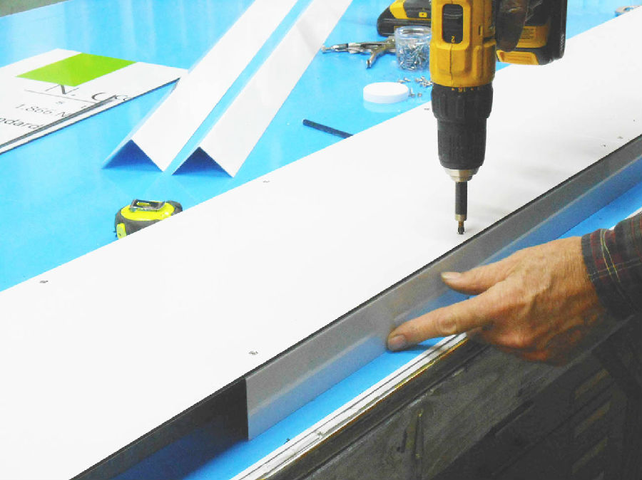
That main panel needed to look dimensional, so the laminate surface sheet was mounted to a pan-formed sign, made from a sheet of 4’x 10’white .040 aluminum pre-painted sheet. The laminate would be cut in a simple shape, with a protrusion at the top being the only element that kept it from being a simple rectangle. But, on this one dimensional panel would also be mounted ½” raised thick letters made from white PVC sign material, but painted dark blue.
如果要使主面板看起来有立体感,就要把成形的字母安装在层压板表面,该层压板是由4英尺x10英尺的白色.040铝质薄板做成的。层压板要被切割成顶部有一个突出尖端的形状,而不是简单的矩形。同时,在这块立体面板上还要安装1/2英寸厚的字母,这些字母是用白色PVC标识材料做成,并且已经被喷涂成了深蓝色。
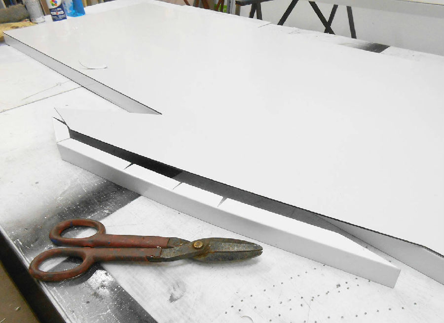
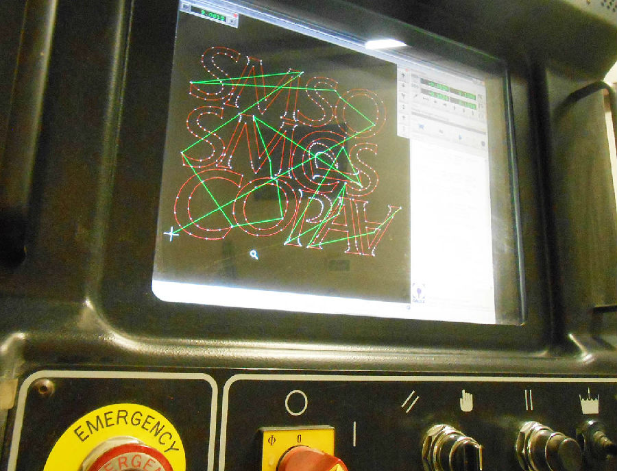
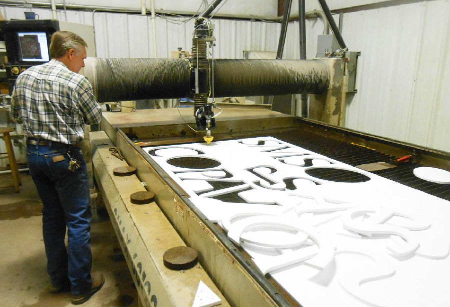
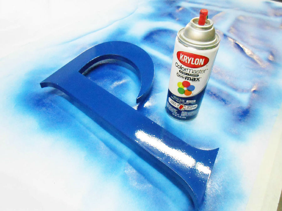
Things had to be simple and fast, but fortunately we have access to some CNC cutting equipment at our sister company, and the limited amount of cut-out work went fairly quickly. For painting the PVC letters, which were made on waterjet (but could have been cut on a router just as well, or even a bandsaw) we were able to find a Krylon color called“Regal Blue”that was just right. For painting PVC sheet, Krylon works well because it really bonds to that type of plastic, and the darker colors in this common spray paint really hold up outdoors quite well.
所有的工作都要简单迅速地进行,幸运的是,我们可以利用姊妹公司的CNC切割设备,使得一些与切割相关的工作可以很快的完成。我们选择使用一种名为“帝王蓝”的喷漆来喷涂PVC字母。该喷漆非常适合PVC这种类型的塑料材质,并且深颜色在户外展板中的作用是非常明显的。
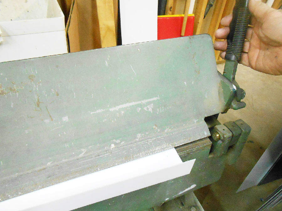
After the letters were cut, they were painted two or three coats with Krylon and the results were quite good. The large panel that the logo panel and these letters would be mounted to was formed on a friend's 10'sheet metal brake to make it hollow and 1½”thick. Laminated sign material, in white cut with the protrusion at the top, was screwed to this .040 aluminum using small #8 flathead stainless steel sheet metal screws. Each hole was counter sunk, very easy in this soft laminate, so the screws would be visually insignificant after they were touched up with white paint.
这些字母被切割完成之后,用喷漆把它们喷涂两到三层,这样就会呈现出非常好的效果。而承载商标板和这些字母背后的大面板,是用朋友的10英尺金属闸做成1½英尺厚的空心板。用小的平头不锈钢金属螺钉把顶部有凸出尖端的白色层压板固定在.040铝制薄板上。在这种软质层压板上钻孔是很容易的,因此在用白色涂料喷涂之后,就看不到这些螺钉了。
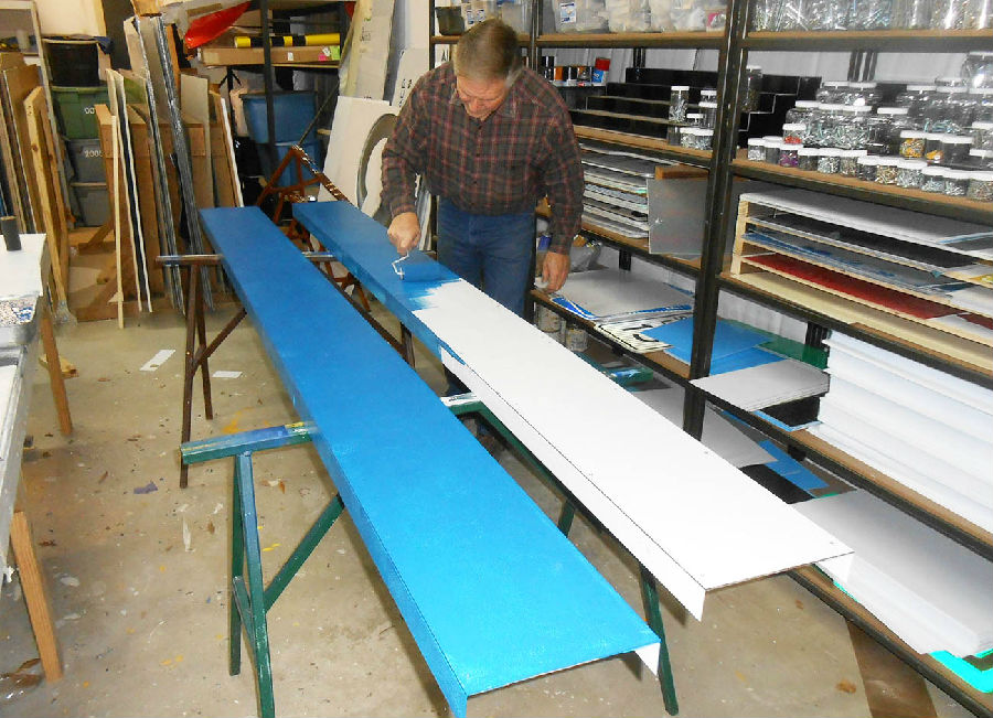
Because there was a raised band around the lower part of the existing sign, and it was cracking up some, it would be covered with a long c-channel like panel, 123”long and 10”tall, made from laminate material with angle trim secured to the edges made from light .040 aluminum formed on our small Tinsmith brake. The pieces of angle trim were in sections, which was fine since the edges would not be very visible. These parts, once assembled, seem fairly large but probably did not weigh more than 10 or 15 pounds.
由于现有标识较低的部分是凸出的棱边,并且有一点破损,这就要用一个长的C型板来覆盖,我们选择用层压板材料做成长123英尺高10英尺的面板,然后把轻质.040铝制薄板垂直固定在面板边缘,这样就做成了C型板。它们虽然看起来比较大,但是重量可能还不到10英镑或15英镑。
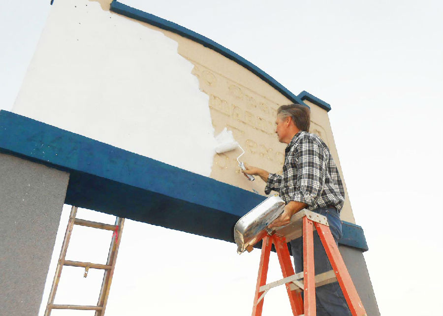
On the Saturday after Thanksgiving, the weather greatly favored us and that afternoon I was out on the jobsite painting everything in sight. I painted the background in a very light gray, the trim in a dark blue that would nearly match their logo letters, and the columns a slightly darker gray, all with latex paint that dried okay on this mild late fall day. Darkness fell while I neatly shaped up the lines where trim and background came together, working by the light of two LED worklights hung on the front of my work shirt.
感恩节后的周六天气非常好,于是当天下午我就到工作现场将所有喷涂工作完成。我用浅灰色来喷涂背景墙,用深蓝色喷涂棱边,这样就和商标字母颜色更相衬,用深灰色来喷涂柱子,这些全部都用乳胶漆来喷涂,因为在温和的晚秋时节是很容易风干的。夜幕降临,在我的工作服上两个LED工作灯的照明下,我熟练地把棱边和背景墙相接的地方做好。
I have used such lights before, which merely light what is just in front of you, but anything at arm's length is fairly well illuminated and progress can be made easily enough. I try to keep at least two or three in my truck at all times.
我之前用过这样的工作灯,它距离你很近时发出的光是很微弱的,但是在距离你一臂之长的距离时,它会发出很强的光,这样就会使得你的工作顺利进展。我打算在我的车上至少备用两到三台这样的工作灯。

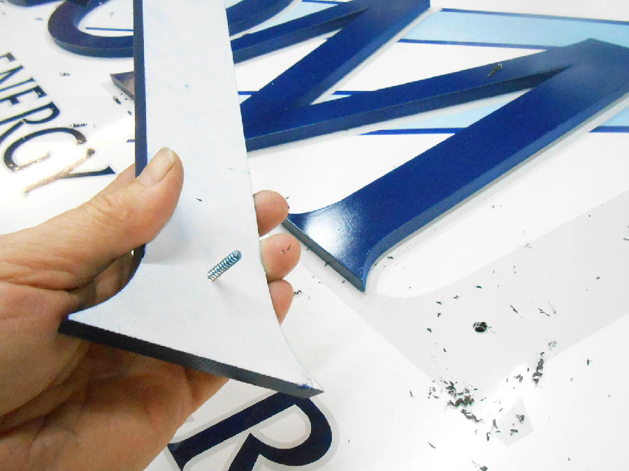
On Monday morning, my staff was back, and they had the day to get the vinyl lettering work done, the outline and digitally printed background part of the logo in place. The main letters, reading“Compass,”had been equipped with studs by merely screwing some #10 by 1½” sheet metal screws carefully in their backs, and then trimming the screw heads off with a small pair of bolt cutters, making the screws into headless studs.
周一上午,员工们都回来上班了,他们把乙烯基刻字做好,并把商标中数码喷印的背景部分固定在整个标识上。所有的字母组合在一起,读作“Compass”,它们背后都安装着双头螺柱,用1½英尺的金属螺钉将其拧紧,然后用小型螺栓割刀把螺钉的头部修平,使得螺钉能够嵌入双头螺柱内。
The letters were set in place over a light gray vinyl outline, and pressed down hard. This pressing made small but visible marks in the soft laminate material, and holes were drilled for the studs to protrude through. The letters would be glued in place in the field, and the studs insured their placement and would secure them while the glue would dry.
这些字母被恰当地放置在浅灰色乙烯基字母轮廓上,并用力按压使其固定在面板上。这样的按压会在软质层压板上留下微小可见的标记,凸出的螺柱按照该标记恰好穿过钻孔,然后用胶水粘合,以确保它们能更加牢固,并且在胶水风干之后,螺柱能保证它们不会随意转动。
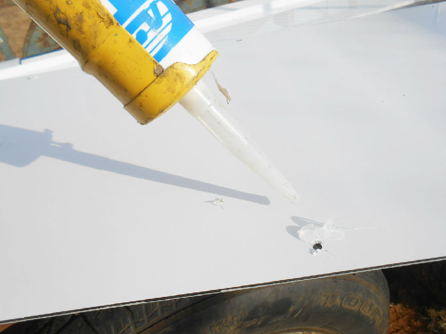
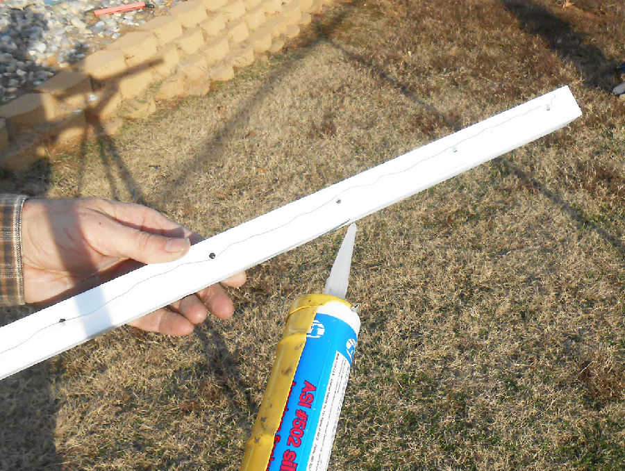
To make the letters more raised, we made small ¼”thick PVC spacers to place on the backs of the letters and around each stud. These spacers were glued in place using plumbers PVC glue, but the letters themselves would be glued in place using 100 percent silicone sealant as the adhesive.
为使字母能更凸出,我们用小型¼英尺厚的PVC垫圈固定在字母背后和螺柱周围。这些垫圈用PVC胶水粘合在适当的位置,同时,字母本身要用100%硅密封胶来粘合。
The main reason for not mounting the letters on the sign panels at the shop was to keep these panels very light, since they would be lifted in place by one man climbing up a step ladder with them in hand, and slipping them over mounting strips secured to the sign with screws and more silicone glue.
没有把字母安装在顶部板上的主要原因,是要保证这些面板尽可能轻便,因为只能有一个人站在梯子上将它们托起,然后用螺钉和硅胶将它们固定在整个标识上。
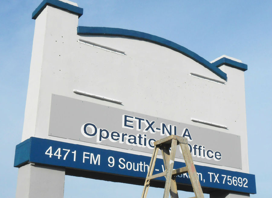
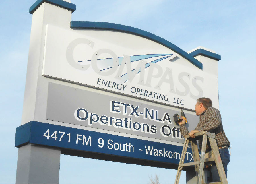
Since the whole sign was covered with textured foam, and whatever structural material there was would not be where I needed it to be, the silicone glue and screw method was as good a way as any for our sign panels and brackets, knowing we could not really trust the screws.
由于整个标识都是用有纹理的泡沫覆盖的,所以硅胶和螺钉同时用于固定的方式对我们的标识面板来说是最好的,这意味着我们不能完全依靠螺钉来固定。
The installation in the field was scheduled for Tuesday, before the VIPs' arrival on Wednesday morning. Of course, final steps and getting out of the shop with everything needed, a truck and trailer full, meant by the time I arrived on location there was really just half a day to do the entire installation. Even this crazy determined sign maker could not make that happen, partly because an important meeting I had to attend that night did not let me extend my stay there.
整个安装过程定在了周二。当然,一辆卡车和拖车就能把所有需要运出店铺的零件都运送到目的地。也就是说当我到达目的地的时候,只剩半天时间来进行整个安装过程了。遗憾的是,由于我当天晚上有重要的会议要参加,所以不得不提前离开那里。
But, things did go pretty much as planned, and each part was easily manageable by one man on either a step or extension ladder. Doing things in sections, using light materials and simple fasteners at all steps of the job, kept the work moving forward at a steady if not rapid pace. But, some of the final work would have to be done the next morning … and early.
然而,事情按计划进展的很顺利,每个部分都是由一个人顺利地完成。在这个项目里,分步进行作业、使用轻质材料和简单的固定物,都促使其以平稳的速度提前完成。但是,最后的一些修饰润色还要在第二天早上或更早来完成。

That's what alarm clocks are for, isn't it? A pre-dawn drive to the location, and a couple of more hours work had the job finished just about the time their important guests arrived. Final touch-ups were still going on when they arrived, but the sign was totally different and reflected the new company name and colors right on time almost to the minute.
在黎明前我们赶到了目的地,花费两个多小时,在他们重要的贵宾到达之时将所有工作完成。当他们到达的时候,最后的修饰润色工作仍在进行,但是标识已经彻底地改变并且按时显现出新公司名称和恰当的颜色搭配。
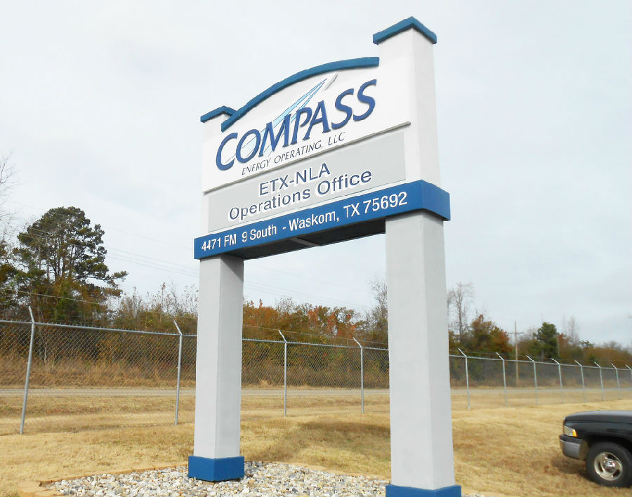
Everyone was very pleased with the work and their sign's total makeover, and surprised with the timeframe in which it was done, especially the caffeine-happy sign maker who was soon on the road back to headquarters to face the next crisis. Oh well—sign making under the gun is a dirty job but someone's got to do it. As Coach Clay, my old football coach used to say, excuses are a dime-a-dozen, results are six points apiece.
每个人都对标识大变身感到非常满意,并且对完成这个项目的时间进度感到惊讶,尤其是标识制作者不久后还要去公司总部迎接下一个挑战。在严密监视下制作标识是一件很糟糕的事情,但是必须有人要做。正如我以前的足球教练经常说的:“不想做的借口比比皆是,而成果每个人都想平分。”
