Within Las Vegas's glittering shimmer of neon and LED lighting and irregular building silhouettes of its different hotel casinos is a somewhat familiar east coast skyline of tall skyscrapers complete with a scaled version of the Statue of Liberty, the Empire State Building and the Chrysler Building, no mistaking here - it's the New York, New York hotel casino. In the front of the hotel/casino is a smallish replica of the Brooklyn Bridge, which is the entrance to New York, New York right there on The Strip (aka Las Vegas Blvd.).
在拉斯维加斯,闪闪发光的霓虹灯、LED发光字以及那些各种酒店和赌场不规则的建筑外观,都容易让人想起东海岸线那边的摩天大楼,就像是缩小版的自由女神像、帝国大厦和克莱斯勒大厦。在这里,你可以尽享其乐——因为这是纽约-纽约赌场酒店。在赌场酒店的前方有一个复刻的小型布鲁克林大桥作为酒店的入口,而这座酒店就坐落于拉斯维加斯大道上。
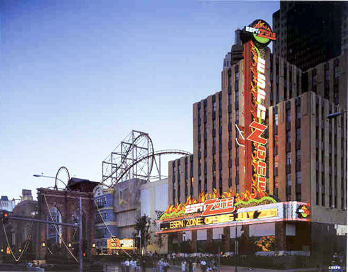
Along that exterior frontage at the northern most point of New York, New York is the ESPN ZONE, a sport theme restaurant whose bright light signage is its main magnet for attracting hungry tourists into its dining areas for great food and all the sports entertainment that guests could wish for. In opening the ESPN ZONE, its sign to be was commissioned by the ESPN corporation through YESCO (Las Vegas), a company that designs, fabricates, installs and maintains signs throughout Las Vegas, Latin America and overseas.
在纽约-纽约赌场酒店的北街对面有一家名为ESPN ZONE的运动主题餐厅,其明亮的灯光标识是引导饥饿游客进入其餐厅的主要吸引力,以便餐厅为客人提供美食和所有体育娱乐活动。在ESPN ZONE餐厅开业之前,ESPN公司将标识设计的任务委托给了YESCO(拉斯维加斯分部)公司,该公司在拉斯维加斯、拉丁美洲和海外均有设计、制作、安装和标识维护的分公司。

The exterior signage on ESPN ZONE is a twice-told tale of two restaurants, one that was and the other that came to be. The prior restaurant was Motown Cafe, a music themed restaurant based on Detroit's rhythm and blues of the 1950s and 1960s. The original exterior signage laid out to promote the restaurant included a marquee, a horizontal reader board that was inserted in front of the marquee and a blade sign. As all things eventually come to pass, so did the Motown restaurant pass into history. The facility was resurrected by ESPN ZONE who inherited the restaurant with both its interior dining and its exterior signage areas, which consisted of the previously mentioned sign spaces.
ESPN ZONE餐厅的外部标识故事一直为人所熟知,两家餐厅一家先开,一家后开。第一家餐厅名为摩城咖啡,这是一家以底特律50年代到60年代的节奏韵律和蓝调音乐为主题的餐厅。为了改进餐厅原始标识的布局,人们搭建了一个巨型标识,并在标识的正面嵌入了一个水平的阅读显示屏和柱状标识。当所有事情都完成得差不多的时候,摩城餐厅也逐渐变成了历史。之后该设施由于ESPN ZONE餐厅的重建而重新焕发生机,该餐厅继承了之前餐厅的内部结构和外部标识区域,而外部标识区域就是前文提到的新建标识项目。
In planning for the ESPN ZONE's signage, the challenge was to make it spectacular, by making it more noticeable and enticing to passing tourists allowing them to easily see that ESPN was here and ready to party hardy with arriving guests. To achieve this goal, Senior YESCO account executive Brian Covey and sign designer Jeff Compton collaborated to create for ESPN ZONE a masterpiece of neon and incandescent lighting transforming the former Motown sign structure into a flickering, glowing illumination that highlighted ESPN's presence along that part of The Strip.
在策划改造ESPN ZONE餐厅的标识时,其项目的挑战在于让它变得更加壮观,更加引人注目并吸引过往的游客,让他们很容易地看到ESPN餐厅就在这里,并准备好欢迎各位顾客的前来。为了实现这一目标,YESCO公司高层的客户经理Brian Covey和标识设计师Jeff Compton合作为ESPN ZONE餐厅创作了一个霓虹灯和白炽灯照明相结合的杰作,将前摩城餐厅的标识结构转变为闪烁的发光照明标识,极大程度地提高了ESPN餐厅在拉斯维加斯大道上的存在感。
Discussing its creation, the first part of designing the ESPN sign said Covey, was to review its new home, the former Motown sign and study its existing presence and visibility along The Strip. To figure out the best way of transforming the ESPN motif onto its new sign structure, Covey documented the sign's location to study it from every possible point of view, "I took many, many digital photos of the old Motown signage from the north and south ends of Las Vegas Boulevard as well as photographing it from across the street near the MGM and even from the median in the middle of the street. Jeff Compton, the YESCO sign designer who created the final sign concept, took all the different viewpoints into account in developing how the final sign would look, as it was presented to ESPN." Compton noted that one big challenge for him was that the building architecture in that part of the hotel venue tended to be very dark with not much 'excitement' going on in that area. "My design was the opposite, to use as much color, light and sign animation as I could to bring attention to that part of ESPN ZONE."
在探讨标识的创作时,负责ESPN餐厅标识设计第一部分的科维表示首先要对标识即将安装的地方进行查看,即前摩城标识的安装位置,以及研究在拉斯维加斯大道上,这个标识现有的存在感和可见性。为了找出将ESPN餐厅主题转化为新标识结构的最佳方式,科维不仅记录了该标识的位置,还从各种可能的角度对其进行研究。“我从拉斯维加斯大道的南北两端拍摄了许多旧摩城标识的照片,以及从米高梅附近的街道上拍摄,甚至从街道正中的中间位置拍摄它。”决定标识最终形象概念的YESCO标识设计师杰夫康普顿考虑了所有不同的观点发展到最后标识可能呈现的样子,并将预估的结果提交给了ESPN餐厅。康普顿指出,他面临的一个巨大挑战是,酒店区域的建筑结构色彩往往非常暗淡,在该地区没有太多“兴奋”点存在。康普顿说:“我的设计恰恰相反,我会尽可能多地使用色彩、光线和动态标识,以引起人们对ESPN ZONE餐厅本身特色的关注。”
Considering ESPN's location in what is one of the greatest sign capitals in the world, the challenge was that the ESPN ZONE had to be esthetically competitive against the surrounding signage around it and the sign had to be easily visible on The Strip during the day. Compton solved these challenges by offering many dynamic features within the ESPN sign package, "It was big, it was very brightly illuminated (day and night) and finally, the lighting had a lot of animation with its varied flickering lights. We also used lots of exposed neon, because the human eye perceives it more intensely and it's a lot more exciting to look at. In all, the ESPN ZONE was a very busy sign to easily catch the eye and inspire tourists to step in and check the restaurant out."
考虑到ESPN餐厅位于世界上最伟大的标志性首都之一中,那么随之而来的挑战就是ESPN ZONE餐厅的标识在美观方面必须与其周围的标识产生竞争力,并且该位于拉斯维加斯大道上的标识在白天必须容易被看见。康普顿通过为ESPN餐厅的标识包装制作许多动态特效来解决这些问题,他说:“这个标识是巨大的,无论是白天还是夜晚它都能够呈现一个非常明亮的照明,并且随着其闪烁的灯光各不相同,它能展示大量的动态特效。我们同时运用了许多的外置霓虹灯,因为这些霓虹灯能更强烈地吸引人们的注意力,让人们更加的兴奋。总而言之,ESPN ZONE餐厅拥有一个非常豪华的标识,可以轻松地吸引眼球并鼓励游客进入餐厅进行消费。”


Marquee Reborn As Neon Showcase
作为霓虹灯展示而重生的标识
The building marquee was 99 feet in length and projected out 11 feet from the building. The basic marquee structure was a large, horizontal polished brushed aluminum canopy with an incandescent reader board inserted in the center of the structure across its front face. Covey noted, "that the marquee's basic frame provided a visual foundation and set the pace for the visual look of the rest of the marquee."
建筑主要的标识长度为99英尺,和建筑物的间隔约为11英尺。基础标识的结构由一个大型的水平抛光拉丝铝合金顶盖和一个嵌入在标识结构正面中间的白炽灯阅读显示屏组成。柯维指出:“标识的基本框架提供了一个视觉基础效果,并为标识其他部分的视觉外观奠定了设计基础。”
Once the final design was accepted by ESPN, YESCO began the fabrication of its new components and sign cabinets package. The job was made somewhat easy by having the original sign structures still intact. Essentially the ESPN project called for placing new signage to the existing marquee. This consisted of the following: a left and right circular single face, open channel logo sign that was placed on each side of the marquee. On the marquee's front side facing The Strip, a newly designed themed motif was established with a series of flickering flames running across its entire length. The blade sign was also completely refitted and a new set of ESPN circular logo emblems were placed on top of it.
当最终设计被ESPN餐厅所接受,YESCO公司就开始制造其新的标识零件和标识灯箱包装。在尽量保持原有标识结构完整的情况下,可以使工作变得轻松一些。总的来说,ESPN项目希望能将新标识安装到现有的标识框架上。这包括以下内容:主标识框架上发光字标识的左右两侧分别安装一个圆形的单面标识;对于面对拉斯维加斯大街的主标识正前方,该公司设计了一个新的主题图案,即在整个标识上安装一个闪烁的火焰图形;柱形标识也完全重新装配,并在其上安装了一套新的ESPN餐厅的圆形徽标标识。
The forthcoming design incorporated a generous amount of steady burn and animated neon to make it visually stand out against all the other signs and attractions along that part of The Strip. Covey noted the very dense exposed neon coverage, "Neon grids filled up all the channel letters, and it was used to outline all the flickering flame shapes on all the signage. We had neon trim on all the lettering and copious amounts on the vertical blade sign as well. The animations varied as we used a variety of neon-based flickering flames. We also used a lot of scintillating incandescent lights flashing behind the ESPN letters and we also had spelling circuits on various logo elements. As for color we used a lot of "hot tropical" colors like reds, oranges, tangerines and green to add some psychological and visual "heat" to the sign. Altogether, the ESPN sign consumed just about 5000 feet of neon to illuminate it. While it was not necessarily excessive, it definitely was above an average amount for the square footage of this kind of a sign."
即将投入制作的设计融合了大量的静态发光照明光源和动态霓虹灯,使其的视觉效果与拉斯维加斯大道上的其他标识得以对比而脱颖而出。柯维注意到霓虹灯的覆盖程度非常密集,他说:“发光字的框架几乎被霓虹灯所填满,它们被用来勾画标识上所有闪烁的火焰形状。我们针对垂直于主标识的柱形标识上的文字和丰富的图案,也都使用了霓虹灯来镶边,当我们变换霓虹灯的灯光效果时,其火焰图形呈现出来的动态效果也不尽相同。我们还在ESPN发光字的背后使用了大量闪烁的白炽灯光源,我们在几个不同的徽标上也添加了电路拼写的元素。在标识的颜色选择方面,我们采用了很多‘热带’的色系,比如红色、黄色、橙色和绿色,不管是心理暗示还是视觉效果方面都为标识增添了一些‘热度’。总之,ESPN餐厅标识消耗了约5000英尺的霓虹灯来照亮它,这个数字的确超过了这种标识平方英尺的霓虹灯的平均使用数量。”
The new circular ESPN ZONE logo emblems placed on the marquee were identical six feet diameter, open-faced channel boxes. The circular channel box cabinets were composed of fabricated sheet metal along with neon lighting in varying colors and were divided into three parts; the bottom was a green field, the center divider was the restaurant's name and the top edge, a flame, all set against a circular black background.
安装在新标识上的圆形ESPN ZONE徽标是两个相同的六英尺直径的开放式灯箱。这个圆形灯箱由金属薄板和多种颜色的霓虹灯组成,分为三部分:底部是一片绿色的田野,中间的分隔线是餐厅的名字,顶部的边缘是一个火焰的图形,这些所有的图案都以一个黑色的圆形为背景。
Again Covey noted that color was very important, "To attract additional attention to the ESPN ZONE's signage, its logo lettering had a color reversal built into it. The ESPN part was white and illuminated with multi-tube white neon with a single red strip running through it. The ZONE word was twice as big and the interior of its channel letters was all clear red exposed neon with a white neon trim around each letter." The style of that word logo effect was applied to the lettering across the top of the marquee as well as across the circular emblems.
科维再次指出,标识的色彩是非常重要的,“为了吸引游客对ESPN ZONE餐厅标识的注意力,它的徽标发光字使用了颜色反转的效果。ESPN字体部分是白色的,并且用白色的多管霓虹灯照亮标识。而ZONE的字体部分不仅是ESPN字体部分的两倍大,并且发光字内部被清晰的红色外露霓虹灯填满,每个字母的周围都有白色霓虹灯围绕。”徽标字体的风格同样被应用于标识顶部的字体效果及圆形标识中。
Within the circular emblem, in between the restaurant's name were a green field and a flaming top. To create the remaining illuminating effects for the logo, the bottom green field was hi-lighted with emerald green neon and filled in with panotone green (PMS # 0363 C). Above the ESPN name was the top edge with its flickering flames that were illuminated with yellow returns and the full flame effect was filled in with a combination of several colors including lemon-yellow (# 32), yellow-orange (# 10-N) and orange (#260-N) neon lighting. Each completed circular emblem was placed in the center of the side of the marquee.
在这个圆形标识中,餐厅的名字位于底部的绿色田野和顶部的火焰图案之间。为了提高标识的照明效果,底部的绿色图案区域选取的是翠绿色的霓虹灯进行高强度的照明,并用泛绿色(PMS#0363 C)填充。餐厅名字上方是闪烁的火焰图形,这些火焰图形边缘用黄色霓虹灯填充照明,全部火焰的图案效果由多种颜色组合而成,包括柠檬黄(#32)、黄橙色(#10-N)和橙色(#260-N)霓虹灯组合照明。每个完整的圆形徽标被安装在标识两边侧面的中间。
Facing The Strip, the marquee front side had two distinct sign elements, the first part, its top decorative element had two sections, a curvy wave-like bulb pack of scintillating lights, and on top of that, an overlay of tongues of flame spread across the entire length of the marquee (at 88 feet).
正对着拉斯维加斯大街,标识的正面有两个不同的元素。首先,它的顶部装饰元素有一个弯曲的波浪式球状闪光灯包装,在标识的上方,火焰图形蔓延的范围横跨标识框架的整个长度(约88英尺)。
Placed over the center of this decorative motif, the ESPN ZONE name in big bold channel letters. The bottom segment of the marquee contained a single line incandescent wedge-based reader board that was 86 feet long, displaying the restaurant's promotions all day and all night.
ESPN ZONE餐厅的名字用巨大的槽型发光字制作而成,并安装在这个装饰图案的中心,标识框架的底部安装了一条长86英尺的单行白炽灯嵌入型阅读显示屏,全天候显示餐厅的促销活动。

Blade Sign Cuts Through Sign Clutter
裁切一个巨大的柱形标识
Directly above the ESPN ZONE marquee was a blade sign edged out in all its glory off the side of the building. The blade sign was double faced and duplicated in a vertical fashion with the ESPN motif placed on top of the marquee. The blade sign had three major visual components; the circular emblem on top, a background field of flickering neon flames with scintillating incandescent lighting, and the ESPN ZONE lettering over the background flickering neon effect. The sign structure itself was 92.5 feet tall, 7 feet wide and projected from the building at 13.5 feet.
在ESPN ZONE餐厅的正上方是一个柱形标识,突出于建筑物的侧面。柱形标识是双面的,两个相同的柱形标识被垂直安装在ESPN主题餐厅的标识框架的顶部。柱形标识由三个主要的可视部件组成:顶部的圆形标识;由霓虹灯火焰图形和明亮的白炽灯光源组成的背景照明;以及背景上闪烁的具有霓虹灯效果的ESPN ZONE字母图形。标识结构本身高92.5英尺,宽7英尺,距离建筑物约13.5英尺。
The blade sign from the pre-existing Motown sign structure was stripped down to its basic frame and rebuilt with the ESPN ZONE themed neon effects. What was new on top of the existing blade sign was the addition of the two circular logo cabinets. Each logo cabinet was 12.5 feet in diameter and made of fabricated sheet metal with channel letters and additional graphics. The completed circular logo with the restaurant's name and the bottom green field was a visual duplicate of the marquee's side emblem. Covey recalled, "We went as far as possible to analysis the blade sign's structural intensity to make sure it could properly support the weight of the additional logo sign cabinets on its top. To make sure that the blade sign's circular logos were easier to see, they were cantilevered out at a 20 degree angle towards the street for more dramatic viewing by approaching tourists."
原有的摩城标识结构的柱形标识被拆分并作为基础框架来重建现有的ESPN ZONE主题霓虹灯标识。现有的柱形标识上新增的是两个带有餐厅徽标的圆形灯箱。每个灯箱的直径为12.5英尺,由制作槽型发光字和新增图形的金属板组合制成。带有餐厅名称和底部绿色区域的完整圆形标识被安装在主标识的两侧吸引路人的注意力。科维回忆说:“我们尽可能分析柱形标识的结构强度,以确保它能够支撑其顶部附加徽标标识的重量,为了确保柱形标识顶部的圆形标识更容易被看到,我们以倾斜20度的角度将它面向街道悬吊,以便为游客提供更多的视觉吸引力。”
Directly below the circular logo were the flickering neon flame field, the scintillating incandescent lights and a vertical placement of the ESPN ZONE letters. Not only was the blade sign brightly lit, but it was chuck full of animation. The flame silhouette was a combination of 50% flickering and 50% steady burn. The ESPN ZONE letters outline were a constant steady burn, the interior fill-neon was set on a spell circuit spelling from top to bottom, ESPN ZONE - flashing three times and repeating.
圆形标识的正下方是柱形标识闪烁的火焰图形霓虹灯部分,明亮的白炽灯和ESPN ZONE字母标识以相互垂直的方式进行安装。柱形标识不仅明亮,而且富有生机。火焰标识的轮廓是一个一半动态和一半静态照明的组合。ESPN ZONE字母标识边缘能够提供持续稳定的照明,其内部则被填充了霓虹灯并按照字母的形状从上至下拼出了电路,“ESPN ZONE”字母标识每闪烁三次就会不断地重复。
Compton said he was pleased with the final design results as it all came together to work very well with the building and the New York, New York-type atmosphere that the hotel was presenting. When the ESPN ZONE sign went live on The Strip, the company's executives who were there for the ribbon cutting ceremonies were according to Covey, "thrilled at what they saw as it exceeded all their expectations. They were definitely happy with their new look." It was a fitting end to a great 'Cinderella' sign story, which could only happen in Las Vegas.
康普顿表示,他对最终的设计成果感到非常满意,因为标识与餐厅所在大厦所呈现的纽约-纽约赌场酒店的氛围相得益彰。当ESPN ZONE餐厅的标识在拉斯维加斯大道上亮起时,该公司参与剪彩仪式的执行人员告诉了柯维他们的感想,柯维说:“标识成果超出了他们的期望,他们感到非常的激动并对新的标识外观表示十分满意。这是一个十足的‘灰姑娘’式标识改造的故事,并且你只能在拉斯维加斯见证这件事的发生。”