This month, Sign Builder Illustrated speaks with a number of ADA signage -related manufacturers and suppliers about some of the big questions and misunderstandings that still persist in this field, as well as trends.
本月,标识设计与制作协会与ADA标识相关的制造商和供应商就该领域存在的一些问题以及发展趋势进行相应的交流。
“There seems to be a lack of real information on what exactly is needed to be ADA-compliant,” says Chris Bayer, president of wholesale sign supplier Cab Signs, noting even after the Americans with Disabilities Act Accessibility Guidelines (ADAGG) hashed out insufficient information to disengage some confusion with an update back in 2012. “Some of the questions we frequently hear are, ‘Which rooms or sign types require raised letters and Braille?’ ‘What materials can be used?’ ‘What size must the sign be?’”
克里斯·拜伊是Cab Signs公司的供应商负责人,他说:“似乎缺少关于ADA标识具体要求的信息。”他还注意到即使2012年《美国残疾人法无障碍指导方针》更新之后,一些信息依旧不完整,需要进行详细讨论。我们经常听到的一些问题是:哪些房间或标识需要凸起的字母?需要使用什么材料?标识尺寸是多少?
Architectural sign systems provider Clarke Systems found that some of the most common ADA violations related to our industry included outdated signs, missing signs, incorrect signs, wrong height, and incorrect mounting.
Clarke Systems是Architectural sign systems公司的供应商,它发现,最常见的ADA违规行为有:标识过时,标识缺失,标识错误,这里的错误包括了不正确的高度和不正确的安装等。
“The regulations specify positioning for ADA signage. When you’re installing multiple signs in a given area, be consistent in placing them—i.e., in a hallway along which signs are posted at every door—so that they are at the same height for uniformity within the specified space,” advises Charles J. Kelly, Jr., president of Clarke Systems.
更新后的指南规定了ADA标识应该安装的位置。当你在规定的区域安装多个标识时,要注意统一一个标准。Clarke Systems公司的总裁查尔斯·凯利建议:“在走廊的每一个门上都贴有标识,这样子统一标准。”
One of the most common oversights within the sign industry is assuming that standards related to ADA-complaint signage only refer to people with vision impairments. It’s actually a little more far-reaching.
ADA标识行业中最常见的疏忽之一是错误的认为ADA只是给视力有缺陷的人设计的。事实上,ADA标识的适用范围更加广泛。
The ADA encompasses more than the visually impaired (an audience made up of persons with other disabilities), so directional and informational signs actually have their own specifications, since a majority of those people do have usable vision.
ADA标识的适用人群不仅仅是视力存在障碍的人,还包括存在其他障碍的群体,这些人里面大多数的视力没有问题,因此,在方向标识和信息标识上都需要进行统一的标准规定。
“The Law was created under the premise of accessibility—unencumbered access/exit to and from a public facility,” says Kelly, noting this allows for improved pedestrian accessibility (visually impaired or otherwise). “Therefore anyone who moves freely through the space is a beneficiary of the Law.”
凯利说:“这个标准制定的原则是能够无障碍的进出公共区域。”她指出,这样能够方便行人(不管是视障人士或其他人士)。“因此,任何在这个区域中行动的人都是这个标准的受益者。”
But the visual aspects remain the topic that generate the most asked questions.
但问题最多的,仍然是视觉方面。
When it comes to designing for ADA directional and informational signs, Kelly states that this is primarily driven by visual standards. “Visual standards dictate that directional signs must meet contrast and visual height requirements relative background colors and viewing distance,” he says. “As for informational signs, most situations are exempt from any ADA regulations.”
当谈到ADA方向和信息标识的设计时,凯利说这主要是由视觉因素决定的。“视觉因素要求方向标识必须要有明显的差别,合适的高度和观看距离,”“至于信息标识,大多数情况下不受ADA规定的限制。”
Jessica Heldman-Beck, director of Marketing Communications at Rowmark, relays that, hands down, the most commonly heard question by her company regarding ADA contrast is whether or not a given color combination meets the 70-30 contrast ratio.
Rowmark公司市场传播总监杰西卡•赫尔曼-贝克说,毫无疑问,她的公司最常听到的关于ADA标识的对比度问题是,使用的颜色对比度是否在70-30这个区间内。

“This ratio is considered the standard recommendation for contrast and is not strictly defined in the law,” she relays. “The law defines the contrast as: ‘characters and symbols shall contrast with their background—either light characters on a dark background or dark characters on a light background.’”
她接着说:“虽然法律没有严格规定,但这个比例被认为最符合对比度的标准。”“法律将这种对比定义为:‘文字和符号应当与背景形成对比。换言之,要么是深色背景上用浅色字符,要么是浅色背景上用深色字符。’”
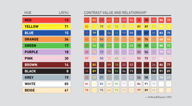
Taking a look at the chart above, Kelly explains that the optimal contrast value is at least a hue of 70, and he offers the following scientific calculation to determine the optimal number for your ADA sign: K1 (highest color value) minus K2 (lowest color value) divided by K1 (highest color value). Then multiply this number by 100 to come up with the contrast value.
凯利解释说,最优的对比值至少为70色调,他还提供以下科学计算来确定ADA符号的最优数量:用K1(最高的颜色值)减去K2(最低颜色值),再除K1(最高的颜色值)。然后将这个数字乘以100得到对比度值。
If the number totals to less than 70, you will need to rethink your color selections to come up with the optimal 70/30 contrast.
如果算出来总数小于70,您可能需要重新考虑重新进行颜色选择,获得最佳的颜色对比度。
According to Rowmark, following in a close second for frequently asked questions is the Light Reflectance Value (LRV) of a specific color. “Light Reflectance Value is a measurement of the percentage of light that is reflected (and conversely how much is absorbed) from color when illuminated by a light source,” relays Heldman-Beck. “LRV runs on a scale from 0 percent to 100 percent. Zero is assumed to be absolute black and 100 percent being perfectly white.”
Rowmark的研究显示,接下来的问题主要是颜色的光反射值(LRV)。赫尔德曼-贝克说:“光反射值是指光源照射时,从颜色中反射的光的百分比(从反面来说,也就是吸收了多少)。”“光反射值的运行范围从0%到100%。0被认为是绝对的黑,100%是完全的白。”
Historically ADA-compliant signs have been perceived as rather basic and bland, but according to information relayed by Heldman-Beck, that is no longer the case, especially now that ADA signage is being incorporated into building designs and décor.
长期来看,符合ADA标准的标识一直被认为是不出彩的,但根据赫尔曼·贝克传递出来的信息来看,这种情况已经改变,尤其是现在ADA标识正被纳入建筑的设计和装饰中。
“The biggest trend that Rowmark sees in ADA signage is the incorporation of branding into the overall signage plan for environmental spaces. Customers are seeking more architectural aesthetic options to fit their corporate branding and image,” she relays. “Gone are the days of utilitarian black-and white ADA compliant signs. Today’s ADA-compliant signs have style and design and just a touch of flair to create a custom, branded look.”
她接着说:“Rowmark觉得ADA标识发展的最大趋势是将标识融入到整个建筑的设计和装饰计划中。商店也倾向选择和建筑适应的,外观更加亮眼的标识,来展示他们的企业品牌和公司形象。”最普通的的黑白ADA标识已经落后了。如今符合ADA标准的标识有自己的风格和设计,能够创造出一种独特的品牌外观。”
Now that UV printing is being used more as a component of many ADA signs nowadays, Bayer reaffirms that this means they no longer have to be text-only and non-attractive. “They can be colorful with digital images, different fonts, styles, and formats,” he says.
如今,UV打印越来越多地用在ADA标识的制作和安装中,拜耳说,这一点意味着它们不再是纯文本的,没有吸引力的标识。他说:“他们可以是彩色的数字图像,可以有不同的字体和不同的风格。”
Kelly finds that most questions aimed in his direction relate to the allowance for a visual design component. “Modifications allow for a non-tactile decorative graphic and its ADA equivalent at a minimum height of 0.5-inch versus the standard ADA height of 0.625-inch,” he says.
凯利发现大部分问题都与视觉设计组件的规定数值有关。他说:“修改后的非触碰的装饰型标识对应的ADA最低高度为0.5英寸,而标准ADA高度则是0.625英寸。”
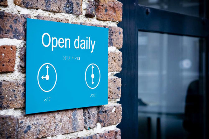
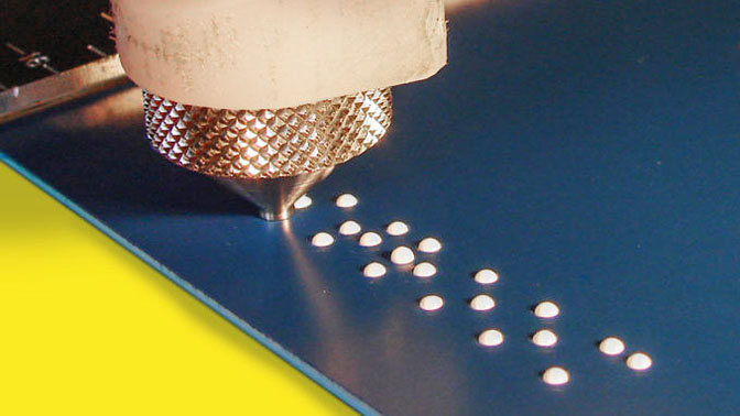
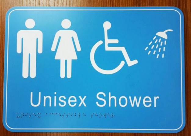
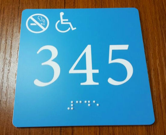
Still these must abide within the rules. “When designing ADA signage some of the most basic standards for consideration are the tactile letter depth of 1/32-inch, the letter height needs to be between 5/8-inch to 2 inches, letter styles should be sans serif only, and only use upper case for tactile characters,” relays Heldman-Beck. “The characters and background need to have a matte, egg-shell, non-glare finish with characters and symbols contrasting with the background color. In addition, the Braille specification is to be domed Grade 2 Braille.”
但以上这些都必须遵守规则。赫尔德曼•贝克接着说:“在设计ADA标识时,最基本的标准是能够触碰到的字母深度为1/32英寸,高度需要在5/8英寸到2英寸之间,字母应该没有下划线,并且只对需要触碰的字符使用大写字母。”“背景需要是哑光、无眩光且难以剥落的,这样子人物和符号就方便与背景颜色形成对比。此外,盲文应该符合二级盲文规范。”
And this variety doesn’t just stop with decoration; it also encompasses materials, which include zinc and photopolymer. “We are also seeing demand for aluminum, brass, Corian, Wilsonart, Chemetal, and other substrates,” says Bayer.
这种改变不仅仅是外观的装饰方面,还包括制作材料的选择,其中包括锌和光聚合物。拜耳表示:“我们还能使用铝、黄铜、人造大理石、防火板、化学面板和其他基材的需求。”
The good news is that you can find updated regulations on the U.S. Department of Justice’s Web site.
另外一个好消息是,你可以在美国司法部的官网上查阅到这个修改后的标准。
