When tasked with having to traverse the ever-changing labyrinth that has become synonymous with medical buildings, offices and hospitals, accurate signage is imperative. From directionals that guide your path to the parking lot, to digital displays that help you make your way to a room, sign companies are striving to keep up with ever-changing client demands while trying to remain accurate, current and informative.
现在,医院越来越大,越来越像一个迷宫,一个好的导视标识是必不可少的。从指引你去停车场,到帮助你去往正确的大楼,标识公司正努力跟上不断变化的客户需求,同时准确、及时的传递信息。
INS + OUTS OF A NEW PAVILION
妇女儿童区的室内和室外标识
Big projects often call for multiple companies to work together to achieve a goal. That was true for Lakeland Regional Health’s Carol Jenkins Barnett Pavilion for Women & Children (Lakeland, FL), whose interior and exterior signage was designed by KMA Design (Tampa, FL) but fabricated by two different signshops in order to accomplish the desired aesthetic. “[KMA] has done other facilities with a focus on women and children in the past and this type of environment presented the challenge of combining a sophisticated feel towards a women’s healing environment, while at the same time serving children’s population in a non-clinical manner,” KMA CEO Barbara J. Martin said.
一般上,大的项目需要多个公司共同努力来实现一个目标。莱克兰地区一个医疗中心的妇女儿童区也是如此,它的内部和外部标识是由KMA公司设计,之后由两个不同的标识商铺制作,以实现它想要的效果。KMA首席执行官芭芭拉·j·马丁说:“KMA过去做过类似的标识,这种环境的标识设计和制作其实是有一定挑战的。”
INTERIOR WAYFINDING
内部导视标识
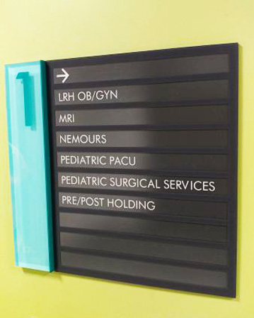
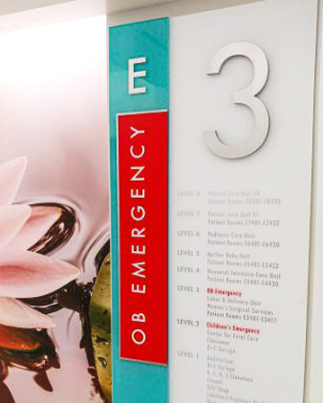
To that end, bids were sent out for both the interior and exterior pavilion signage. Creative Sign Designs (CSD; Tampa, FL) was awarded the job of providing production-level designs, and fabricating and installing the interior signage/wayfinding for the Barnett Pavilion. The project consisted of creating room, department and elevator IDs; flag and stairwell signage; wall and ceiling directionals; and a history wall – all color-coded for easier hospital navigation, according to CSD Vice President Melanie Harden.
为此,妇女儿童区分别对室内和室外的标识进行了投标。最后选定Creative Sign Designs公司进行设计、制造和安装内部标识工作。该项目包括房间、科室、电梯、楼梯间、墙壁及天花板的各种标识。该公司副总裁梅勒妮·哈登说:标识用不同颜色编码,方便医院进行引导。
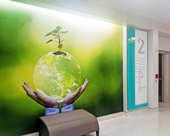
Creative Sign Designs generated a variety of color-coded signs for Lakeland Regional Health’s Carol Jenkins Barnett Pavilion for Women & Children in Tampa, FL.
(Creative Sign Designs公司为佛罗里达州坦帕市莱克兰地区的健康中心的卡罗尔·詹金斯·巴尼特妇女儿童区设计各种颜色编码的标识)
Harden and her team aim to help their clients avoid “signage pitfalls” that can befall large-scale interior signage programs. “We consult, conduct wayfinding analyses, produce conceptual and fabrication-level designs, permit, fabricate and install interior and exterior signage,” she said. “This is attractive to our healthcare clients as it provides a seamless process for all of their signage needs.”
哈登团队的目标是帮助客户避免落入“标识陷阱”,这种陷阱可能会出现在一些大型室内标识项目上。她说:“我们提供标识咨询服务,进行线路分析和安装内部以及外部的标识。”“这对一些医院来说是很有吸引力的,因为它包含了医院需要的所有标识的整体流程。”
The CSD team designed the signage with CorelDRAW, Illustrator, SA International’s EnRoute and FlexiSign PRO, OMAX Intelli-MAX, and KeyedIn. The signs were then fabricated using digital printers, screenprinters, CNC routers, lasers, a press brake, shears and a water jet. All interior ADA signage was mechanically fastened to the wall, while the rest of the signage was mounted with countersunk screws. One down, one to go.
CSD团队运用的标识设计软件有:CorelDRAW、Illustrator、SA International的EnRoute和FlexiSign PRO、OMAX Intelli-MAX和KeyedIn。然后,他们用数字打印机、屏幕打印机、数控雕刻机、激光打印机、压机制动器、剪切机和水射流切割机制作了这些标识。所有内部的ADA标识都是采用机械方式固定在墙上,而其余的标识则用沉头螺钉固定。
EXTERIOR EMERGENCY
外部紧急标识
For the exterior of the pavilion, Baron Sign Manufacturing (Riviera Beach, FL) fabricated the creative, colorful and bold signage that would direct visitors to the children’s emergency entrance. “Healthcare signage is very different from other forms of signage, especially in its wayfinding applications,” Baron Senior Estimator Glen Spaulding said. “While design and overall cohesion is important, it is also very important the people visiting those locations can quickly and easily navigate their way through the site.”
在展馆外部,Baron Sign Manufacturing公司制作了富有创意、色彩丰富的标识,引导游客前往紧急入口。Baron公司的高级估算师格伦·斯波丁说:“医疗行业的标识与其他行业标识形式有很大不同,尤其是在导视标识方面。”“虽然标识的设计是重要的,但能够快速的引导人们去往想去的地方显然更加的重要。”
Once the area was identified and modified, throughout construction KMA created the design using 3D-modeling techniques to ensure the illumination and design would be aesthetically pleasing within the space. Next, a playful color palette was chosen with alternate returns and faces to add interest. “We did not want any trim caps on the letters to allow for a seamless transition from face to returns, [because] this added to the look of the letters as they are viewed at a close distance,” Martin said.
在确认需要设置导视标识的区域之后,KMA公司使用3D建模技术进行设计,确保照明和设计更具美学设计。接下来,在颜色的选择上大胆一点,制造多彩效果。马丁表示:“我们不希望在字母上看到装饰帽的痕迹,从正面到背面,都需要无缝进行过渡,这样子在近距离观看字母时,视觉效果会更好。”
KMA’s detailed notes made Baron’s sign fabrication and installation process fairly seamless, Spaulding said. “Because this was such a creative endeavor, both the KMA Design team and the Baron Sign Manufacturing team had several in-plant meetings and conceptual development engagements.”
KMA团队设计的时候进行了详细的记录,这使得之后标识的制作和安装过程可以无缝衔接,斯波丁说。“因为这是一个创造性的工作,KMA设计团队和Baron制造团队都召开了几次会议,以获得更好的效果。”
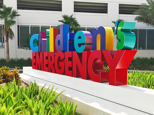
Baron Sign Manufacturing helped lessen the blow of what could be a scary place for some children by making an emergency sign bright and playful.
(Baron 标识制造团队让紧急标识变得明亮而有趣,从而帮助减轻造访者来到医院的压力)
To create the artwork, Baron used SketchUp and CorelDRAW, as the programs helped with the 3D rendering of some of the more unique design aspects of the project, Spaulding said. Sign materials included Matthews Paint systems, GE Lumination, 3M vinyl and Eastern Metal Supply aluminum. The sign was built using a MultiCam CNC router and installed on an existing footer.
斯波丁说:Baron团队使用了SketchUp和CorelDRAW设计这件艺术作品,因为这些程序能够帮助项目进行3D渲染。标识的制作材料有Matthews的标识油漆系列、GE的标识光源、3M标识膜和Eastern Metal Supply的铝合金。这个标识是使用MultiCam 公司的数控雕刻机制作的,并安装在现有的支架上。
Hospitals can be a stressful environment. These projects point to the future of healthcare signage by keeping in mind that well-crafted signage can make the trip less stressful, or, at the very least, not add to the stress of the patient or visitor. “More digital and static signage combined to maximize flexibility and a means to communicate with multiple languages and provide additional support for wayfinding … [are] becoming the norm,” Martin said.
医院很容易让人觉得充满压力。这些标识项目是一个很好的尝试,因为它们可以减少人们来到医院的压力,至少不会增加病人或访客的压力。马丁说:“现在导视标识的发展趋势是将数字和静态的标识结合在一起,最大限度地发挥导视标识的指引性。”
WALKING THE WALK
言出必行;说到做到
The Premier Health network (Dayton, OH) has kept PLANIT Studios (Worthington, OH) plenty busy over the years with a long-term contract for implementing indoor digital wayfinding systems in all five of Premier Health’s hospitals. “We started working with the organization resolving wayfinding issues in several of their hospitals on a small scale,” Planit CEO Pete Williams said. “Our first large-scale project was with Miami Valley Hospital when they added a new bed tower. During this project we developed a system-wide standard. In healthcare, the buildings and departments are always changing.”
Premier Health network 医疗集团与PLANIT广告公司签订了一份长期合同,Premier医疗集团旗下的五家医院都由这个广告公司设计并制作导视标识。Planit公司的首席执行官皮特·威廉姆斯说:“我们开始与这个医疗集团合作的时候,只是进行小规模的导视标识制作”“我们的第一个大型项目是与迈阿密的医院合作,他们增加了一个新的塔楼。在这个项目中,我们制定了一个标识通用的标准。毕竟在医疗行业,大楼和部门是在不断变化。”
Most recently, Planit completed another full-signage program for the Miami Valley Hospital North campus, which combined both traditional signage and digital mapping as well as digital kiosks. This transformed what once was a health center into a hospital, and provided a wayfinding system that connected patients and their families seamlessly to all areas, according to Williams.
For the Miami Valley Hospital North project, Planit audited the existing sign system and met with key stakeholders throughout the facility to gain insight into existing issues and to ensure that they met Premier Health’s standards. From there, Planit produced a sign location plan, developed the maps and messaging being used, and coordinated the work with fabricators from Hightech Signs (Fairfield, OH) to approve shop drawings and oversee installation.
最近,Planit团队完成了迈阿密谷医院北区的另一个标识项目,它很好地结合了传统标识和数字地图。根据威廉姆斯的说法,这里曾经是一个健康中心,现在改造成了医院,标识可以很好的引导将病人和他们的家人去往想去的地方。对于迈阿密谷医院北区这个项目,Planit团队研究了现在的标识系统,并与整个园区的主要利益相关者进行了会晤,以深入了解现有问题,并确保它们符合Premier医疗集团的标准。在此基础上,Planit团队制定了导视标识计划,开发了正在使用的数字地图,并与Fairfield公司的合作,进行施工并监督安装。
Mapping the campus and having it click with the general public was quite an undertaking, Williams said. The campus has two main public entrances linked directly to parking lots that bring the patients and visitors in at two different levels. The emergency entrance is accessed by a side street and the new bed tower and emergency waiting room are not easily found from within the main building. Planit was able to solve many of these issues by going digital. “With digital wayfinding we can add as much information as we want because we are not limited by wall space,” Williams said.
威廉姆斯说,绘制校园地图并在导视标识中利用好它是一项艰巨的任务。北区有两个主要的入口,直接与停车场相连,可以将病人和访客带到两个不同的楼层。紧急入口则是从侧街进入,从主楼很难到服务台和紧急治疗室。Planit团队通过数字化解决了这些问题。威廉姆斯说:“有了数字地图,我们可以添加尽可能多的信息,因为不受墙壁空间的限制。”
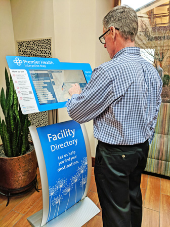
For Premier Health, PLANIT Studios was tasked with implementing indoor, digital and smartphone-connected wayfinding systems in all five of their hospitals, as well as other interior signage.
(Premier Health、PLANIT Studios的任务是在所有五家医院安装室内、数字和智能手机连接的寻路系统,以及其他室内标识)
Planit literally walks the walk to understand client needs. “We spend a lot of time walking the halls, watching people and how they experience spaces, and asking ourselves if the existing signage is helping or creating more confusion,” Williams said. “Wayfinding begins days or even weeks before [an] appointment. The signs should simply be a confirmation of what they have been told or seen prior to coming on the campus. All of these items must work in unison in order for the patient to have a positive experience.”
Planit团队展开工作前需要了解客户的需求。威廉姆斯说:“我们花了很多时间在大厅里观察人们和他们的活动体验,并问自己现有的标识是否有着可以改善的地方。”“对于造访者来说,在预约前几天甚至几周前就应该开始安排线路。这些导视标识应该是他们在进入校园园区之后才会看到的具体信息。所有这些项目必须协同工作,才能让造访者获得好的一个体验。”
Planit used AutoCAD, Google Sheets, Adobe Illustrator and InDesign to create the wayfinding solutions, making sure their design files coalesced with the software used by their fabricators. The wayfinding systems were constructed with clear acrylic, digitally printed Avery Dennison vinyl, ViewSonic touchscreens and Displays2go monitor stands with tilting brackets. In addition, the kiosks are equipped with a MazeMap software that can be completely linked to mobile devices. “A patient can either search on a kiosk or on a mobile device to get a map delivered to them with specific directions to where they need to go,” Williams said. “It is a personalized map that the hospital can link [people] to ahead of their visit in order to guide them from door to door.”
Planit使用AutoCAD、Google Sheets、Adobe Illustrator和InDesign这些软件来进行标识的设计,确保他们的设计文件与制造商使用的软件兼容。导视标识由透明的亚克力、标识膜、触摸屏和LED显示屏组成。此外,还配备了一个MazeMap软件,可以完全连接到移动设备上。威廉姆斯说:“患者可以在触摸屏或移动设备上搜索,得到一张地图,上面有他们需要去的具体方向。”“这是一张个性化的地图,医院可以在病人就诊前就提供这张地区,以便引导他们从一个地方到达另一个地方。”
On the horizon, Williams sees smartphones continuing to play a key role in healthcare wayfinding. “We are seeing a lot more inquiries into digital wayfinding and electronic kiosks. Over the last five years, there has been a significant increase in the population that has a smartphone. [They] are becoming part of our every-day lives and our clients are asking, ‘If I can get from place to place using a smartphone in my car, why can’t I find my way around a building using the same technology?’”
展望未来,威廉姆斯认为智能手机会在医疗导航中发挥关键作用。“我们看到越来越多的人开始使用数字地图。在过去的五年里,拥有智能手机的人口有了显著的增长。手机正成为我们日常生活的一部分,我们的客户会问,‘如果我可以在车里用智能手机从一个地方到另一个地方,为什么我不能用同样的技术在一栋大楼里找到我想去的地方呢?’”
 For Premier Health, PLANIT Studios was tasked with implementing indoor, digital and smartphone-connected wayfinding systems in all five of their hospitals, as well as other interior signage.
(PLANIT广告公司的任务是在Premie医疗集团的五家医院中安装室内、数字和智能手机连接的导视系统,以及其他室内标识)
