For more than 125 years, Chicago has been an experiential, influential design laboratory. The Chicago and Prairie Schools of Architecture earned international renown at the turn of the 20th Century, and inspired later design movements. The city’s innovations in commercial architecture and sign design, however, are less commonly heralded. Examples abound of iconic Chicago buildings integrating flawlessly with environmental graphics. The controversy over the 20-ft.-tall channel letters recently installed on Michigan Ave.’s Trump Tower reveals the passion with which Chicagoans revere the city’s legacy of design harmony.
芝加哥的建筑标识已经有125年的历史了,在建筑标识的发展史上,芝加哥一直是一个经验丰富有影响力的地方。在20世纪初,芝加哥和Prairie建筑学派曾名噪一时,由此激发了标识设计运动。芝加哥标志性的建筑大楼的标识设计融合了很多因素与环境完美对接。然而,芝加哥在商业建筑和标识设计上的创新并不是那么受人推崇。最近备受争议的是安装在密歇根大道上超过20英尺高的发光字标识流露出来的热情与芝加哥推崇的和谐设计产生鲜明的对比。

Architecture
建筑风格
Chicago’s architecture, which gained the “City with Broad Shoulders” an international reputation, was a product of a unique place and time. The city’s pioneering skyscrapers clearly revealed the steel beneath their cladding – a perfect, vertical, street-grid representation. The unique ornamentation paid little heed to classical precedent; instead, native plants and designers’ imagination inspired the voluptuous carvings and patterns. Chicago’s commercial structures were advanced in their own way.
在国际上,芝加哥因为特殊的建筑风格而被冠以“具有宽阔肩膀的城市”的称号,因此,在那里形成了很多独特的人文景观。芝加哥的首座摩天大楼清晰地为大家揭示了这种钢筋混凝土的庞然大物是一个完美的垂直的区域标识。建筑上独特的装饰物在历史上很少见,但是,本土的植物和设计师的想象力催生了他们独特的设计模式。芝加哥的商用建筑标识走在世界前列。
The buildings that lined electric-streetcar corridors were two stories or less in most cases, with flat roofs, but their parapets and façades were adorned with ornamental features distinctive to Chicago. Geometric details on simple, horizontally proportioned buildings meshed with the rise of the automobile, and great glass expanses, made possible by advances in steel-frame technology, filled the façades.
楼体建筑依靠着电车的通道,并且大多数是两层的建筑,平平的屋顶,但它们的护墙和外墙都经过与众不同的修饰,非常有芝加哥独特的特色。简单的几何图形细节,水平均匀的建筑网格搭配着汽车的出现,大片的玻璃,通过先进的钢铁结构技术填充外墙产生无限的可能。


Cinemas of the 1910s and 1920s employed prominent signs – some designed by architects, others by sign companies. Most relate carefully to the façade’s design. Rapp & Rapp, a prolific architectural firm that developed cinemas nationwide, called Chicago home. Nationwide. Its most famous structures included the Paramount Theatre on Times Square, Loew’s King in Brooklyn, and the Paramount in Denver. In Chicago, the firm devised the city’s signature, namesake theatre, with an iconographic marquee and sign. Its features visually anchored the street and served as a superlative, place-defining landmark.
20世纪第二个十年里出现的电影院都有出色的标识,一部分是由建筑师设计的,另一部分则由标识公司设计。很显然,它们在外观设计上做了很多工作。Rapp & Rapp是一家很有名的建筑公司,在美国曾为很多电影院做过外观设计,其中也包括纽约泰晤士广场的派拉蒙剧院、布鲁克林勒乌公司的King剧院还有丹佛的派拉蒙剧院。这个公司设计了一个城市的标志性建筑,同名的剧院、相同的华盖和标识。剧院在视觉上的冲击力重新塑造了芝加哥的地标。

Graphic statements
图形体现
Chicago’s prominent role in America advertising made the city a mecca for talented graphic designers. Titans such as Leo Burnett and Foote, Cone, and Belding created countless national campaigns and well-known trademarks. Chicago’s Container Corp., under the leadership of Walter Paepcke, hired European designers like A. M. Cassandre, Jean Carlu and Herbert Bayer to create promotional environments for the company.
在美国的广告行业里,芝加哥充当着重要的角色,它是一个充满设计灵感的圣地。李奥贝纳和贝尔丁创造了很多知名的LOGO和知名商标。芝加哥的Container Corp公司在瓦尔特的带领下,从欧洲高薪聘请了几个设计师,如,卡桑德尔,珍·卡路,赫伯特等,为公司带来了新鲜的设计理念和风格。
Chicago’s signmaking legacy is no less important. Three companies in particular had a vast and lasting impact in Chicago and across America. The Federal Sign Co., formed in Chicago in 1901, became the preeminent U.S. electric-sign company. It pioneered many technological advancements for incandescent-bulb signs and innovatively contoured sign boxes.
芝加哥的标识设计文化很重要,有三家公司对于芝加哥甚至整个美国的标识设计有至关重要的影响。1901年在芝加哥成立的Federal Sign公司现已成为美国电子标识行业的非常知名的公司了,它开发了很多制作工艺,先进的白炽灯标识和新颖独特的波状灯箱标识。
The White Way Sign Co. next took the lead among Chicago’s signmakers. It created movie-palace spectaculars and developed a near-monopoly well beyond Chicago’s borders. Finally, the Beverly Sign Co. specialized in painted-wall graphics and custom outdoor billboards. It originated panelized sign strategies, which segmented information into discreet, graphic shapes. When Wayne Heath left Beverly for the West Coast, this novel approach was eventually translated to electric signs.
White Way标识公司是芝加哥标识行业的领军企业,它创造了电影院里的看板,在芝加哥及其周边地区几乎形成垄断。最后,Beverly标识公司专注有户外喷绘广告和广告牌的制作与安装。Beverly标识公司最初从事标识策划,信息分类转变图形。当Wayne Heath离开Beverly公司到西海岸地区之后,这种方法就被应用到电子标识领域了。
Beautifying built environments
美化建筑环境

Architecture and graphics merged powerfully in Chicago. A sophisticated, highly advanced design strategy was explored in the design of the city’s Schlitz Brewery taverns. In the early 20th Century, Schlitz promoted beer consumption by constructing as many as 57 neighborhood pubs. The company’s trademark globe emblem was universal. Sometimes integrated in brick bas relief, elsewhere it was rendered in polychromic, glazed terra cotta. Each was integral to the building, rather than a clumsy afterthought.
建筑结构和平面设计在芝加哥互相融会贯通。一套精致的、系统的、先进的设计理念在芝加哥Schlitz酒馆的标识设计中被开发出来。在20世纪初期,Schlitz通过在附近创建连锁酒吧大大促进了啤酒的消费。它的标识遍布全球,有时融入砖浅浮雕,在其他地区,它的标识有时是多彩的,有时是褐色陶器,每一个标识都能与建筑很好地融为一体。
Chicago’s leading architects precluded signs from being the cumbersome constructions so common on America’s commercial corridors during the early 20th Century. At the time, most architects denied the importance of an on-premise sign for their freshly finished facades. With the exception of cinemas, electrical light was generally awkwardly integrated into façade designs – if addressed at all.
在20世纪初期,芝加哥知名的建筑师们都不赞同将标识设计成一个巨大的笨重的结构挂在美国商业大道两旁的建筑上。当时,大多数的设计师都没有意识到内部标识的重要性,他们都把精力放在建筑外表的细化设计上。处理电影院以外,电器亮化在建筑外表上很少出现,即使有电器亮化也显得很笨拙,与建筑格格不入。
Legendary Chicago architects Daniel Burnham and Louis Sullivan provided exceptions. Sullivan orchestrated the increased scale and prominence of environmental graphics for financial institutions.
传说中的建筑设计师Daniel Burnham和Louis Sullivan率先打破传统设计思维,Sullivan开始在金融单位的建筑上增加图片的数量和规模。

Although banks typically invested modestly in identity, his deft interweaving of graphics into façade compositions garnered nine commissions. Burnham played a central role in developing Chicago’s World Columbian Exposition (1893) – which famously came to be known as the “White City” – and the sweeping Chicago Plan (1908), which integrated graphic standards that aptly complemented office buildings’ and department stores’ vast facades.
虽然,银行在外部宣传的投入上一向很谨慎,但Sullivan成功的外观图片设计和立体构图还是取得了一份不菲的佣金。Burnham在芝加哥哥伦比亚世界博览会的发展过程中发挥着至关重要的作用,它以“白色的城市闻名于世”,1908年的“芝加哥计划”集齐了很多可以装饰办公建筑群和百货公司的外观设计。
Chicago’s status as the nation’s center for terra-cotta production enabled its common usage for exterior buildings’ graphics. Its efficient manufacture permitted mass-produced, ornamental, multi-colored tiles, and made sculptural forms and glazed graphics affordable for even simple commercial structures. The possibilities for business identity were limitless. Even without their lettered signs, many businesses announced their trade graphically. If the details didn’t communicate overtly, they suggested powerfully.
芝加哥是美国陶土的主要产区,这使得芝加哥曾有很多建筑标识是用陶土来构建的,它制作简单,在得到政府许可之后,它很快就变成能大宗生产的、颜色丰富的、极具观赏性质的瓷砖,它还可以用于雕刻,制作光滑的图像,被广泛地应用于商业建筑标识中。企业身份的可能性是无限的。即使没有那些意蕴深刻的标识,很多公司的贸易也很顺畅。如果标识能够传达更具体的细节,那么它就会有更好的宣传效果。
Signs’ golden age
标识的黄金时代
The 1930s ushered in a golden age for Chicago’s marriage of architecture and graphics. Architectural firm Holabird & Root set trends in merging these arts. Its long concourse at the mammoth Chicago Daily News building, built in 1929, directed visitors across the riverfront toward the train station. A 180-ft.-long mural, painted by John Warner Norton, embellished it. Its depiction of spinning press wheels, speeding trains and endless columns of newspaper text suggestively mirrored the relentless flow of commuters below.
20世纪四十年代是芝加哥建筑标识蓬勃发展的时期,建筑公司Holabird & Root开始在标识设计中将建筑和绘画艺术相合。芝加哥的每日新闻大厦前有一个很大的广场,它指引着游客从河边陆地到火车站的方向。这栋大楼上有一个180英尺长的壁画,是由John Warner Norton画的,用来装饰每日新闻的大楼。
In 1929, Holabird & Root devised another landmark space, the Chicago Motor Club building, which also featured a Norton mural. It recently reopened as an upscale Hampton Inn property; a gargantuan map in the lobby highlights major roadways from the era when the Motor Club opened.
在1929年,Holabird & Root公司设计了另外一个地标——芝加哥摩托俱乐部建筑,它也是用Norton的壁画来装饰的。最近,它以汉普顿酒店的高级会所重新开放。当摩托俱乐部的大门开启之后,大厅里的巨大的地图是一个很大的亮点。
Holabird & Root’s retail storefronts captured the press’ interest, and influenced architects and graphic designers’ storefront designs globally. The firm even explored creative possibilities for service-station design, where graphics dominated structure and identity trumped shelter.
Holabird & Root公司的小型零售店面捕捉到了媒体的兴趣,全方面地影响了建筑师和设计师的店面设计理念。不仅如此,Holabird & Root公司还为加油站设计标识。

George Fred Keck was another prominent Chicago architect adept at incorporating graphics into his compositions. His prescient design for the Miralago Ballroom building, a mixed-use retail center built in 1931, features a vertical blade sign attached as a fin to a tower feature that visually anchored the long, low composition. The sign fin segued into a canopy over the entrance to the ballroom – everything aligned and connected.
George Fred Keck是另外一个杰出的芝加哥建筑设计师,他擅长于绘画和设计。他为Miralago Ballroom设计的标识像一个垂直的叶片像鱼的鳍一样粘在一个高楼上,Miralago Ballroom是一个综合性的零售商店,建于1931年。这个“鳍”后来就演变为商场入口上方的华盖了。
Bertrand Goldberg, another Chicago modernist, gained attention in the late 1930s for his futuristic plans for a gas station and an ice-cream stand that relied heavily on signage for visual impact. Goldberg eventually became famous for his twin Marina City towers along the Chicago River.
Bertrand Goldberg是另一个芝加哥现代艺术家,他通过未来派加油站和冰淇淋站的设计制作的标识所形成的视觉冲击在30年代后期开始被重视。Goldberg最终通过他在芝加哥河沿岸的马利纳诚双子塔设计而闻名于世。
The world’s Attention (again)
再一次被世界关注
Inventive signs were plentiful at Chicago’s 1933-34 World’s Fair, titled “A Century of Progress.” The exposition provided many Americans with their first glimpse of European modernism; ST covered various facets of World’s Fair signage throughout 1933, from the various lighting technologies on display (see ST, May 1933, page 14) to its overall influence on sign art and design (see ST, June 1933, page 11).
创造性的标识被聚集在1933年到1934年的芝加哥世界博会上,标题为“一个跨世界的进步。”这次世界博览会为很多美国人提供了与欧洲现代艺术第一次接触的机会;标识在1933年覆盖了整个世博会的各个方面,从不同的光源显示技术到标识艺术和设计的整体影响。
Inside the electric pavilion, GE created an enormous city diorama, complete with streamlined skyscrapers, miniature storefronts, moving prop automobiles, and a sky that changed from day to night.
在电子展馆内,通用电子创造了一个巨大的城市立体模型,配有流线型的摩天大楼,小型店面,可移动的汽车和一个能昼夜转换的天空。
A full-scale faux Main Street was also available as a walk-through exhibit. The fully illuminated storefronts on display, with large-scale lettering arranged in a poster-like fashion, employed a strategy imported from Europe. Such dynamic design was still a complete novelty to most fair-goers in 1933, who were familiar only with the traditional retail building front defined largely by a slim fascia sign or hanging, electric-bulb sign.
一个全部人造的商业街同样被作为展示。全照明的店面陈列,配与大型的字母排列在海报上体现时尚,全部的制作都从欧洲进口。像这种动态设计在1933年对于很多观众来说都是非常新奇的,当时很多人只熟悉在传统零售大楼薄薄的门头招牌和电子灯泡标识。
Backlit lettering evolved due to sign limitations imposed by World’s Fair regulations – ironically, just when exposed neon was first getting a foothold on Main Street. The fair showcased the creative blending of graphics and architecture for the future commercial corridor, a bold move pushed by corporate sponsorship aimed to stimulate increased consumption.
背发光字的演变归因于世界博览会法规对标识的限制 – 具讽刺意味的是当时是霓虹灯第一次在商业街出现。在博览会上展示了未来商业走廊图形与建筑的创作融合,一个突出的变化就能通过企业的赞助刺激与增加消费。
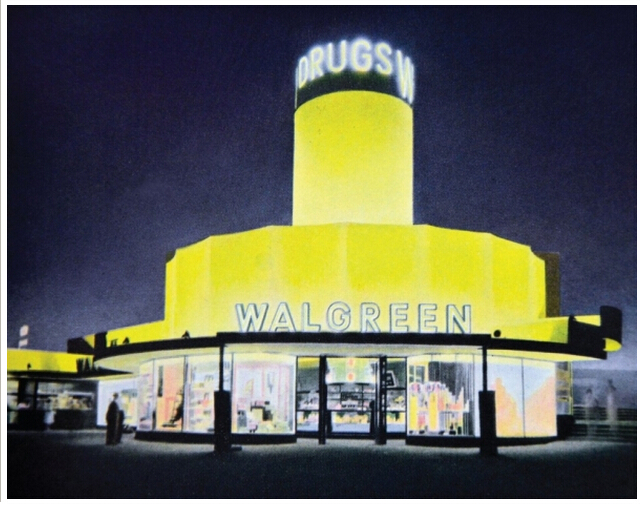
Outside the electric pavilion, Chicago retailer Walgreens introduced a freestanding prototype store fashioned to be a visual lure along the roadside that captivated travelers with bold signage and a carefully integrated tower feature. Chicago architects and sign designers created much of the chain-store design that spread modernism and its novel, graphic approach to middle America.
在电子展馆外面,芝加哥的零售商Walgreens 推出了一个独立式原型的店面产生的强烈的视觉感受,并且路边大胆的标识牌和一些精心制作的塔形视觉标识都吸引住不同的旅行者。芝加哥的建筑师和标识设计师创造了很多连锁店面设计能传播现代主义,而且它的内容图像渗透到美国中部。

Chicago architect Alfred Alschuler developed many chain-store structures built across the U. S. He’s an unsung hero today, despite his prolific and particularly seamless integration of architecture and graphics. Alschuler was probably most highly recognized for his work that appeared along State St. in the 1930s. In 1936, in his sign for men’s clothier Benson & Rixon, Alschuler explored the full potential for use of glass block (a newly introduced material). He defined the building envelope in essentially a graphic manner, as a simple, sweeping curve, articulated with stripes of ribbon windows. Elegant, restrained ribbon lettering complemented the masculine modernity of the façade. Down the block, a year later, Alschuler unveiled his Chicago design for the Kitty Kelly shoe store, again employing glass block in a striking way. The lettering was so compressed it mimicked the vertical lines of the very narrow building.
芝加哥建筑师Alfred Alschuler发展了很多跨越全美国的连锁店面的结构建筑。虽然今天他是一个无名英雄,但是他丰富独特的建筑与图像的无缝集成产生很大的作用。Alschuler的标识作品可能是1930年代华州街上有着最高的认可度。在1936年,在他为男装品牌Benson & Rixon做的标识,Alschuler探索并使用全电位的玻璃块(一种新出现的材料)。他用图像的形式定义建筑的基本结构,这是一种简单,不带曲线,有清晰纹理的条状窗户。简洁、内敛的刻字布满了男性现代主义的外墙。一年后,Alschuler解开了他为Kitty Kelly鞋店在芝加哥设计,并再一次在显眼的位置应用玻璃块。展现的字体非常紧凑,模仿狭窄建筑的垂直线。
Both stores were enormously influential nationally, appearing in many editorial pieces and advertisements for glass block.
两个店面的设计体现在全美国都产生了很大的影响,玻璃块也在很多社论和广告中都有出现。