One simple way to increase the probability that a channel letter sign will be effective for a commercial client is to make sure it ranks high on the legibility scale. It is important, however, to first understand the difference between legibility and readability.
增加槽型发光字的易读性能为客户的业务带来一定的影响,那么,了解槽型发光字易读性和可读性之间的区别非常重要。
Legibility is the degree to which a chosen typeface makes it possible for someone to read something without effort. A highly legible typeface, therefore, is quickly comprehended by the reader without requiring a mental ‘translation.’ Legibility is also an informal method of measurement as how easy it is to distinguish one letter within a sign from the others next to it.
可读性是指所选择的字体,使人们观看之后,不经意地联想到其他东西。高度清晰的字体很容易被理解,不需要翻译。可读性也是一种非正式的测量方法,能清晰地区分标识中一个字母与其他字母的差别。
Readability, on the other hand, measures how well a given combination of words is read within a larger body of text. A common example would be a paragraph on the page of a book.
显然,可读性衡量了文本内读取给定单词组合的程度。类似一本书的封面对整本内容的一段描述性语言。
Sans serif fonts tend to offer stronger legibility, while serif fonts tend to offer better readability. With that in mind, the rule of thumb for effective signage is to configure the typeface for optimal legibility, which typically calls for a sans serif font.
运用无衬线字体能为标识提供更强的易读性,而衬线字体倾向于为标识提供更好的可读性。 考虑到这一点,有效的经验法则是,要实现易读性,通常需要配置使用无衬线字体。
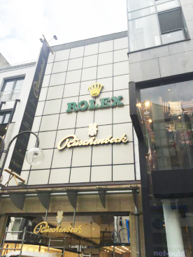
Artistic fonts
艺术字体
Such definitions are important to keep in mind when customers ask for their signs to be produced in an ‘artistic’ font.
当客户要求他们的标识要以艺术字体来生产时,对于艺术字体的定义就变得重要了。
“Letterforms composed of unique shapes, artistic deformations, excessive ornamentation or other novel design elements cause the reader to have to process what they are looking at first, instead of just taking in the message,” wrote graphic designer Douglas Bonneville, author of The Big Book of Font Combinations, in 2011.
平面设计师Douglas Bonneville道:“对于由独特的形状,艺术字体、多样的装饰以及新颖的设计元素组成的槽型发光字,受众不仅是被外观所吸引,也会对内容花上更多时间去品读。”
Compared to other written media, it is especially important with signs to place an emphasis on legibility, as they typically must be read quickly from a moving vehicle at some distance. When customers present a signage concept that is heavily artistic, but would not be highly legible in a visually competitive environment, signmakers should consider asking them to reconsider the value of their design. Would they prefer an artistic channel letter sign or a legible one that yields a 25 per cent increase in foot traffic for their business?
与其他书面媒体相比,标识最重要的属性就是易读性,大多情况下,书面媒体是人们在一个舒适的环境中去慢慢品读,而标识,受众花费的时间可能是一辆车穿梭过去快速扫视的时间,需要在几秒钟就能让他们清晰明了地反应直观的内容。当顾客明显感到标识的艺术效果强于清晰效果时,标识制造商应考虑需要重新设计了,在现实生活中,面向大众的标识,直观效果比抽象效果会更好,大众喜欢一个清晰的字幕,一个清晰的字幕能为他们的业务增加25%的人流量。
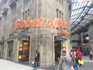
Many people find sans serif fonts lack a sense of excitement. They may not carry the same ‘flash’ as custom fonts, but when push comes to shove, most commercial sign customers will take foot traffic and higher revenues over pizzazz any day!
许多人发现无衬线字体给人带来的感觉不是那么容易产生兴奋感,它们可能不会像自定义字体一样,给人一种清晰爽朗的感觉,但是当无衬线字体推出时,却为大多数商业标识制作商将带来了可观的利润。

Legible fonts
可读字体
Some basic sans serif fonts that offer high levels of legibility include:
一些基本无衬线字体提供高水平的可读性包括:
· Arial.
· Arial字体
· Calibri.
· 默认字体
· Century Gothic.
· 哥特式字体
· Verdana.
· 宋体
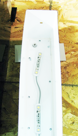
In addition to legibility, there is another reason when designing signs to select from among these standard sans serif fonts. For channel letter signs, these fonts tend to offer sufficient interior space for the optimal placement of light-emitting diode (LED) modules for internal illumination. Figure 1 shows a letter channel with sufficient space for LED module placement. This involves not only adequate space for mounting the modules in place, but also enough room for the LEDs to light the sign face optimally, given their directional lighting angles.
无衬线字体除了可提高标识的易读性之外,还能节省标识的内部空间。对于槽型发光字,这些字体能提供足够的内部空间,以便放置用于内部照明的发光二极管模组。图1显示了一个字母通道,具有足够的LED模块放置空间,使LED能够根据定向照明的角度最佳地照亮标识的表面。
A more ‘creative’ or serif font, on the other hand, may well entail compressed interior channels, which can prevent the optimal LED module placement. Tighter channels can restrict the LEDs’ viewing angle and result in a compromised illumination area. This is not a good situation, as the customer who has approved the font is less likely to approve a dimmer appearance, leading to a change order prior to full production and a delay in the sign’s installation.
另一方面,在标识制作过程中,字体可能需要临时被压缩,这样可以有效地防止LED导致照明区域受损。但是,字体规格的改变会使照明变弱,这不是一个好的情况,客户不太可能接受变暗的外观。而且更改字体的规格,会延迟标识的生产与安装。
Avoiding sign communication failure
避免标识有效内容的缺失
Illegible signs are a real issue. James J. Kellaris, the Gemini chair of signage and visual marketing for the University of Cincinnati, has researched the effectiveness of sign legibility for retail customers. Presenting the results at the Signage Foundation’s 2012 National Signage Research and Education Conference (NSREC), he said approximately 41 per cent of the population of the U.S. had “driven by and failed to find a business due to signage communication failure. Plus, consumers tend to make quality assumptions about a store based on having clear and attractive signage.”
辛辛那提大学标识视觉营销主任James J. Kellaris研究了有关标识易读性和有效性的专题。他在2012年国家标牌研究和教育基金会上提出了观点,他说:“在美国,大约41%的人口由于标识可读性弱而忽略它们的存在,导致标识商店的业务下降。此外,消费者会根据标识的清晰度来对标识商店的质量进行假设,他们会认为可读性越强的标识,这家标识商店的质量与服务会更好。”
The term ‘clear’ is also important in this respect. If a sign’s font is not clear, after all, the sign will not be legible.
除此之外,一个标识的字体如果不清楚,也会带来负面影响。

Kellaris presented further research at the 2014 NSREC, based on perceptual evidence from grocery store shoppers. In this study, he compiled a list of common reasons people found signs hard to read. Among these were situations where “the letters use a fancy font.”
Kellaris对研究进一步进行了受众分析,在这项研究中,他列出了所有降低视觉可读性的因素,其中包括花式字体所产生的感官影响。
The objective for any commercial sign is of course immediate comprehension, not hesitation, translation or analysis. The reader must quickly and easily grasp the sign’s message. With this in mind, a retailer or other sign shop customer can hardly lose with a highly legible sans serif font.

The letters will be easily readable and provide ample illumination space. When combined with an appropriate colour configuration, such a letter set will generate excellent results.
任何一个商业标识的目的都是需要被受众快速、轻松地掌握所要传达的信息,而不是产生犹豫琢磨的状态,或者还要额外花费时间进行翻译或分析。考虑到这一点,标识商店几乎使用的是高度清晰的无衬线字体,不仅易于阅读,还能提供充足的照明空间,结合适当的颜色配置时,将产生优异的视觉效果。
Decorative fonts certainly have their place in the sign industry, but most prominent business signs are not that place. It is a signmaker’s responsibility to inform customers about the potential drawbacks of a ‘creative’ or ‘artistic’ font and to see if they are willing to consider higher-legibility options.
艺术字体在标识行业占有一席之地,但大多数商业标识商店并没有完全去应用,还存在开发艺术字体潜在作用的缺陷,所以,要提高标识易读性,该如何做好字体和内容的设计相当重要。


