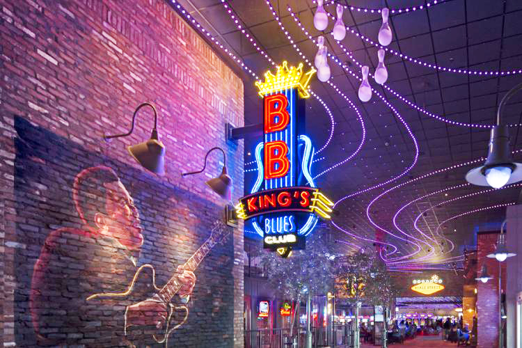
In life, as in song, with everything eventually the thrill is gone. So, when planning a renovation of the existing Wind Creek Casino in Montgomery, AL, the ownership teamed up with BB King’s Blues Club in Memphis, TN to not only expand the facilities, but also to add an exciting venue to the property.
生活的乐趣有时会像一首歌,随着时间的流逝而慢慢消散。为了保留这一份乐趣,当位于蒙哥马利的一家名为“Wind Creek”的赌场准备进行标识翻新时,其赌场主人与位于田纳西州孟菲斯市的BB King's Blues俱乐部进行了合作,此举不仅扩大了基础设施建设,而且为赌场增加了一个能够使人尽情娱乐和放松的场地。
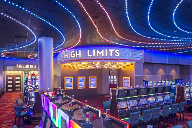
Lorenc+Yoo Design (Roswell, GA) assisted in recreating Memphis’ famous Beale Street by creating festive signage and theming for the property. We had previously completed two other Wind Creek properties with PCI Gaming; however, this design was a bit more challenging. It required a much more energetic and layered development to mimic the historic entertainment district with its years of renovations, blunders and white-washing. For example, Beale Street’s convenience stores were to become beverage stations; the police station, casino security; a theatre and marquee, the high-limits section; and, as the centerpiece – BB King’s Blues Club.
Lorenc+Yoo Design设计工作室(罗斯韦尔市,乔治亚州)曾为孟菲斯市著名的比尔街重新设计过街边店面的节日标识和主题样式。之前我们已经完成了Wind Creek赌场的另外两个PCI Gaming项目,然而,这次赌场的设计将更具有挑战性。它需要经过多年的翻修和粉饰来营造一种更有活力和层次感的发展氛围,以模仿历史悠久的娱乐区。比如,比尔街的便利店变成了饮料站;警察局负责维护赌场安全;剧院和大型帐篷的安置有高度限制;以及作为核心部分——BB King Blues俱乐部。
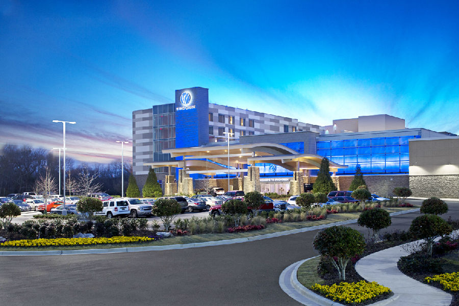
When we were approached to take on the project, the concept for recreating Beale Street was already being developed by Dale Partners Architects (Jackson, MS). Jimmy Peavy, project manager for the Creek Indian Enterprises Development Authority, allowed us to use the streetscape as a canvas to maximize the environmental graphics’ impact. Our work complemented the architecture and interior design with an overlay of signage, large hand-painted murals, marquees, and features such as vintage bulbs lighting the restroom signage.
当我们接手这个项目时,Dale Partners Architects(杰克逊,密西西比州)已经提出了翻新比尔街的概念。印度企业发展局的项目经理吉米·皮维(Jimmy Peavy)允许我们将街景当做画布来进行创作,希望借此来扩大环境图形的影响。我们的工作与建筑和室内设计相辅相成,包括标识、大型手绘壁画、移动字幕和以复古灯为特色的洗手间标识。
For the major elements in the design, we used neon for an authentic Beale Street look. We researched signage from Beale Street, Route 66, Vegas and other famous installations as well as what others have achieved with neon and incandescents for lighting, script and illustration. Varying techniques of lighting and letter construction made it look as if different hands were creating the signs. In many instances we had to step back and let go of our more trained predilection to hide wires and hardware, scratches and cracks.
针对设计中主要元素的选取,我们采用霓虹灯为比尔街的外观进行装饰。我们对66号公路、比尔大街和其他比较有名的地点的照明设施进行了调查,发现大多数情况下霓虹灯和白炽灯都是为了发挥照明、标记和导向作用的。不同的发光字工艺制作手法,使这些标识就像是通过不同的双手直接在建筑物的墙面上制作安装完成的。在许多情况下,我们必须更加谦虚,放下我们之前的经验来重新思考如何隐藏好发光字的电线、硬件、划痕和裂缝。
Marty Peck, the lighting designer from Creative Lighting & Design (Germantown, WI) chose Color Kinetics’ LED lighting system, controlled by an ETC Mosaic system in the ceiling plane, as a complementary programmed light-and-sound show inspired by Van Gogh’s The Starry Night. The architect incorporated many planes of mirrored panels on walls, columns and the ceiling, to visually carry all lighting. Creating an environmental experience where the streets are filled with gaming machines was challenging. Thank-fully, the central corridor to the expansion was 25 ft. tall, allowing for floor-to-ceiling visuals.
来自Creative Lighting&Design(美国威斯康星州,日耳曼敦)的照明设计师Marty Peck选择了Color Kinetics公司的LED照明系统,该照明系统由天花板上的ETC Mosaic系统控制,并按照梵高的《星空》图来作为灯饰的安装图案。建筑师在墙壁、柱子和天花板上安装了许多镜面面板,将空间内部照明的可视性最大化。在充满游戏机的街头中创造一个舒适的环境体验是一种挑战,幸运的是,扩建后的中央走廊的高度是25英尺,能很好地呈现从地板到天花板的视觉效果。
We also engaged illustrators to create a variety of themed images that muralists then hand-painted. The exterior of the property was treated with a vibrant modern skin that hid this extremely different world within. A series of horizontal bands comprising perforated aluminum panels with a direct-print neutral pattern composed the façade, “floating” in front of the building. A light trough with programmed RGB LED fixtures split the panels at the base of the bands. When everything came together, it turned out to be an intentional collage of experiences rarely seen outside of Las Vegas. The property transformed from casino-only, to a casino, hotel and nightclub destination.
我们还聘请插画家设计各式各样的主题图像,并聘请壁画家将这些图像手绘出来。在这个非同寻常的世界里,该建筑的外观显得格外充满活力。这一系列与天花板保持平行的灯带是由带有直接打印中性图案的穿孔铝板,在建筑物前面进行“浮动”的立面构成。由色彩可控的RGB LED灯的固定光带槽将灯带底部的面板分开。当所有事情都安排好之后,就会发现这是拉斯维加斯特有的拼贴装饰图案。这家建筑就从原本只有赌场变为赌场、酒店和夜总会的三合一场所。
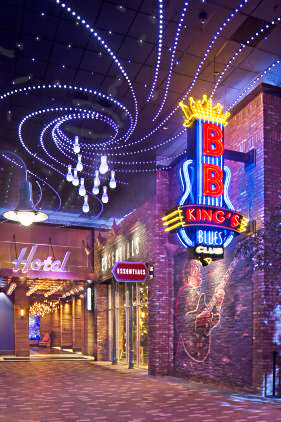
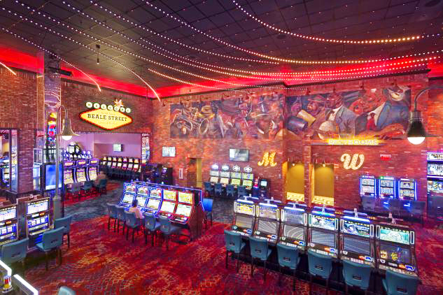
With the successful expansion complete, PCI Gaming engaged Dale Partners and Lorenc+Yoo to carry the same type of theming through the rest of the property. This included continuing the bands described earlier, onto the rest of the building in a more free-form, undulating pattern. We also developed the identities and storefront design for Lucille’s casual diner, the Bus Depot casino entryway and Non-Smoking Gaming, which was themed as a factory.
随着建筑的成功扩建,PCI Gaming项目由Dale Partners和Lorenc + Yoo合作,通过剩下的资金来进行相同类型主题的设计。包括沿用灯带之前的设计模式,在建筑物的其他地方以更自由、起伏的方式进行设置。我们还开设了Lucille休闲餐厅,以公共汽车停车场为主题的赌场入口和以工厂为主题的禁烟游戏室。
The Bus Depot was a major endeavor. Inspired by Greyhound terminals of the 1930’s and ’40s, we clad the overhead fascia horizontally in scalloped, chromed panels with neon bands running the length and dimensional letters supported in front.
公共汽车停车场是一个主要的改变。受到20世纪30年代和40年代的灰狗公交停车场的启发,我们使用扇形的镀铬面板水平地覆盖了天花板上的旧标识,并将霓虹灯带悬挂在上面,通过改变它们的长度使它们变成我们想要的发光字形状。
As the renovation proceeded, the client asked Lorenc+Yoo to identify the zones of the gaming floor through dramatic ceiling-mounted elements. We developed EZ Street, Fortune Freeway and a series of other musically-themed, iconic elements that we sprinkled throughout the rest of the gaming floor. The central piece was a 12-ft. neon guitar suspended from the ceiling and surrounded by 3-ft. spinning records and programmed LED lighting.
随着整修的进行,Lorenc + Yoo的设计使客户对游戏室的地板到充满趣味性元素的天花板的整个空间都充满了好奇。我们开发了EZ街道,幸运高速公路和一系列其他以音乐为主题的标志性元素,尤其是游戏室休息空间的的地面非常令人惊喜。中央部分是一个长约12英尺的霓虹灯,它被制作成一个吉他的形状悬挂在天花板上并被周围长约3英尺的LED灯光环绕着。
Given the fast pace of fabricating so many custom-graphic elements with so many types of lighting, we recommended that Henry Inc. (Decatur, GA) join the team. Lorenc+Yoo has a 30-year history with Henry on various projects across the US. We had some ideas on how to create what we were looking for, but Henry’s resourcefulness and communication allowed us the freedom to realize our complex designs. Knowing what our client was expecting, we gave them more than what they asked for, which is always our goal.
由于光源的选择类型和定制图形元素繁多,并且制作节奏如此之快,我们建议亨利公司(佐治亚州,Decatur)加入该团队。Lorenc + Yoo与亨利在美国已有30年的合作历史。我们对于设计这方面一直坚持着自己的一些想法,亨利的智慧以及与他进行沟通可以使我们更自由地去实现我们复杂的设计。我们的目标是,在了解了客户的需求后,我们要给客户一个更好的结果。
“When I first worked with Henry in 1983, I recall going to their shop and learning about how to put projects together and they led me into their neon shop,” said Jan Lorenc, principal/design director of Lorenc+Yoo. “The variety of colors and the intensity was an amazing experience to see firsthand, but what was more amazing was seeing their craftsman bending the neon tubing against asbestos patterns. It was a craft that has remained a part of what was originally named Henry Neon Company.”
Lorenc+Yoo的首席设计总监Jan Lorenc说:“1983年,当我第一次和亨利一起工作时,我去到他们的商店学习如何把项目整合在一起,随后他们把我带到了他们的霓虹灯店。店里各式各样颜色、亮度的霓虹灯都非常让我惊奇,这是一次难得的经验。更令人惊讶的是,他们的工匠在折弯霓虹灯管时不需要石棉的辅助,这种手艺在亨利霓虹灯公司创办之初就一直坚持到现在。”
The property ownership agreed that the use of real neon here was important. In fact, they wanted more and more neon, and at one point, they asked us to populate the 175-ft. connector wall between the expansion and existing casino with signage and awnings. In a week we developed eight options for neon signs, of which six were selected. Half of these were flag-mounted and half, wall-mounted, to add dimensionality and to truly convey that street-side feel.
委托我们的店主认为霓虹灯起到了非常重要的作用,因此,他们想要更多的霓虹灯来装饰。有一次,他们要求我们对赌场现有的墙部区域和扩展区域的175英尺范围内的标识和遮蓬进行装饰。在一个星期内,我们制定了八种霓虹灯设计方案供他们选择,他们选择了其中的六个。一半是悬挂式和一半是壁挂式的装饰,可以增加空间的可视性。


