A generation ago, cookie-cutter hotels were the norm. The interiors and exteriors of a typical hotel brand of that era were the same, whether in Portland, ME, or Portland, OR. That’s no longer the case. Today, high-profile lodging chains and independent boutiques alike are seeking to create immersive, hyper-local experiences.
几十年前,无论是在波特兰,还是在其他地方,我们看见的酒店标识都是千篇一律。但现在却大不相同,许多知名的连锁酒店,或单独经营的酒店,都在探索一种呈现出独特魅力的品牌标识。
“Millennials, in particular, aren’t as attracted as their parents to the larger hotel chains,” said Katie Sprague, a vice president specializing in graphic design for CallisonRTKL (Los Angeles), whose hotel clients include Hilton, Mandarin Oriental, Marriott and Shangri-La. “They’re looking for boutique destinations that are unique, small and unpretentious. To combat that, the mega-chains are responding by launching ‘soft brands,’ like Marriott’s Tribute Portfolio or Hilton’s Curio Collection, which are unique properties that offer the chains’ back-of-the-house operating systems and loyalty programs.”
洛杉卡利森标识设计公司副总裁Katie Sprague说:“20世纪末21世纪初,人们对于酒店的要求不高,很普通的酒店都非常受欢迎。现在,人们开始寻找独特、小巧、朴实无华的酒店居住。”为了满足人们需求的变化,许多酒店与洛杉卡利森标识设计公司合作推出“软品牌”作为回应,比如,万豪酒店独特的礼品标识,以及希尔顿大酒店的古玩标识,这些独特的品牌标识吸引了人们的更多关注。
All those developments mean hotel signage requires more creative approaches than in the past, Sprague said. “Today’s designs often look much more ‘bespoke’ and connected to a particular place. Some of the bigger brands are even relaxing their signage standards to allow for more flexibility and less uniformity. Our recent work for one of the major flags in Florida [shown on opposite page] is a great example of a less-corporate look. In terms of signage, we were encouraged to think ‘beyond the rectangle.’”
时代不断的发展,进而提高了标识设计要比过去更具创造力。Katie Sprague解释:“最近,我公司为一个在佛罗里达州的酒店设计宣传标识时,我们团队努力打破传统思维,寻求在标识设计上更灵活,而不是死板的如出一辙,使标识更生动形象的突显酒店特色品牌。”
Following is more from Sprague as well as two other design experts in the field on specific ways that hospitality signage is evolving.
下面是Katie Sprague和其他两位标识设计师关于设计佛罗里达州酒店标识的更多信息。

KATIE SPRAGUE, VICE PRESIDENT, CALLISONRTKL
Kati sprague是CALLISONRTKL副总裁
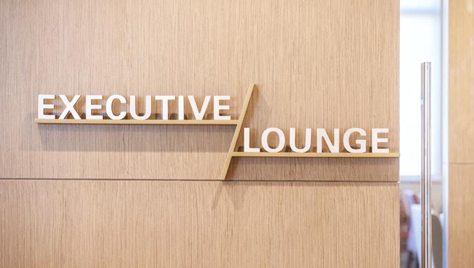
To give the executive lounge signage a distinctive look within a hotel it designed for a major brand in Florida, CallisonRTKL used dimensional letters in an asymmetrical lockup.
为了突显酒店的景墙标识,打造一个独特的外观,CallisonRTKL在酒店走廊的门锁上使用了不对称的字母标识。
Broader materials range: In addition to the usual metal or acrylic panels, designers are working with natural, repurposed or reclaimed materials. These lend a sense of authenticity, history or even storytelling. Some boutique hotels treat signage like artwork, with a return to hand-crafted styles. Explore the use of simple materials used in clever ways – where smart design outperforms expensive design.
材料选择:一些精品酒店将标识视为艺术品,希望回归手工制作风格。因此,设计师们在选择制作材料方面,不仅有亚克力板、金属,还使用了天然的、可再利用或可回收的材料。这些材质制作出来的标识,可以给人们营造一种真实的历史氛围,就好比有人在讲故事。所以,聪明的设计可以巧妙地使用简单材料,比使用昂贵材料设计的标识更有魅力。
Fonts and/or lettering: Due to its simplicity and readability, sans serif is still king, but hand-lettering is also popping up, especially in smaller hotels. This trend has moved from social media to print media to signage, reflecting a “maker’s quality” that’s popular today.
字型和字体:由于无衬线字体简单易读,仍然是主流字体,但是手写字体也在兴起,尤其是一些较小的酒店。这一趋势已经从社交媒体转移到打印媒体,再到标识牌,反映出如今流行的“制造商品质”。
Technology: Cut through visual clutter with creative content. “Digital content can be shown as projection, or on a multi-touch display, or even on a phone,” Sprague said. “Additionally, Bluetooth beacons are being integrated into signage to provide additional content and personalization. Hotels are seeking to know more about who is staying with them, so they can cater specifically to their tastes.”
科技设备:有创意的标识可以打破视觉上的混乱感。Katie Sprague表示:“比如数字标识可以通过投影显示,也可以通过多点触控显示,甚至可以在手机上显示。此外,蓝牙信号灯也被运用到标识中,突显品牌的个性化包装,酒店这些独特标识,都是为了吸引更多的客人。”
Wayfinding: State-of-the-art wayfinding offers the opportunity to be part of a larger narrative, helping to craft a unique guest experience for each property. Also growing in popularity are environmental graphics – murals, public art, décor – that help tell a story.
寻路:独特的导视壁画标识、公共艺术导视标识以及路牌标识,可以给入住客人提供愉快的心情。如上述所说,这些独特的导视标识就是讲故事的前奏。

GUSTAVO NERI, VISUAL IDENTITY ART DIRECTOR, HBA DNA
Gustavo Neri是 HBA DNA视觉艺术总监
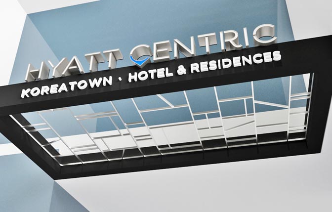
The exterior entry for this planned Hyatt Centric hotel in Los Angeles’ Koreatown will incorporate canopy signage that complements the property’s architecture. Courtesy of Hirsch Bedner Associates (HBA).
美国赫希·贝德纳团队(HBA),给坐落于洛杉矶韩国城的凯悦中心酒店设计的主入口招牌标识,与酒店的建筑风格相辅相成。
With 27 offices across the globe and $132 million in design fees for 2018, Hirsch Bedner Associates (HBA; Santa Monica, CA) is the largest hospitality design firm in the world, according to Interior Design magazine’s list of “Design Giants.” Last June it launched HBA dna, which the firm describes as an “experiential branding Neri sees the following trends impacting the studio’s signage packages for its hotel clients:
根据《室内设计》杂志的“设计巨头”名单,美国好施贝德纳公司在全球拥有27个办事处,2018年的设计费为1.32亿美元,是世界上最大的酒店设计公司。该公司推出赫希·贝德纳团队的一系列设计作品,宣称可以让客人体验更多的新颖感,为客户打造独特的酒店新品牌。以下几方面是影响酒店标识设计的因素:
Architectural integration: Signage is becoming a part of the design, rather than an afterthought that’s placed atop a design. A good signage package will speak the same architectural language as its location and follow the brand’s overall guidelines to create a seamless identification and directional design.
建筑结构:好的标识是在建筑设计时就包括在其中,而不是建筑完成以后才想要添加上去,因为标识不仅代表了建筑的形象,还是品牌宣传的重要手段。
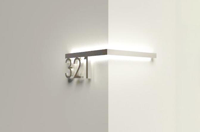
Halo-lit lettering: More sign designs are moving away from the fully lit standard and incorporating halo lighting. This style is visually more sophisticated, giving a property a more boutique, chic aesthetic that feels both elegant and elevated. Both interior and exterior signage are experiencing this trend.
光晕照明字体:为了给酒店带来精致、优雅、别致的美学效果,许多的标识设计正在脱离常规的发光标识标准,逐渐采用了光晕设计发光标识,这种设计风格虽然复杂,但是在视觉上的宣传效果最佳。
Custom lettering: The industry is shying away from stock, bold letterforms and turning to creating a more signature look by using custom typography. Custom lettering (i.e., a handwritten look) helps blur the lines between a bespoke sign and one that is machine-made on a mass scale.
定制字体:标识设计正在规避使用常见的粗体字体标识,转而使用更具特色的定制字体做外观标识,定制字体有助于字母标识脱离机械化制造。
Different directionals: Designers are moving away from harsh, big-box/corporate-looking directionals like those made of acrylic. “By incorporating more pin-sign directionals, a space immediately softens, creating a more minimalist look,” said Neri. “Using custom symbols, such as arrows and placards that are slimmer and better-designed, adds to an overall welcoming vibe.”
不同方向:Neri说:“为了营造更浓厚的欢迎氛围,标识设计团队不再使用千篇一律的粗体字母标识,而是通过加入更多的导视标识,比如定制的箭头符号、标牌语,创造一种简约的外观,给客人渲染一种亲切的氛围。”
Raw materials: Again distancing themselves from the corporate feel, designers are sourcing oxidized metal, organic wood forms – all adding texture and letting the materiality speak for itself. The result is a more honest, genuine product that reinforces a boutique-like feel, Neri said.
原材料:Neri继续补充:“制作材料方面,标识设计师在使用氧化金属的同时,也使用有机木材增加标识的纹理感,让材料发挥真正的作用。这样会让客户感受到产品的真诚可靠性,同时让酒店增添了更精致的感觉。”

KELLI FELLERS, VICE PRESIDENT, GRAPHIC DESIGN, NELSON WORLDWIDE
Kelli fellers是 NELSON WORLDWIDE平面设计副总裁
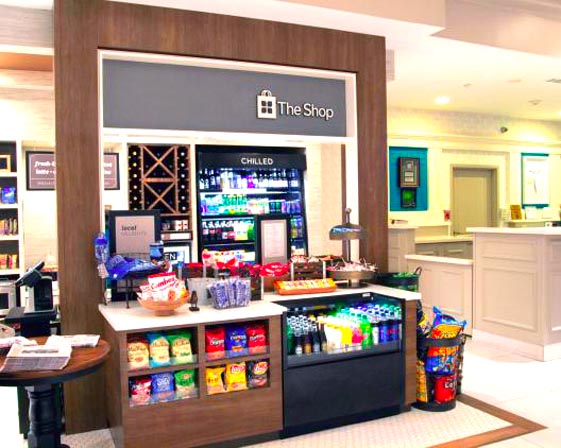
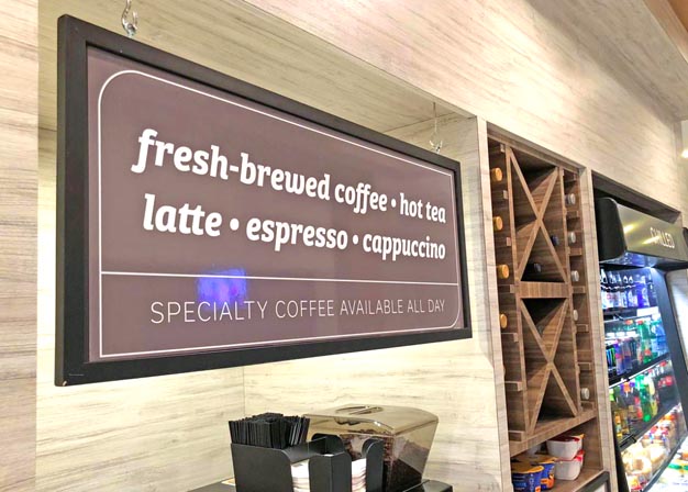
A rich brown sign draws the eye to the offerings at The Shop’s specialty coffee and tea station.
如果咖啡店想要吸引更多人的注意,可以尝试设计一个丰富的棕色标识。
Custom signage isn’t just for luxury hotel brands or independents– it’s also increasingly important in so-called select-service or mid-tier brands, such as Hilton Garden Inn (HGI).
定制标识不仅适用于豪华酒店品牌、独立酒店品牌、希尔顿等中档酒店品牌,还适用其他商业宣传效果。
As Fellers of NELSON Worldwide (Minneapolis) explained, “We’ve seen a focus on enhancing environmental branding and signage systems, inspired by how retailers incorporate seasonal messaging or how coffee houses add a layer of localization into their space.”
Fellers解释:“我们越来越关注标识对于品牌的重要性,是因为看见了零售商融合了季节性产品信息进行售卖,以及咖啡馆在店内添加本地特色标识,这些都是利用标识加强宣传效果。”
A good example of this trend is the signage package for HGI’s lobby shops, Fellers said. “The brand recently rolled out a system-wide update to their on-property retail outlet, now called The Shop. That installation is a bit like a retail shop-in-shop – it retains some of the original brand language, but has an additional layer of personality that helps it stand out from other zones within the public space.”
一个典型的例子就是HGI酒店大堂的招牌标识。该品牌为酒店推出了全新的标识设计,重新设计了主入口标识,而且把每个房间原始的品牌广告留下了,但是额外增加了一层景墙标识,使整体空间不再平凡无奇。
She said the HGI package also showcases three other emerging trends in hotel signage:
Fellers还说,HGI还展示了酒店标识的其他三个新趋势:
Typefaces: From the parent brand, The Shop retains a clean, sans-serif font, but to add a bit of expressiveness and hierarchy to the messages, an italicized typeface (Bree Serif), was added. This style of typeface is starting to show up more in both the retail and food-and-beverage sectors.
字体:HGI从创始品牌开始,酒店就为了突显整体干净的效果,一直使用无衬线字体,但是最近为了迎合人们需求的变化,展现酒店的多层次信息化,开始使用斜体字(布里衬线),并且这种字体也开始出现在零售业和食品饮料中。
Color: The new HGI prototypical public space is a mix of bright colors with fixture, furniture and equipment elements in a bold palette. The Shop is a sharp contrast to this space, using neutral colors that help to make the type highly legible and act as a support role allowing the product to pop.
颜色:新建在HGI酒店的大厅区域的商店使用了明亮的色彩,家具和其他销售品就好比是一个巨大的混合调板色,在加上清晰易读的中性色彩字体,使整个空间形成了鲜明的对比,给客户眼前一亮的新鲜感,增加了销售量。
Materiality: Flexibility for graphics is key in The Shop, but maintaining that trait across 700-plus HGI locales can be a challenge. “That’s where the materiality of the signs comes into play,” Fellers said. “For The Shop, that translated into the use of a material called Visual Magnetics. In this system, a magnetic backer is installed or built into a sign holder and graphics are printed on a separate skin layer. This material is easy to print on and flexible, which makes it easy to drop ship to the hotel’s many locations. This, in turn, allows the brand to act more like a retailer and change out the graphics for seasonal or promotional messages, keeping the space fresh all year round.”
材料:图形标识的灵活性是酒店的关键,但是要在700多个地区都安装HGI酒店这样的标识设计,的确是一个巨大的挑战。但是可以利用视觉磁学的材料解决标识安装的困难,把图形标识安装在磁性衬垫上,这样图形标识就被单独打印在一个表皮层上,这种材料安装的标识不容易脱落,方便运输到各地的酒店。反过来说,这就使品牌标识像一家零售商,可以根据酒店要求,随时更换四季促销的图形标识,全年保持卓尔不群的创造力。
