Basic color combinations, font styles, margins
and graphics usage in successful designs at proper distances.
成功的横幅标识设计之中,字体的样式、边距、颜色还有图形是必不可少的几项要素。
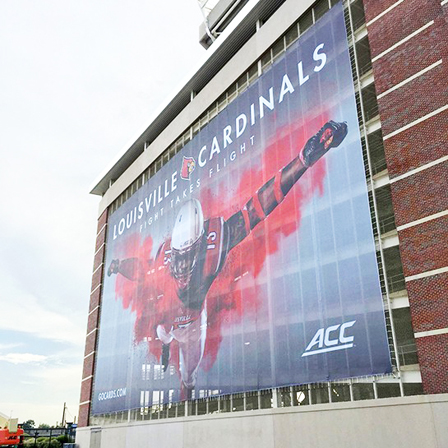
One of the more difficult tasks involved in a sign shop is designing a banner from scratch. When a customer provides the basic message and asks you to be creative, where do you start? Since the primary goal of a banner is to grab the viewer's attention and then communicate a message, the banner should be readable and visually attractive. The following steps are a good place to start to create an appealing and attractive banner, and to maximize its effectiveness.
最让标识设计公司头疼的任务之一,就是从零开始设计横幅标识。当客户提供了基本的信息,并要求产品具有足够创意时,应该从哪里开始设计工作呢?众所周知,横幅广告的主要目的是吸引顾客的注意力,并且传达信息,那么最重要的设计方向就是可读性和视觉吸引力。下文所提供的5个步骤将会是一个很好的开始:教你如何设计一个具有吸引力,并使其效果最大化的横幅标识。
1.Choose appropriate font styles.
步骤一:选择合适的字体
Avoid using more than two type styles on a banner. The more fonts used, the harder it is to read. Sans serif fonts like Helvetica, Futura and Antique Olive are the easiest to view from a distance. They should be used for the primary message on banner. Likewise, serif fonts such as Goudy, Benguiat or Times are appropriate for a secondary message. Fonts such as Old English Text or Engraved are almost impossible to read correctly from a distance and should only be used when the viewer is stationary for a period of time (such as in a conference hall, meeting room or retail store) to be able to absorb the entire message at their own pace.
首先要注意的是,一定要避免在横幅上使用超过两种类型的字体,使用的字体越多,就越难以阅读。一般来说,无衬线字体是最容易从远处看到的,应该将它们应用于横幅上的主要信息;而衬线字体就更适合用于次要信息。
Take into account the type of business or event where the banner will be used. A bridal shop or beauty salon banner can be dressed up with a script font such as Brush or Commercial Script; however, these fonts would be out of place in an auto parts business.
其次,要根据展示的业务或公司的类型来选择字体。婚庆店和美容店的横幅,可以使用毛笔字或商业字体,而这两种字体,如果用于汽车行业就并不合适了。
Also, try to stay away from using all upper case lettering on your banner. It can be used for one word or a line of text for emphasis, however, it takes the human eye longer to read and process words in upper case.
如果使用英文字母,应尽量避免在横幅上使用大写字母,大写字母的确可以用来强调一个单词或一行文字,但它也会大量消耗观看者的阅读耐心。
2.Use Graphics Appropriately
2.合理地使用图形画面
Logos, clip art, borders, etc. can effectively be used to grab the viewer's attention, but should not overpower the sign's main message. If the viewer is only concentrating on the cool clip art or graphic, the message has been lost.
商业图标、剪贴画、边框这些图形可以有效地吸引观看者的注意力,但在实际使用时不应抢占横幅标识上的主要信息。如果观众们只是专注于很酷的剪贴画或者图形,那么想要传达的信息就等于丢失了。
As a signage professional, you have already developed an eye for what works and what doesn't. As you drive around your community, look around at all the banners vying for your attention. Notice the ones that stand out. Mentally take a note about one or two elements of the banner design that grabbed your attention in the first place.
一名专业的标识行业人员,一定要对哪种广告有效,哪种广告无效拥有自己的看法。在业余时间里,比如开车回家的时候,看看周围的横幅标识,在脑海中记下一两个最具吸引力的设计元素,是很有必要的。

3.Consider viewing distance and viewing time.
3.考虑观看距离和观看时长
Always ask your customers, "How far away will the banner be from the viewer?" If a grand opening banner will be on the front of a business with a large parking lot between the storefront and the street, the letter height must be large enough to be viewed by drivers on the street. Also, keep in mind that a driver only has about 1.5 - 3 seconds to read a message while in motion. The chart below will help determine the correct height vs. viewing distance.
一定要询问客户这个问题:“你需要在多远处看到横幅?”如果一家刚开业的公司,和街道之间相隔一个大停车场,那为其制作的开业横幅上面的字体高度必须足够大,让街上的司机们都能看到,同时需要注意,司机在行驶过程中,只有大约1.5-3秒的阅读时间。
下面的图表将有助于确定各种观看距离所需要的字体高度。

4.Use effective color combinations.
4.使用合适的颜色组合
Your customers may already have a color combination they want to use for their banner. Sometimes this is a good thing, and sometimes it is bad. We've all had to make banners that are embarrassingly ugly, or just plain hard to read because of poor choice of colors. The best scenario is when the customer asks us for help in choosing appropriate colors for their banner. The following chart shows the most readable and successful color combinations in order of viewing effectiveness. Color combinations with high contrast between the background and letters are easier to read and can be viewed from greater distances. Always consider the type of business or event when choosing colors. Pink, purple, teal and orange colors aren't shown on this chart, but still can be used for certain holidays, special events or parties.
有些客户已经拥有属于自己的颜色组合,在制作横幅时,他们就会想使用这些颜色,有时这是好事,有时却是坏事。标识设计者们都曾经因颜色使用不当,制作过让人尴尬且难以阅读的丑陋横幅。最理想的情况就是,客户允许设计者选择合适的颜色制作横幅。下面的图表展示了最易读和最经典的颜色组合。一般来说,背景颜色和字母颜色之间的对比度越高,阅读效果就会越好,也易于从更远处被看到。
和字体一样,在选择颜色时,也要考虑到公司的性质和实际的事件。粉红色、紫色、蓝绿色和橙色在这个表格中没有出现,但它们就适用于某些节日、特殊事件或聚会。

5.Banners need margins and white space.
5.横幅标识需要留白
Margin widths are usually the most abused spaces on a banner. Common errors include stretching letters and graphics to fill the entire banner to the edges, or the text and graphic is too small for the sign and the margins are too big. A general rule of thumb is to have the top and bottom margin be 10% of the height, and right and left margins be at least as wide as one of the banner's main font character width. For example, a 48" sign should have a 4.8" top and bottom margin. A three-foot wide banner should have at least a 3" margin on the top and bottom. Avoid filling the empty spaces of the banner with graphics. White space helps keep the viewer's eyes concentrated on the text.
横幅上的空白地带是最常被滥用的部分,常见的错误包括:将字体或图形拉伸到整个横幅的边缘;或是文字和图片太小而空白的部分太大。行业内一般的经验法则是:顶部和底部的留白需要占到整个横幅高度的10%,左右边的留白至少要与横幅上主要字体的宽度相当。例如:一块40厘米高的横幅,至少应该留有4厘米的顶部和底部空白。
同时,要避免用图形填充横幅的空白部分,留白有助于使观众的眼睛集中在文字信息上。
Although these are good general guidelines, they might not always produce desired visual results. Use your own discretion and intuition to help your customer. Creating attractive and effective signage is essential for your customers' satisfaction and is sure to guarantee repeat business.
以上虽然是很实用的通用指南,但不要期望只依靠它们,就可以一直生产出好的视觉效果。利用自己的判断力和直觉,创造出具有吸引力的标识来帮助客户才是长远的发展之路。